Wednesday, March 26, 2008

THE SIMPLER SIDE OF WILLY POGANY

Many people say that the illustrator Willy Pogany (1882-1955) reached the pinnacle of his career with a series of lavish, ornate books including The Rime of the Ancient Mariner (1910), Tannhauser (1911), Parsifal (1912) and Lohengrin (1913). These books feature spectacular gilt designs on sumptuous leather bindings, elaborate borders on each page, and illuminated initials with hand calligraphed text.


Personally, I find them exhausting.

I don't think Pogany started getting interesting as an artist until he shed all the regal trappings and learned to simplify.


Left alone with just a line and a blank page, Pogany began to produce work of enduring value. Each line becomes more important when you don't have fancy textured paper and intricate borders to rescue (or obscure) the quality of your work.


Here are a few scans of Pogany's original drawings so you can see his line up close:


Even his small, "simple" drawings weren't that simple.


Surrounding a picture with fancy borders can enhance its appearance, but only to a limited extent. Ultimately, the picture pays a heavy price for that boost; it is harder for a picture to achieve greatness when encumbered with ornamentation. One of the most important things for an artist is knowing when to stop.

Tuesday, March 25, 2008

Car Flipping Art Cars


April in UK means that the British Rollover Championships is going on full "tilt". This video is hilarious and when I saw it I knew it would make the art car central "hall of hillarity" (and I am not talking about any presidential candidate in particular) The cars are painted somewhat artistically therefore I think they be included here.

"Tapigami" Masking Tape Cityscape by Artist Danny Scheible

Danny Scheible is the amazing "Tapigami" artist who created an entire city scape using regular masking and painter's tape. I met Danny at Art Car Fest 06 in Berkeley CA, where he came to visit all the cars and was gracious enough to make and give out small versions of what he does. We talked for a while and during that time he created a small city scape that I have in an old 100 CD plastic container to protect it from dust. There is not a lot of mention of him on the net but since we drive art cars through cities, I figured it would be OK to write about him on art car central. Maybe he can do a city scape inside a car!!! Danny you rock and you have inspired me with your art.

from this..

To this!!!!!


and the video

Sunday, March 23, 2008

John Lennon and His Rolls-Royce Art Car


Originally the car was painted matt black overall but John got tired of it and in April of 1967, visited J.P. Fallon Limited, a coachworks company located in Chertsey, Surrey. They then commissioned "The Fool" - a Dutch team of gypsy artists, to paint the car "psychedelic" at a cost of £2,000 (or about $4,200 Cdn).

John’s newly painted psychedelic car drew some public outrage when a old woman, in London’s downtown, attacked the car using her umbrella and yelling: "You swine, you swine! How dare you do this to a Rolls-Royce." Obviously, the Rolls-Royce is passionately regarded in England as one of the many symbols of British dignity!

This is one car we won't be seeing in any of the parades, and by far the most expensive and famous art cars that was bought for $2,299,000 in 1985 by Mr. Jim Pattison’s Ripley International Inc. for exhibition at Ripley’s "Believe It Or Not" museum.

John Lennon's car is featured in more detail in this tribute youtube video of him and his Rolls-Royce, with the "Lucy in the sky with diamonds" sound track

Saturday, March 22, 2008

WILLIAM OBERHARDT


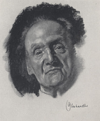
William Oberhardt (1882 -1958) was like a 20th century version of Hans Holbein the Younger. Just like Holbein, Oberhardt had an astonishing gift for rendering the human head. "Heads are my preoccupation," he said. "To me the world is full of heads." Both Holbein and Oberhardt were summoned to draw the most famous people of their day. Holbein drew portraits for the court of Henry VIII while Oberhardt drew portraits for Time magazine.


Cover of the first issue of Time magazine, by Oberhardt


Portrait by Holbein

Both artists could paint, but both found their highest expression in the medium of charcoal drawing, which enabled them to display great freedom and sensitivity.


Oberhardt was a very traditional, almost old fashioned artist. He was appalled at his fellow illustrators who used photographs, emphasizing that an artist's job was not to "copy form" but to "strive for interpretation of personality through form."


He advised young artists:

Avoid haste, and don't take pride in hectic activity...Technique evolves gradually. It is the blossoming forth of years of intelligent study, not surface imitation of accepted mannerisms or formulas. Do not waste time on cleverness which might develop into mere facility.
Despite his traditional approach, you can find great, almost abstract designs in Oberhardt's portraits. Once he gets beyond the subtle nuances of the face, he allows himself to go wild with bold surrounding marks that play an important role completing the design:


In discussing "the distribution of blacks in the background," Oberhardt the traditionalist sounded surprisingly modern: "I follow only my feeling of harmony."


Wednesday, March 19, 2008

"MADE FOR THE MAKER'S OWN DELIGHT"

For fifty years, cartoonist Don Trachte made an excellent living doing uninspired, simple minded drawings.


Nothing about these drawings hinted that behind closed doors, Trachte was so talented he could paint a major Rockwell oil painting well enough to fool all the experts:


Similarly, the cartoonist James Swinnerton had a long, successful career making mediocre drawings that revealed no particular artistic ability:


Yet, in his spare time Swinnerton painted powerful, sensitive landscapes:


Rose O'Neill was another artist who made a small fortune with bland, inferior drawings. The public just loved her cute little imps, called Kewpies:


Nobody guessed that behind the scenes, O'Neil drew intense, erotic drawings and wrote steamy poetry. Her real drawings look like the work of Brad Holland, who came along 50 years later.


When a reporter asked O'Neill about the striking contrast between her professional work and her personal drawings, O'Neill refused to comment, saying "these things were made for the maker's own delight."


I'm not suggesting that every one of these private pictures is a work of genius. However, it is interesting to me that so many artists could not find a market for quality art, and survived only after they dumbed down their work.


I would never have guessed from their public work that these artists were capable of creating such pictures. I think their best work, the work they did for their "own delight," deserves some exposure.


Thursday, March 13, 2008

ONE LOVELY DRAWING, part 18

There are millions of drawings out there with a claim on our attention, but that doesn't mean we can't pause for a moment over one lovely example.

When you stand in a meadow full of daffodils, your eye may settle by chance upon just one. Not the Best flower, not the worst, but by looking at it and smelling it up close you learn something about every other flower in the meadow.

Today's flower is from the great Ronald Searle. Here he does what he does best-- dips his pen in his DNA and comes up with a brilliant, caustic, insightful drawing.


Searle's line is a joy to behold.


In the following detail, note how Searle applies his trademarked approach to three completely different surfaces; the hard geometry of architecture, the soft folds of a curtain, and the natural lines of flowers have all been humanized by Searle. This is what great artists do.


Searle's editorializing is as sharp and wise as his line. Look at the marvelous way he conveys these gelatinous corporate "yes" men:


It's hard to overstate Searle's influence on generations of artists that followed him. (Obvious examples include Pat Oliphant, Jeff MacNelly and Mort Drucker).


His drawings are always worth revisiting.

(PS: for more about Searle, check out this great tribute blog dedicated to Searle.)