Thursday, September 28, 2006

The naked teacher: teaching performance art

CNN reports:


Mo Xiaoxin, a 56-year-old assistant professor at a university in Changzhou, in eastern Jiangsu province, shocked students by stripping during a lecture on "body art" to emphasize the "power" of the body and to "challenge taboos," the Beijing News said.

"There are no taboos in the field of research, but to do this directly in the course of teaching is obviously not appropriate," the paper quoted Tian Junting, a culture ministry official, as saying.

The lecture was part of a course within a newly established "human body art and culture" research institute -- China's first -- at Jiangsu Teachers University of Technology, the paper said.

Mo arranged for four other models, including a man and woman in their 70s or 80s, and a younger couple, to strip naked in front of the class while he lectured, the paper said.


Scandal? Or trivial event? Are we to see this through the eyes of an art critic for whom a naked body is just another element of artistic expression? Or should we rather interpret it from the students' point of view? Would it then be an indecent act, a very embarrassing one? Of course, the article says little about the context of the class. It was part of an experimental course on body art. But was it a practical course? Is a practical course in body art actually possible? I've heard of body art workshops where people were encouraged to self-mutilate. How exactly does that work? Does one train various techniques, until one gets them right? Is there a set of "exercises" one has to execute to pass?

If we accept that a significant part of contemporary art looks to go "out of the box", teaching it becomes a challenge. Trust me, I know. The whole idea is how to get someone to accept the excentric as central, i.e., how to see ("alternative") contemporary art as a basis, or a context for work. This is extremely difficult, much more difficult than just learning to appreciate it. On one hand, the students need to comprehend the strength of new works, the impact they potentially have; on the other, it's not enough to see it in a distance, in an attitude of all-encompassing tolerance. This - body art, performance, controversial or plain shocking installations - is to be, if not a foundation, at least a contemporary history. That means, it needs to be close enough to be useful, to be felt as something we might have done, but (often fortunately) don't need to do any more.

Does this mean the teacher was right? Only if he achieved his goal. Only if the people watching him not only got the point (their point, not necessarily his point), but also, will feel empowered through the experience.

Shocking almost certainly wasn't the teacher's goal. After all, why should the very presence of human body shock? Well, maybe "shock" is not the right expression. But there is certainly an uneasiness. Now here's the trick: without this uneasiness, body art loses its special power. Cutting your body becomes no different than cutting a sheet of paper. And if someone chooses to do the former rather than the latter, it does make a difference to her.

But teaching it? Or: actually doing body art (if getting naked comes anywhere near as much as an introduction to body art) in front of the students? Two points irritate me here:

1) A teacher that instead of making the students discover things by doing them does them himself is at least suspicious. I'd rather have a scandal where the teacher convinced students to actually do body art. At least then, they are the performers, and not just forced spectators. The article states that the teacher tried making the students undress too. It seems it didn't work. Was there any room left on the stage?

2) On a more personal level, art that aims to "break taboos" rarely ever speaks to me. It's not too hard to watch. It's too easy. As one ex-body artist said, the performers are not the only ones sweating. The audience sweats too - of a specific embarrassment and more often than not, a deep desire to be somewhere else.

My doubts regarding Mo Xiaoxin are both as a teacher and a perfomer. But they have little to do with indecence.

Wednesday, September 27, 2006

SORRY, BUT MY RHINOCEROS DROWNED

Artists are most creative when they have to explain a missed deadline or a mistake in their artwork. This honorable tradition of excuses goes back as long as there have been artists. One of the best excuses came from Durer, an early illustrator.


The year was 1515, at the dawn of the Age of Exploration. Western civilization was awakening from centuries of medieval sleep, turning from superstition to the Scientific Revolution and the Renaissance. Durer was tasked with drawing a rhinoceros but unfortunately, nobody had ever seen a rhinoceros in Europe. It was an almost mythical beast described by travelers from exotic lands.

Explorers captured a rhinoceros in the far jungles of India. They strapped the great beast into a ship and sent it back to Europe. It was on its way to Italy, a gift to Pope Leo X, when the ship went down at sea.


What could Durer do? He never got to see the rhinoceros, so in the time honored tradition of illustrators everywhere, he faked it from a description and from a sketch in a letter. His drawing (above) was inaccurate in many ways but there was no one to contradict him, so Durer's drawing established the European concept of a rhinoceros for the next 250 years.

I sometimes think about that primordial beast, plucked from its home in the jungle and carried off to a new world. It was destined to become the most famous rhinoceros in history, although that wasn't much consolation when that storm came up at sea. The ship sank, taking the poor, uncomprehending beast down to a watery grave.

Western civilization would eventually improve its technique for studying wildlife. But in 1515, when cultures didn't quite come together-- when the past didn't quite connect with the future, east didn't connect with west, faith didn't connect with rational inquiry-- there stood an illustrator astride the cultures, bridging the gap.

Thinking digital differently

Flowing in the baroque wilderness of fleshy forms, diving into the realm of whatifs and whynots, is a delicious project called pixelnouveau. Explore it, get lost in it as I did, discover the scent of digital daydreaming...

As any truly experimental project, it has its more and less successful bits - some works seem a little unfinished, as if not nurtured. Also, the navigation is absolutely complicated - but that makes it easier to wander aimlessly, appreciate whatever comes up, and not get the false impression that you're in control. The general feeling is of a rich, dense garden, whose sense still evades me. (Though not the senses).

hint for the desperate explorers: once at pixelnouveau, scroll to the right.

Size matters?

I'm sorry. The post from two days ago was bad. I'm putting it offline and leaving only a minimalist version.

Claes Oldenburg and Coosje Van Bruggen, Cupid's Span

Size matters? How exactly?
----
Kant's distinction between aesthetic experience and sublime experience could mean that, for instance, when visiting a pyramid I am so overwhelmed by it, the experience ceases to be aesthetic and becomes sublime. If we hold on to this distinction, we could risk saying that the experience of art may be similar if it belongs to the same category: in this example, the Louvre pyramid can have a strong aesthetic effect, but it lacks the size that could overwhelm. Does our sensibility really work the way the kantian categories would like it to? I'm not sure. Today, size, even when we're talking about really large-scale sculptures, seems just another element of our overall artistic judgement (notice how we're backing up from the idea of aesthetic experience, though...).
---
Take a few works: Jeff Koons' Puppy, Douglas Gordon's 24-Hour-Psycho, and Chris Bors's answer to it, 24-Second-Psycho. Or even the Colossus of Rhodes a few years before.
Why, then, does playing with size/scale often feel like cheating? Is Kant the answer? Do we basically enter other categories here and become overwhelmed? If so, shouldn't the issue of the scale be ignored?

Jeff Koons
---
Then again, scale is balance. Looking for balance is also looking for the right size. The right ontology, the right way of being, as if we were looking for some sort of homeostasis, balance or harmony, a balance which has as much to do with the object itself as with the context. But is Michelangelo's David any worse for standing in the Accademia Gallery?
---
When Cattelan makes a praying Hitler, the strike of genius is making him small, like an innocent being. Because size plays a role. That means size has a character, smaller is cuter, larger is more impressive, etc.

---
But then how do we cope with pictures of things? Why would our imagination compensate so well in a model representation, but have so much difficulty in regards to the original?
---
Going back to Kant, we could say that playing with the size factor is an expression of frustration with other qualities. Take Oldenburg, for example. Here is a fragment of a beautiful text he wrote in 1961:
I am for an art that (...) does something other than sit on its ass in a museum.
I am for an art that grows up not knowing it is art at all, an art given the chance of having a staring point of zero.
I am for an art that embroils itself with the everyday crap & still comes out on top.
I am for an art that imitates the human, that is comic, if necessary, or violent, or whatever is necessary.
I am for an art that takes its form from the lines of life itself, that twists and extends and accumulates and spits and drips, and is heavy and coarse and blunt and sweet and stupid as life itself.
(...) I am for the art that a kid licks, after peeling away the wrapper.
I am for an art that joggles like everyones knees, when the bus traverses an excavation.
I am for art that is smoked, like a cigarette, smells, like a pair of shoes.
I am for art that flaps like a flag or helps blow noses, like a handkerchief.
I am for art that is put on and taken off, like pants, which develops holes, like socks, which is eaten, like a piece of pie, or abandoned with great contempt, like a piece of shit.
I am for art covered with bandages, I am for art that limps and rolls and runs and jumps. (...)
I am for the art of underwear and the art of taxicabs. I am for the art of ice-cream cones dropped on concrete. I am for the majestic art of dog-turds, rising like cathedrals.
So, in the case of Oldenburg, where is all this art gone? What is it that makes one move from the majestic art of dog-turds to huge post-ready-mades? Could size-ism be a form of escapism?
---
For the lover of big-scale things: how to create large projections on buildings.
For the lover of small-scale things: very small objects. And also, a site full of small bits and pieces of small-scale video art by Alex Pearl, a reader of this blog.

Saturday, September 23, 2006

THE TRIBUTE OF A SIGH

In 1748, Thomas Gray stood alone at dusk in the crumbling remains of a small cemetery in the English countryside. He thought about the generations sleeping beneath the moss-- farmers and plowmen from humble villages where fame or fortune never visited. Soon the ivy would cover the last vestiges of their time on earth.

Gray wrote a beautiful
Elegy to these "unhonored dead" who have no monuments to commemorate their lives. He reminds us:
Perhaps in this neglected spot is laid
Some heart once pregnant with celestial fire.
Their neglect, says Gray, is the way of the world:

Many a flower is born to blush unseen
And waste its sweetness on the desert air.

I think of Gray's elegy when I turn the yellowed pages of old magazines or newspapers and see the valiant work of thousands of now forgotten artists: staff artists for newspapers, draftsmen working in the bullpens of commerical art studios, freelancers eking out a living. Much of their art is best forgotten, but many of these artists were great. They remain anonymous today for reasons unrelated to quality-- born too soon, born too late, drank too much, or perhaps just never caught that lucky break.


Before long, these brittle pages will turn to dust. The beautiful work of these artists will be remembered for only another generation or two by their families before passing on to obscurity. I have no idea how many of these artists are still alive, or what became of them, but I am posting a token handful of commendable drawings so the internet might rescue them from undeserved obscurity.


Gray wrote that in the absence of grand memorials, those who came before us at least deserve "the passing tribute of a sigh." I agree, and this is my sigh for these and other commercial artists who labored so hard in the name of excellence.


Thursday, September 21, 2006

Banksy exhibition...gallery-style


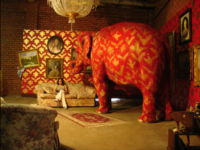
See this great text by Valerie Palmer about a recent Banksy exhibition. The elephant was apparently a fitting centerpiece and stole the show from the political ideas we're used to seeing from the British sweet-painting rebel. Bottom line:
The power of his work lies in the way it interacts with its environment and that obviously gets lost when you put it in any kind of gallery setting.
I guess my wish came true.
Question: Is there any way for revolution to go mainstream?
My answer: No.
Question: What about Cattelan?
My answer: Come on, that's softball compared to Banksy. Cattelan's subversion is a Viennese Waltz compared to Banksy's creative punk attitude.
Question: So how can a guy like Banksy gain recognition?
My answer: He's got it already.
Question: More recognition?
My answer: What's the point? To "promote his values"? Let's face it: the value of critique is that it criticizes. Once it becomes part of the game, it smells of hypocrisy.
Question: What about subversion? Isn't that an option?
My answer: Possibly.
My answer after having though about it for a minute: But there's something cynical about it, isn't there? While in the case of Banksy, there hasn't been so far.
Question: Well, how is he supposed to make a decent living?
My answer: I don't know - find a sponsor? Hell, if I knew, I would be doing it already.
My alternative answer: Just as the jester's role used to be an intelligent critique, also of the ruler, and he made a living off it, so there might be room for an official jester... In the best of possible worlds, that is.

Tuesday, September 19, 2006

Style. Beyond the individual


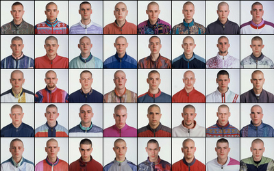
Exactitudes (= exact attitudes), by photographer Ari Versluis and stylist Ellie Uyttenbroek, is an exercise in style (or rather was, from 1994 to 2002 - it is now present online, in a traveling exhibition and in the form of a book). Style is what makes the person unique, but also, quite paradoxically, what makes her so easily categorized. Some say the search for identity isn't at all a search for authenticity (which is a controversial concept), but rather, a search for style. Identity, here, would mean a sort of a definition that allows one to make a drawing. So here we have it, those young boys are making the drawing of themselves - they are getting themselves defined, they are become unique, and totally anonymous at the same time.
It is quite an exciting balance/game/tension, between the self-as-unique and the self-as-participating. Exactitudes shows it clearly. Maybe a little too clearly. It might be because the work is somehow dated, and that, beyond the fact that styles have evolved quite a bit (another proof that identity might be more about style than we think). The pictures, their esthetic qualities, but also the way it was made: the styling, the forcing into categories. Is it necessary? The argument, found in the "about" part of the page, that everything is stylized anyway, simply doesn't seem enough. That's why the groups that speak most to me are ones where the difference, and the similitude, are there, impossible to hide, like in the Tattoo Babes series, or the Dreads one. The others often seem forced, as if the similarity sometimes wasn't enough and needed to be underscored - and it really needn't! Maybe in these two cases, the presence of the naked body seems like something more honest, less manipulated? Then again, come and think of it, the tattoos could be fake.

Saturday, September 16, 2006

Al Magnus: taking children seriously

For Al Magnus, it all started with having children.

How surprizing is that? Of course, these are images of fairly tales. Some actually ring a bell. Most are rather fairy tales in themselves. But to start off, remember they were not meant for us, but for the little ones. Hopefully, that can be a good enough excuse to enjoy, as we usually enjoy the things that weren't meant for us.

Then, of course, there is more. The above image, called Paisagiste II (Landscape Designer II) has two versions. The first one is in color. This one, however, is quite different. By taking away the color, the general atmosphere becomes heavier. But there is another change. The boy pulling on the rope all but disappears. (Yes, there is a boy pulling on the rope). Suddenly, we discover the designer is not quite the one we thought it were. Maybe, because in the tales we know, we can only think of one designer.
But isn't the designer someone with the power to reinvent? To construct, but also, to make a Very Silly Thing (La Grosse Betise)?
Maybe, the power of attraction of children's tales is not that they're far-fetched, incredible, fantastic, but that they design things in such a way that we feel this world-changing design on every step? This is a big difference, since we rarely associate children's stories with the creation of order. Come to think of it, it is an order that they have in common with some, maybe not all, art. And so, the trivial idea that artists are the adults that remained (or went back to being) children can be understood in a whole different way. Artists treat designing seriously.


ARTISTS IN LOVE, part five

The meanest illustrator who ever lived was surely James Montgomery Flagg, who was always quick with an unkind remark.

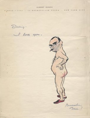
Flagg's autobiography makes fun of the contrast between illustrator Albert Dorne and Dorne's wife. According to Flagg, Dorne's wife was beautiful, petite and elegant while Dorne looked like a brute who might murder you in a dark alley.


It's true that Dorne carried the psychic scars from his childhood in the slums. He had to scratch and claw his way out of Hell's Kitchen not only for himself but for his mother, his two sisters and his younger brother. He worked as a boxer and dealt with terrible situations that, in his own words, left him "hard boiled." Not surprisingly, he became a heavy drinker with a difficult personality. He rapidly went through three marriages.

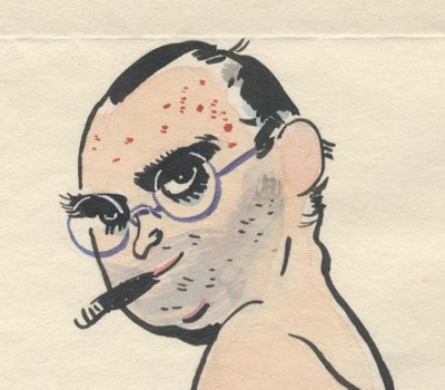
But somewhere along the way, Dorne began to outrun his demons. He seemed startled to find himself capable of a permanent relationship with his fourth wife. After fifteen years of marriage, he said "I am slowly and definitely being convinced that this is it." This self-portrait from Dorne was found among his wife's personal effects after she died:


In the safety of his marriage, even the "hard boiled" Dorne could be reborn as the nubile nymphette from September morn.

Biologists used to wonder why nature invented such a complicated, impractical process as sex, which requires two parties coming together to perpetuate the species. Compared to the asexual reproduction that worked so well for our single-celled ancestors, sex seems highly inefficient. Two separate organisms must overcome many obstacles to find each other and mate. And that's even before you take into consideration the problems caused by that time you showed up late for dinner.


The answer, biologists tell us, is that the parasites and bacteria all around us evolve more rapidly than we do and would soon learn to evade their hosts' immune systems if we did not rearrange our genes with each new generation. By blending ourselves with another person, we force our natural enemies to begin all over again.


The same observation might be made about relationships in general.

When two individuals combine, they have a chance to fill in blind spots and compensate for weaknesses that might otherwise harden during a solitary existence. It is not easy to "rearrange your genes" with another person (as Dorne's first three marriages demonstrate). However, the process can sometimes normalize thoughts and behavior which, if left to grow in isolation, might overtake us like the parasites and bacteria. As Bernard Malamud wrote, "if a man is not careful his own thoughts can poison him."
In the 33 years of his last marriage, Dorne overcame his childhood traumas. He ended up a nationally prominent illustrator, president of the Society of Illustrators and wealthy beyond his wildest dreams. He was an art collector and philanthropist, founder of the Famous Artists School (and then the Famous Writers and Photographers schools, with more than 50,000 students in 55 countries). He was appointed to the President's Committee for the Employment of the Handicapped and devoted substantial time to nurturing young talent. A well deserved happy ending for a very special and powerful man.

Wednesday, September 13, 2006

For V.

The work, by Maarten Vanden Eynde, is called Rave Nature, but here is something interesting: the photo's file on the artist's server is named podium. I much prefer this second name. Also, as we can read here, contrary to many other works of land art, the work as such was not the picture, but the thing itself. It was part of a festival, and was actually an installation that at night would be lit with disco lights and a stroboscope, and smoke would come out while a song would play... I'm not really sure if I still enjoy it as much. One thing is for sure: this picture certainly doesn't convey the idea of rave. Which might be part of the trick, come to think of it. As if the stage was set, but impossible to comprehend during daylight? On a more general level, it's fascinating how the opening of interpretations, as would be the case without the night party, leaving the stage as is, at the same time attracts (makes it more enigmatic) and repels (oh, yah, I get it, conceptual work, got the concept, let's go). Is it cat vs. dog? Is it about the work (over)interpreting itself? Two other pieces by the artist I particularly appreciated:

Both are from the Genetologic Research series. The second one seems to only really gain power when seen in the physical space, but we get the point.

Remixing stuffed birds


Pour les dents d'un blanc éclatant e saines (meaning: for teeth that are shining white and healthy) is an installation by Jeroen Diepenmaat. In it, stuffed birds play records by putting their bill into the groove. One of the impressive things about it is that it's not one of those suggestive works that actually only work as a symbol. It works! On his site you can listen to the sound this and other installations make, or you can choose to chill out to some collaborative re-mixing he's been making. All his works seem to be evolving around vinyl and old cars, and often include interesting ways of callaborating with others (artist, students, groups of unsuspecting passers-by...). Speaking of vinyl, it's impressive how old-style vinyl lovers keep reinventing themselves. Is there anything better for creativity than apparently disqalifying limits? Could this be a difference between the amateur and the professional? The amateur doesn't need limits to his areas of investigation...
(via)

Tuesday, September 12, 2006

In these dark days

Oh, entertain me, do entertain me, make silly things, funny things, call them art, call them rat, but make them pleasant and direct and, why not, simple, and use the tongue of greatest lovers, the tongue that tickles, that brings emotions to the flower of the skin, as the Portuguese like to say...


More here.

He's for a jig or a tale of bawdry, or else he sleeps. - Hamlet


(via)


Sunday, September 10, 2006

September 11


***

I found the second of these two works by Peter Coffin as an illustration to this article by art critic Jerry Saltz. Two other discoveries Saltz provides are the Strange Powers exhibition at the Creative Time gallery (unfortunately judging from the participating artists, and not a visit...) and a quote by Erik Fishl:

Imagine calling two pets, one a dog, the other a cat. Asking a dog to do something is an amazing experience. You say, "Come here, Fido," and Fido looks up, pads over, puts his head in your lap, and wags his tail. You've had a direct communication with another species; you and Fido are sharing a common, fairly literal language. Now imagine saying, "Come here, Snowflake" to the cat. Snowflake might glance over, walk to a nearby table, rub it, lie down, and look at you. There's nothing direct about this. Yet something gigantic and very much like art has happened.
A few questions: If the dog stands for entertainment (as I believe it could), doesn't it value entertainment? I mean, in this example, why would the cat always be the better of the two? Don't you ever get the feeling the cat simply doesn't get it? And what about cat cynicism? Where does that leave art amateurs, huh?

Found thanks to the nonist

Saturday, September 9, 2006

I have been working on transferring all the articles to the new labeling system. So far, 50 out of some 500 posts have been re-tagged, so be patient. In the meantime, you can search through the archives or Google's searchbox.

Friday, September 8, 2006

BEN JAROSLAW


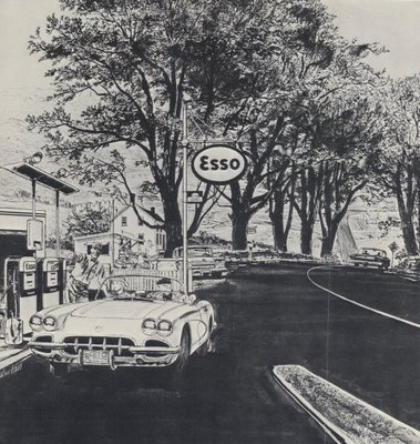
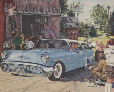
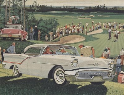
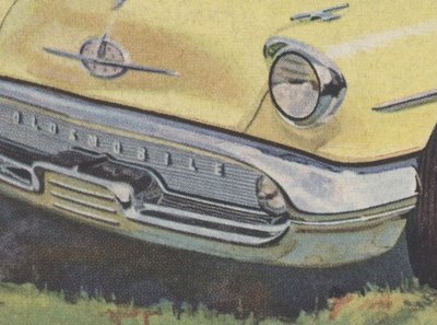
When I was younger (and dumber) I didn't pay much attention to illustrations of cars. Sure, the illustrators had great skill, but I saw them as technical specialists rather than creative artists. If there was ever a subject matter that cried out for photography, it had to be cars.


I began to pay closer attention when I realized that some of the best illustrators of the day-- Austin Briggs, Fred Ludekens and Robert Fawcett-- were doing car illustrations. But my eyes weren't fully opened until the day I heard the illustrator Bernie Fuchs discuss car illustrations the way a poet might rhapsodize about a flower.


Fuchs is famous for his lush, impressionistic paintings, but in the 1950s he worked in a Detroit studio painting backgrounds for car advertisements (including these). He worked closely with car painters and still holds them in the highest regard. He recalls one car illustrator as "a great observer of light and color" and another illustrator as "terrific at painting values using payne's gray. He was able to create sunsets reflected in the side of a car, or a sky reflected in the hood."


Fuchs reserved special praise for the work of Ben Jaroslaw, the illustrator whose car paintings are reproduced here. Fuchs admired Jaroslaw's talent and high standards. He credits Jaroslaw with showing him the ropes and helping him develop into the artist Fuchs later became.


Photography made car illustration obsolete in the 1960s. However, it will not surprise you that years later, the fine art community suddenly discovered the beauty and abstract qualities of photo realistic car paintings when "fine" artists such as Richard Estes began painting cars for posh galleries and museums:


All it took to transform car painting from commercial art to fine art was to move the picture from the pages of the Saturday Evening Post to the walls of a museum and hang it in an impressive frame. ArtCritical.com does not mention Ben Jaroslaw, but it does heap praise on Estes:
Richard Estes is a god among artists today, with legions of followers acknowledged and unacknowledged, aspiring to his masterly style (and few, if any succeeding) and decades of lofty prices in the commercial market place also attesting to his preeminence.
In my view, Richard Estes is not as talented as Ben Jaroslaw, but Estes became independently wealthy because he had the good sense to package his art properly and sell to a less discriminating market.

Thursday, September 7, 2006

Próżna 2006 (translation of review by Dorota Jarecka)

I rarely do it, but it's worth it. The following is my translation of an article by Dorota Jarecka that appeared yesterday in the Polish newspaper Gazeta Wyborcza.

The Project Próżna 2006 breaks with the sentimental-folk climate of the "Singer's Warsaw" festival. Nobody here tries to prove that one can return to the past, bring it back to life or play it back.

The Ulica Próżna 2006 Project
curator: Krystyna Piotrowska
until September 10, Warsaw

Every year the "Singer's Warsaw" festival attracts people to the otherwise deserted Próżna street and creates a fiction. The forgotten climate of a forgotten Warsaw appears again. The artistic project in the building at Próżna 7/9 is a whole other story: no orchestra rhythms, no singing cantors, no Jewish cuisine or cut-outs. Here nobody tries to make anyone believe that the one can go back to the past.

It's a rather painful than happy contact with the past, and the pleasant feeling of participating in a fiction is questioned and treated mistrustfully. The building was designed in the 1880's by the architect Brauman for Naftal Perlman. It was later bought by Zelman Nożyk, founder of the synagogue on Twarda street, the only one in Warsaw to survive the war [WW2]. The building extends along Próżna street, it has several entrances and reaches as far as the Grzybowski square. In 1940 it was inside of the first large ghetto. In the summer of 1942 the ghetto border was diminished and the building was left on the outside. That's why it wasn't brought down after the collapse of the 1943 [Jewish ghetto] insurrection. After the war it had state-owned apartments. Nine years ago it was bought by the Lauder Foundation, who sold it two years ago to a developer called Warimpex.

The house, together with a few neighboring ones on Próżna street, are something unique in Warsaw, since it survived both the Warsaw Insurrection [in 1944] and the reconstruction of Warsaw, but they also didn't undergo nearly any remodeling or improvement. They look just about the same as they did in 1945. When the Lauder Foundation bought the house, the locators renting apartments had to move out. There is always someone there in the abandoned houses, ripping out the old tiles or stealing the balustrade. The water pours in through the roof. We can check by ourselves: in the last years the house at Próżna 7/9 turned into a ruin. It would require an archaeologist to distinguish between war damages and the devastation of the last few years. All the signs mixed together. The house is a conglomarate of damage.

That is the house that artists have entered. Since the very first meeting with art here, we are nearly swept off our feet. Katarzyna Krakowiak, a young sculptor (teacher at the Academy of Fine Art in Poznań), filled the floor of one of the entrances with sidewalk tiles. They give to the first step, caving in. We discover they are laid on an air-filled, rubber foundation. We walk as through concrete waves, on a shaking ground. The work is called "Swindle of Balance".

Another work present was Artur Żmijewski's "Our Songbook". It consists of a film made in Israel - emigrants from Poland, 60 to 80 years old, sing Polish songs. It is an astonishing document. It shows there are no easy national qualifications. Żmijewski says: there are limit identities, fluid ones, impossible to name by a political or media language - and even less by the language of official passports. In his film, the artist shows the counsciousness of a specific group of people living in Israel, but one which is neither the consciousness of all Jews, or of all Poles.

The "Ulica Próżna 2006" project is exactly such a collection of individual messages. Krystiana Robb-Narbutt created a narration about her family which didn't survive the ghetto. It is made of toys inside of glass aquariums. The history is told with a naive language, seemingly inadequate to the events. Yet the subject is the very search for a language. The props used in this story (the toy wagon stands for the transport, the Christmas decoration "angel hair"[bands of very thin stripes of translucid plastic] is the grey hair of an old woman) are a conscious choice of an immature language. Because any other language lost its value and can no longer tell the story.

The common language becomes ridiculed. Something is "Jewish", something is "Polish" - but what does that mean, exactly? In Krystyna Piotrowska's installation, a real, live carp swims in the bathtub. Next to it, the artist put two recipes for carp taken from an internet cuisine book - carp "Polish style" and carp "Jewish style". The Polish one is a little more caloric, but it's pretty much the same. And the carp doesn't know what nation it belongs to.

A wooden model of Próżna street, as it is to look after the remodeling (to be made in near future), stands in one of the rooms. The developer wants to create a luxurious hotel in this building. The empty, enormous apartment on the second floor where I managed to enter, with the traces of the old life, with the colors of the old paints still on the walls, will be gone.

Próżna street cleaned of its junk and cleanly painted is a problem for me. In Poland what tells something about history is not reconstructed antiquities, but crumbs, wrecks, litter. The flashy, crystal clean street will stop being Próżna [meaning "Void" or "Vain"] and become Empty street. Yesterday, walking through the house at Próżna 7/9, I had the feeling that I'm walking through the real museum of the history of Polish Jews. How can we save it?

- Dorota Jarecka


Extra: from the curator's note:

The way Próżna street looks makes it completely visually autonomous from its surroundings, the current center of Warsaw. It puts it in an aesthetically and historically provocative oposition to the contemporary city. It constitutes a dramatic shock of a dead and decaying fragment of the city of the past with the live and indifferent city of today. It is the image of a conflict that is both ethical and aesthetic. It is the fruit of a German crime from times of War and of the post-war indifference.
Such a dramatic tension in the city space is an inspiration for the creation of the Artistic Project "Ulica Próżna 2006". The goal of the project is to show how the newest language of art can relate to this past and this present, which the opposition of Próżna street with its surroundings calls upon. (...)
The Artistic Project "Ulica Próżna 2006" is also open to interpreting it from the perspective of such contemporary phenomena as cultural, religious or political foreignness and animosity. Also today, they lead towards crime on a mass scale. - Krystyna Piotrowska (Polish fragment here)

Wednesday, September 6, 2006

Art that speaks for itself

One of the most important issues I have been struggling with recently is the question of commentary within the artwork. Take a conceptual work and leave out the comments. What do you get? What is a life of a concept without a conceptual framework? Behind the rhetorical question lies a complicated issue. First, it's with the relation between the esthetic experience and the contextual, often intellectual approach. Then, going more specifically toward a commentary that is included in the work itself, we have questions of self-reference and self-presentation, and things get messy. Several issues: isn't it a sort of self-publicity, or rather, a self-justification, which serves as an excuse for any "misreadings", that is, readings different from the one intended? Of course, an artist's text (also in the case of an artist's statement) can get quite smart and distanced, so as not to get too involved. People like Cattelan or Matthew Barney are masters at that. But sometimes the work lives off the description. It seems to only make sense through the concept - and not because the concept is the work, but because either a) the work seems an excuse for the concept, or b) the concept guides us through the work like a map. It's the second case I'm interested in. Take Book, a formally simple work developed by four artists, two of them in the U.S., two in Belfast. Look at book. It is an artist's sketchbook exchanged every week for 36 weeks, creating a sort of an artistic dialogue between the two sides. The conversation of images, so common these days, might tell us little (especially given the small size of the images, which doesn't allow a more patient analysis). But everything changes dramatically when we receive guidance (I recommend the audio version, which is very pleasant and, well, human). Things become clear, make sense, and... sometimes appear as obvious (!).
Yes, an auto-guided work. Isn't it something problematic? Do we need a guide?
What's the problem with a guide? Well, for one, he makes it difficult to drive by ourselves. He also intervenes in the very aesthetic experience we're having, and can easily spoil it. In the case of Book, we can turn the comment off. But it's not that easy (like turning the TV off for someone I know). And then, there are works which impose this guidance. Sometimes it's a subtle comment by the author, other times, the curator makes his ideas all-too-clear, but at times it's simply there, put so clearly within the image, the film, the play, we can't miss it. Does it always make the work poorer? Because we're not driving? Can't someone else drive?

Tuesday, September 5, 2006

Monday, September 4, 2006

Easy still


Yes, we are still in the slow, gentle recovery zone. That's why all these really sweet links. Here is another one:

The story is too easy, etc etc. But let's just let it go for now.
Enjoy the fall of an angel. By Geoffroy Barbet Massin, produced by the digital editing studio Mikros Image.
I once asked Alex Kelly from Third Angel, who was a teacher of mine, what he did when he found something was too pretty, so pretty it was unbearable, like kitsch, but not really kitsch, only too pretty. He answered, "there is no such thing as too pretty. Enjoy it."

FOLDS I LOVE


The world offers unlimited numbers of cool things to draw. Yet, artists seem to have special affection for drawing folds in fabric.


Folds dominate so many pictures, it is clear that artists are fascinated by them. Their complexity, their movement and their abstract quality give artists a lot to play with. Sometimes folds are such fun to draw that artists go a little overboard:


Although folds in cloth have remained basically unchanged through the ages, the artist’s treatment of them has changed dramatically. Folds in medieval art were generally angular, while folds in Renaissance art were rounded. For a contrast between two different cultures, compare the carefully controlled, tightly rendered folds drawn by the great illustrator Durer in 16th century Germany...


...with the lush, spontaneous lines of another great illustrator, Bernie Fuchs, in the U.S. in the 1970s:


Today, Christo brings the artist's obsession with folds into the modern era with his brilliant wrapped works...


...or his running fence, where fabric stretched and flapped in the breeze:


When Christo wrapped the Reichstag building in Germany, he said:

From the most ancient times to the present, fabric forming folds, pleats and draperies is a significant part of paintings, frescoes, reliefs and sculptures made of wood, stone and bronze. The use of fabric on the Reichstag follows the classical tradition.

By my calculation, there are 8,743,921 absolutely great drawings of folds. When I woke up this morning, the following six were foremost in my mind:


Leonard Starr stoically insisted that writing and drawing his daily comic strip On Stage was "a business" but his pleasure in painting these folds is almost palpable.


Here, Austin Briggs' folds of cloth dominate the outline of the figure.


Any fan of the Godfather knows what Mort Drucker has concealed under these well rendered sheets


Kyle Baker takes a more restrained but very interesting approach to folds


Alex Raymond's bold treatment of the folds in this smoking jacket elbows everything else out of the picture


Finally, one more (very different) approach by Mort Drucker where the folds ran away with the drawing. Talk about a knock out ending!