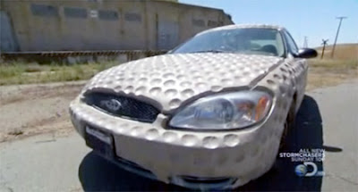
With all this talk about Tiger Woods I though it would be appropriate to go out and find some Golf Ball Art Cars. Honestly I haven't even followed the news on the latest Tiger Woods Scandal and frankly I am bored already. But I am an opportunist and figured I get some hits by using Tiger Woods name over and over again so I decided to do a Golf Car vs Tiger Woods Career art car entry. All I found were three golf ball cars and golf ball car prank video that have nothing or maybe everything to do with Tiger Woods career. So what is it?
A-One giant golf ball crushed car
or
B-Tiger Wood's career getting crushed under the weight of his ego
A) Car destroyed by multiple golf balls at a golf range
or
B) Tiger Woods life takes a wrong turn?
A) Aerodynamic golf ball car
or
B) Tiger Wood flying through all this media attention unscathed?
A) Prank video of a car filled with golf balls
or
B) Tiger Wood's career falling apart?
Monday, November 30, 2009
Saturday, November 28, 2009
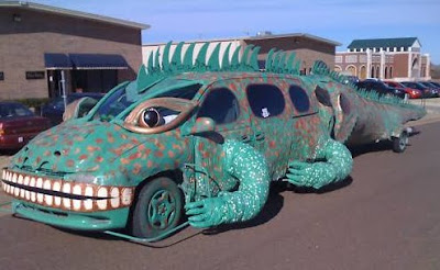
Iguana Art Car - For Sale
The Iguana Art Car is a one of a kind art car and is for sale on
Friday, November 27, 2009
Tuesday, November 24, 2009
Got Canadian Bike Flair?
You could never accuse this man of not having enough flair on his bike, with enough windmills to make a little on the side from PG&E. Photo was taken in Queen Alexandra, Edmonton, AB, Canada, the hat says it all.
Monday, November 23, 2009
Fun and Unsafe Mad Max Mutant Vehicle at Burning Man.
I am not sure what this is but it has a Mad Max feel to it, on the extremely unsafe side of the spectrum. So there is no side, or rear impact protection but their is front end roll bar with a massive spare tire. Trunk space is minimal but the spare tire doubles up as a passenger seat with a fantastic view. I would say unsafe at any and all speeds with a rating of -10 but totally fun to drive around burning man, a rating of +10.
Sunday, November 22, 2009
The Song Is You
It might seem innocent.
Yes, this is innocence. It is the purity of what happens when the postmodernisms and the camps and the sooavantgardes have made their statements and played their anti-tunes, and yet, we are still there, trying to listen in to that something special.
Call us romantic. Call us Those Who Couldn't Stand The Progress And Stepped Back.Retrograded, taking the easy way out, exploring the (music's, world's, history's) feedback.
Yet feedback is not the sound that comes back to its source. It is not the echo. It is the echo used as an input.
Thus, what you call feedback is the mere beginning, the source material of the process of creation. As the world comes back crumbling to the imperfection of our ever-childish senses, our feeble gestures, breaking through our inherited self-irony, make things possible. Better, they give us back the light.
Too light? Too naive?
Would you prefer this?
The Gospel was right: The meek shall inherit the Earth. Actually, they've inherited it already. Along with the self-irony, they took what was most precious, and what many deemed lost - the damn aura. Yes, the damn aura still shining and glowing through all the mechanical reproductions. We still want their bloody flesh, we still want to know this is where it's at, right here, between the stage and you, between the song and you.
x x x
All this crossed my mind when watching the brilliant The Song Is You festival at Powiększenie in Warsaw recently.
The song that stayed with me the most was simple.
Here it is:
Do you get it? Beyond the gorgeous lyrics, can you feel how it was, listening to it in the club basement, with the grand piano behind Momus, the lights, the weekend dying away? Or can you imagine it? How different is the song you hear from mine?
More on the festival here. Don't miss tonight (12.03), the last part of the festival, with Kyst and AU.
Patchwork Art Car
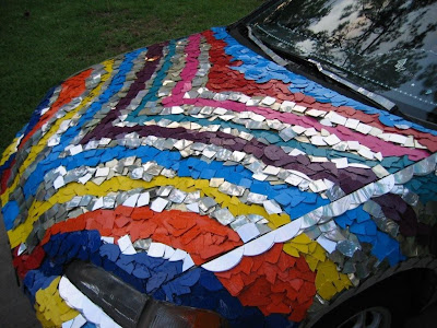
I found this great looking patchwork art car on flickr today. It's painted but it sure look like a quilt of some sort.
Saturday, November 21, 2009
ONE LOVELY DRAWING, part 29
This is why your grandpa spoke with such reverence about the great Al Dorne.
1953 illustration from Colliers about six greedy, shiftless sons waiting for their father to die.
These overalls alone are an act of utter brilliance:
Notice how sharply Dorne observed the folds at the knee and the waist, and how he used such a descriptive line to convey them. You can also tell from the way he drew those haunches that he understood perfectly the anatomy beneath the overalls.
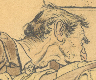
Dorne's knowledge of anatomy did not hobble his imagination in any way. Look at the liberty he took in redesigning the human skull, placing ferret-like heads on the bodies of lummoxes.
In addition to the seemingly dislocated jaw, note the loving attention Dorne paid to the furrowed brow, the curve of the eye and the interaction between cheekbone and nose. This is a master draftsman at work.
Other examples of that fabulous Dorne line include:
But it would be a mistake to look at this drawing as just the sum of its highlights. Look at the total architecture of the drawing. Dorne has carefully placed these sons, leaning forward like vultures, to focus all attention on the dying old man.
Although he is the centerpiece of the drawing, you never see the old man's face. In a further act of stagecraft combining color and line, the old man's red sleeve draws your eye right where Dorne wanted it. (Admittedly, these watercolors have faded with the years, but even in 1953, that sleeve stood out).
For me, this is a lovely drawing with the kind of complexity that you rarely see in illustrations designed for today's shorter attention spans. The artist Leonard Starr recounts an exchange between Dorne and famed pop artist Andy Warhol: Warhol claimed, "Art today has to go beyond mere drawing" to which Dorne responded, "Excuse me, Andy, but there's nothing fucking 'mere' about drawing."
Wednesday, November 18, 2009
Swing Set Car Mod - Unsafe at Any Speed
via There, I fixed It
This fantastic Swing Set Car Budget Mod is brought to you by There, I fixed It, a very disturbing photo indeed. Its either a case of not wanting to break down the entire swing set to move it or the kids love to spice things up a bit by swinging while driving. Frankly this swing set is unsafe at any and all speeds.
Labels:
Budget Mod,
Metal,
Sculptured,
Sedan,
Swing Set,
Unknown
Monday, November 16, 2009
Sunday, November 15, 2009
THE SPRINGTIME OF BOB PEAK
Bob Peak started out in the 1950s as just one of many young, capable illustrators.
But in the 1960s, Peak caught fire and began turning out radically different work. His line work had roots in the Viennese Secessionist movement (particularly Schiele and Klimt) and in the great Rene Bouche, but Peak's hot, fluorescent color combinations were unprecedented; his extreme angles, cinematic style, and space age dynamism were blazingly original.
Nobody else was doing work like this at the time.
Peak's work was "radical" in the truest sense of the word (defined as "going to the root or source.") Note in the following unpublished picture how Peak is not merely fine tuning details-- instead, he goes all the way back to the simplest most fundamental questions of design, composition and color and comes up with a striking result.
Literally, a "revolution" occurs when something completes a full cycle and returns to its starting place.
Peak's salad days in the 1960s were a remarkable, vibrant period, but he was too hot not to cool down. As Peak matured, he remained commercially successful but his innovations came fewer and farther between. He had a lucrative career making movie posters that seem to me to be repetitive and uninspired, the type of art that might be sold on vacation cruise ships.
Even if Peak's innovative period was not sustainable, there was a moment when he found the voice for his time and place. That was enough to establish a legacy that can't be taken away.
Past Present
Take a look at the pictures by Roger Cremers. The series, which won an award at the 2009 World Press Photo, is called Preserving Memory: Visitors at the Memorial and Museum Auschwitz-Birkenau, Poland, 30 April-4 May.
No, I will not be writing about how the ever-present cameras turn us into monsters. Or about consumerism versus culture.
What interests me here, to start with, is how we position ourselves in relation to the past.
What is given to us is not merely a luggage - a heritage that is like an object. It is an ever-eroding landscape. And each person has her own map she may or may not use to rebuild it, or rather, to build herself into it.
Watch these bodies. These figures. Watch how they open a dialogue they are not aware of. Watch how they become, that's it, a sign.
Maybe the most dramatic is the last one, the young man lying on the ground, his hands close to his face. Forget his camera. Now, what do you see?
Or maybe the most dramatic is the first, black figure, that is watching birds through binoculars, or a plane, or he could almost be shouting a friendly greeting to someone standing on the roof... were it not the seemingly anonymous bricks behind him. Were it not our maps. And now, with your map, what do you see? Who is hitting him? Shooting?
Or rather, what is he, what are they protecting themselves against?
What makes a sign a sign?
When does it signify, lead to the signified? How does the arrow gain its shape? How is it born?
How much of these vectors is rooted in us so deeply, we spell it out with every word, unknowingly?
Take this much less spectacular project by William Boling, called Never Gone. Boling took photographs of the places in Atlanta where the Battle of Atlanta occurred in July 1864.
So what makes a sign a sign?
When does it signify, lead to the signified? How does the arrow gain its shape? How is it born?
How much of these vectors is rooted in us so deeply, we spell it out with every word, unknowingly?
No, I will not be writing about how the ever-present cameras turn us into monsters. Or about consumerism versus culture.
What interests me here, to start with, is how we position ourselves in relation to the past.
What is given to us is not merely a luggage - a heritage that is like an object. It is an ever-eroding landscape. And each person has her own map she may or may not use to rebuild it, or rather, to build herself into it.
Watch these bodies. These figures. Watch how they open a dialogue they are not aware of. Watch how they become, that's it, a sign.
Maybe the most dramatic is the last one, the young man lying on the ground, his hands close to his face. Forget his camera. Now, what do you see?
Or maybe the most dramatic is the first, black figure, that is watching birds through binoculars, or a plane, or he could almost be shouting a friendly greeting to someone standing on the roof... were it not the seemingly anonymous bricks behind him. Were it not our maps. And now, with your map, what do you see? Who is hitting him? Shooting?
Or rather, what is he, what are they protecting themselves against?
What makes a sign a sign?
When does it signify, lead to the signified? How does the arrow gain its shape? How is it born?
How much of these vectors is rooted in us so deeply, we spell it out with every word, unknowingly?
Take this much less spectacular project by William Boling, called Never Gone. Boling took photographs of the places in Atlanta where the Battle of Atlanta occurred in July 1864.
So what makes a sign a sign?
When does it signify, lead to the signified? How does the arrow gain its shape? How is it born?
How much of these vectors is rooted in us so deeply, we spell it out with every word, unknowingly?
How To Win An Art Contest In One Easy Step
Make one.
Tom Polo created the 2009 B.E.S.T. Contemporary Art Prize for Painting contest. The criteria were typical of the art contests we know. Except for one small point, which stated:
eligible entrants are artists born on the 1st February, 1985 and named as 'Tommaso Polo' on their birth certificates.
The exhibition of the finalists (guess who?) is taking place at the MOP gallery in Sydney.
The winning work, by - you guessed it - Tom Polo, is called Continuous One Liners (Young People Today).Possibly many of my dear readers are thinking, we've had similar ideas, but they were too childish to execute. Maybe the most seductive part of tricksters is that by putting to life the silliness we only imagine (or think we imagined), they at once make it more serious and much more ridiculous.
You can find an interview with the artist at The Art Life.
Why B.E.S.T.? Because Everybody Still Tries.
Saturday, November 14, 2009
Dave Hervey's Cosmic Groove Lizard Art Car
Cosmic Groove Lizard Art Car - Guitar View
Cosmic Groove Lizard Art Car - Lizard View
Cosmic Groove Lizard Art Car - Closeup Hood View
I just got this great email today from Dave Harvey who created the Cosmic Groove Lizard Art Car as a result of reading Harrod Blanks book on Art Cars. He is also a musician, puppet maker and painter of guitars furniture and now a very beautiful and amazing art car. The copy below is his bio taken directly from his web site and be sure to go check out his web site for a peek at his other works of art.
Hello- David Hervey here. I am a painter and musician from Wilmington, NC. I grew up at the beach and have enjoyed art and music since a young age. I started my painting career shortly after graduating from ECU in the spring of 1997. My main media interests are in acrylic painting as well as mask and puppet making. Recently, I have started custom painting guitars to get a true one-of-a-kind instrument look. I draw my inspiration from God my creator, and from my awesome friends and family. I love to spark feelings of happiness in my paintings, though serious subject matter is often portrayed as well. Both realism and abstraction are captured in my works as I feel it helps to keep me balanced and never bored with my projects. I strive for my work to exhibit vibrancy, though not necessarily perfect realism. I enjoy impressionistic realism because it captures life’s beauty in an original, energetic way. People (specifically faces) are often expressed in my paintings and masks. I find humans to be very interesting subject matter. I consider harmony and balance to be very important in art and life in general. This makes life sweet and continually interesting… Until we meet again, may your journey be blessed… David Hervey Artist/MusicianDave Hervey Puppet and Painting
Friday, November 13, 2009
Twinkle Twinkle Little Art Car - Happy Fridays:)
I woke up this morning and glitter was on my mind so I remembered that Twinkle Twinkle Little Car was sent in by Nicole Strine some time ago and decided it was time to put her up on Art Car Central. This Honda Civic, I think, and is covered in thousands of cut up CD's donated by a few software companies in Texas. Nicole and her Husband spent about 6 years working on the car and unfortunately this beauty is not longer with us. After it was vandalized they scraped all the CD's off the car and some time later was broadsided at an intersection. May she put a twinkle in your eye today and may she live forever here on Art Car Central.
Twinkle Twinkle Little Art Car Covered in CD's
Labels:
Coupe,
Honda,
Objects Glued,
Plastic,
RIP,
Texas,
Twinkle Twinkle Little CAr,
USA
Subscribe to:
Posts (Atom)