Wednesday, September 30, 2009
Polly Morgan's choir
What is this choir of possibilities you offer me? Where can it take us? What tragic song may be ours, what sort of future may a non-future contain? Then again, isn't it just a question of measure? Stop here. Stop here. The still. The gesture, frozen, with the impossible life no less possible than any other still. Still. Hold it more gently. Don't make your hand into a fist. Let them be flowers, let them be flowers, singing flowers, watching singing flowers, for just another, for just another still.
You can purchase this exclusive Polly Morgan print at murmurart. If you dare hang this on a wall.
Monday, September 28, 2009
In Hiding
Works by Janine Antoni (the first one is a sculpture - a cast of the artist - and not a photo of a performed action, as is the case with the second one).
And as a bonus, a work by her called Umbillical (2000), made of a "sterling silver cast of family silverware and negative impression of artist's mouth and mother's hand".
Sunday, September 27, 2009
DETAILS (A TAXONOMY FOR BEGINNERS)
Here's how it goes:
There are details that hum and details that sing. There are details that accumulate like silt when the artist isn't paying enough attention, and smother the picture.
Then there are details where artists with impeccable technique find refuge from questions of meaning and purpose.
Wrightson
There are details that are diamantiferous...
Briggs
all the way down to the subatomic level....
Then there are details so insanely disproportionate that we can only attribute them to the addiction to drawing (an addiction that has so far bested every methadone program offered by art schools).
Drucker
Of course, we forgive the excessive details in Renaissance art; those details were created in an era of new excitement for empirical facts and the physical world, after artists awakened from the long medieval fixation on the afterlife. Renaissance artists were entitled to their painstaking focus on the natural world, but you'd better have an equally good excuse if you want to get away with the same level of detail today.
Altdorfer
There are details which are just a playground for scamps.
Wood
Then there are sly details, the ones that seduce the artist with his own skill. Be on your guard, for these are the most dangerous details of all!
Frazetta
There are details that envelop you in a warm bath, and there are details that shimmer like phosphorescence in the sea at night and swirl around you, drawing you deeper into the picture to the place where mermaids whisper that answers do exist.
On those rare occasions when an artist exercises restraint, the few carefully selected details can acquire supernatural power. The single line of a stocking can inspire you to leave a bookstore and go hunting for your wife.
Sometimes detail gets lucky and is given a starring role in a picture, as when an artist merges the background with the foreground, making the center of the picture everywhere at once.
Fawcett
Once upon a time, laborious detail was the cheapest and safest way to make sure a viewer valued a picture. Even if the art was no good, viewers were subconsciously flattered that the artist was willing to trade so many hours of his life to entertain them. But the muse became indignant that so many of her supplicants were abandoning her for the god of manual labor, so she invented photoshop. Now even the lure of cheap flattery is gone.
Nicolausson
Scientists report that fully 17% of the artistic details in the known universe are attributable to cowardice; there are artists who add detail to hedge their bets, believing that it is safer to draw lots of little lines than one big one. But artists who believe they can escape accountability by blurring their choices with three or four lines where one would suffice are wrong. The fatal flaw with their theory is what the economists call diminishing marginal utility: with each additional superfluous line the artist invests a little less thought or judgment (and adds less value to the picture).
So many lines-- hundreds of millions of them throughout history-- are conceived in hope, only to end up as part of an endurance test for crow quill pens. One can only ponder the wasted potential, the disappointed ambitions of these lines whose lives were stripped of individuality, personality, and any other trait that might have redeemed them. It is, my friends, a holocaust of mind numbing proportions. But who will hear their cry?
Saturday, September 26, 2009
Do You Believe In Magic? Grospierre vs. Radziszewski
a comparison of Karol Radziszewski's To Pee In a Bun and Nicolas Grospierre's Kunstkamera
The two recently* opened exhibitions at the main two contemporary art centers in Warsaw – Zachęta and the Contemporary Art Center – have some clear similarities.
Both exhibitions are witty, explicit dialogues with art history. They both play on the distance that separates contemporary art conventions from what has been somewhat recklessly left behind. Radziszewski exhibits works hidden in the depths of the national gallery’s archives. Some are excruciating to look at, others are curious discoveries or brilliant works. Grospierre goes back to the format of the Kunstkammer and does what he does best – plays with it.
They both focus on the structure of an exhibition, and make it an essential aspect, a sort of a meta-work which goes far beyond the classical idea of curator and uses the ambiguity of this function to the utmost. It is impossible to say where the curator’s role stops and the artist’s begins. This goes far beyond the inclusion of the curator’s own works in the exhibition, or his manipulation of the showing. We never know when the appreciation of the shown works is genuine, and when it is ironic. And because of the artists’ works being part of the selection, the self-irony is, as always, disarming.
However, each artist enacts the role of contemporary art trickster in a different way. Beyond questions of scale, budget and context of production, the two exhibitions are at two opposite sides of an old aesthetic debate. They present two different approaches to the question of value in aesthetics. But first, let me give you a brief description of each of the exhibitions.
Karol Radziszewski’s exhibition To Pee in a Bun, is grandiose. It is a personal take on the collection of Poland’s most renowned and respected public gallery of Modern Art (charmingly called The Encouragement for Fine Art).
In it, he acts “merely” as curator, and also as one of the numerous exhibited artists. Here is what the curator had to say in a conversation with himself as artist :
We could say that Nicolas Grospierre creates a similar procedure of remixing curator and artist when in the Kunstkamera installation, (which is the size of one of the smaller rooms in Radziszewski’s exhibition), he hangs mainly pictures of objects and photos created by other people, and signs the whole as his piece.
Yet the vectors, here, point elsewhere. Instead of spreading the works and opening, if not exploding, them, he seems to move inwards, closing the space and folding it yet again. Upon entering the "room", we discover a game of images reproducing images reproducing the same space with other images. The game goes on, like a play with mirrors, ad infinitum. The "meaning" is still ambiguous - yet it concentrates, thickens, moves toward inhabiting the space instead of abandoning it.
So what does all of this have to do with philosophical debates?
In an article published in 1936, Stanisław Ossowski, one of Poland’s most notable thinkers from the famous Lvov-Warsaw school of thought, argued against aesthetics understood as the “construction of value systems”. The generalizing of arbitrary aesthetic feelings and opinions to the level of theory should, in his opinion, give way to a sociological perspective on art and the aesthetic, one which would embrace the richness of opinions and points of view instead of imposing them.
This bold proposal was answered the same year by another great mind, Henryk Elzenberg, who argued that no matter how weak and prone to error, our aesthetic judgments remain anchored in value systems that can and should be discussed – as we cannot speak of aesthetics without referring to value, and values are open to discussion.
To put it bluntly: in Radziszewski’s exhibition I see Ossowski’s distancing from aesthetics as a system of values, while Grospierre’s installation follows Elzenberg’s ideals.
These are really two different ways of approaching the world.
Ossowski claims that any discussion about aesthetic values comes down to a power struggle. And this overpowering does not go through a sharing of enthusiasm or disgust, but goes through the attribution of value. Why? Elzenberg explains:
Hence the need for distance.
It seems Radziszewski claims it on every single step. On one hand, his collection is a moving away from an engaged position, it is rather a questioning of our aesthetic values, of their ever-astounding relativity and apparent insignificance. Who are we to say that this is pretty, and this isn’t? How are we to judge the works that a mere 30 years ago were judged outstanding, while today they’re hidden away in a museum cellar?
On the other hand though, Radziszewski’s approach differs from Ossowski’s philosophy in one respect: being an artist, and not a social scientist, he does not feel the need to eradicate the position of power. To the contrary, he exposes it by exploring it to the fullest. Why bring a porn film into the gallery? Because it’s shocking, and attracts audiences. The aestheticist’s position allows him to create values arbitrarily:
Grospierre is at a very different point. He does not feel the necessity to question everything – art history has done it sufficiently. Instead, he looks for ways of exploring the place of art today while not undoing it all yet again. Romantic? Certainly. It is a self-ironic romanticism, one that takes great effort in presenting itself as distanced and eye-winking. No wonder Grospierre cites Italo Calvino and Borges: this is the romantic universe that leads the battle for saving beauty. It is not, however, an intuitive aesthetic experience kind of beauty. The Kunstkamera is all about unending layers of initiation. It is a dive into the possibility of image, the possibility of the reflection of things, of some sort of hidden and evolving harmony between the object and the subject.
It reminds one of Heidegger’s conception of art as a window to some other realm we can in no other way describe. Here, this realm always crosses first an image of the reality we know – and so, we never know if this is the level of work-of-art, or it is only a description thereof. Fittingly, the exhibition flyer (a photocopy with clear photocopy marks) explains it all, and more. It seems to impose its vision of the work before we even get to see it.
Take, for instance, the “Trophies” section.
Or did the whole building of aesthetics collapse, leaving us in a void where any new creation of value is so easily ridiculed, art may at best be looked from a great distance, with an ironic, witty, sensitive yet unaffirming stance?
I must say I prefer Grospierre's installation: it's discursive and communicative, inquiring and playful, desperately searching for beauty, or maybe: aiming at beauty. This is a work of a believer. And although I'm not exactly a believer, I can repeat after one of my favorite characters, Samuel Hamilton: I don't really believe in it save that it works.
*It took me some time to write this... and tomorrow is the last day of Kunstkamera! Hurry if you want to see it.
The two recently* opened exhibitions at the main two contemporary art centers in Warsaw – Zachęta and the Contemporary Art Center – have some clear similarities.
Both exhibitions are witty, explicit dialogues with art history. They both play on the distance that separates contemporary art conventions from what has been somewhat recklessly left behind. Radziszewski exhibits works hidden in the depths of the national gallery’s archives. Some are excruciating to look at, others are curious discoveries or brilliant works. Grospierre goes back to the format of the Kunstkammer and does what he does best – plays with it.
They both focus on the structure of an exhibition, and make it an essential aspect, a sort of a meta-work which goes far beyond the classical idea of curator and uses the ambiguity of this function to the utmost. It is impossible to say where the curator’s role stops and the artist’s begins. This goes far beyond the inclusion of the curator’s own works in the exhibition, or his manipulation of the showing. We never know when the appreciation of the shown works is genuine, and when it is ironic. And because of the artists’ works being part of the selection, the self-irony is, as always, disarming.
However, each artist enacts the role of contemporary art trickster in a different way. Beyond questions of scale, budget and context of production, the two exhibitions are at two opposite sides of an old aesthetic debate. They present two different approaches to the question of value in aesthetics. But first, let me give you a brief description of each of the exhibitions.
Karol Radziszewski’s exhibition To Pee in a Bun, is grandiose. It is a personal take on the collection of Poland’s most renowned and respected public gallery of Modern Art (charmingly called The Encouragement for Fine Art).
In it, he acts “merely” as curator, and also as one of the numerous exhibited artists. Here is what the curator had to say in a conversation with himself as artist :
C: Curators are the ones who make the artists conscious of
‘what’ they have created and ‘why’; often, they also manipulate the
works being displayed, creating their own narratives from pre-existing
works, at the same time disregarding their previous context.
A: Like you did in this exhibition?
C: Yes. (laughs)
A: Why?
C: I treat other artists’ works as elements of a larger whole, like
tubes of paint, from which I have to squeeze out colours in order
to paint one complex painting.
A: That’s a very colourful metaphor . . .
C: Thank you.
We could say that Nicolas Grospierre creates a similar procedure of remixing curator and artist when in the Kunstkamera installation, (which is the size of one of the smaller rooms in Radziszewski’s exhibition), he hangs mainly pictures of objects and photos created by other people, and signs the whole as his piece.
Yet the vectors, here, point elsewhere. Instead of spreading the works and opening, if not exploding, them, he seems to move inwards, closing the space and folding it yet again. Upon entering the "room", we discover a game of images reproducing images reproducing the same space with other images. The game goes on, like a play with mirrors, ad infinitum. The "meaning" is still ambiguous - yet it concentrates, thickens, moves toward inhabiting the space instead of abandoning it.
So what does all of this have to do with philosophical debates?
In an article published in 1936, Stanisław Ossowski, one of Poland’s most notable thinkers from the famous Lvov-Warsaw school of thought, argued against aesthetics understood as the “construction of value systems”. The generalizing of arbitrary aesthetic feelings and opinions to the level of theory should, in his opinion, give way to a sociological perspective on art and the aesthetic, one which would embrace the richness of opinions and points of view instead of imposing them.
This bold proposal was answered the same year by another great mind, Henryk Elzenberg, who argued that no matter how weak and prone to error, our aesthetic judgments remain anchored in value systems that can and should be discussed – as we cannot speak of aesthetics without referring to value, and values are open to discussion.
To put it bluntly: in Radziszewski’s exhibition I see Ossowski’s distancing from aesthetics as a system of values, while Grospierre’s installation follows Elzenberg’s ideals.
These are really two different ways of approaching the world.
Ossowski claims that any discussion about aesthetic values comes down to a power struggle. And this overpowering does not go through a sharing of enthusiasm or disgust, but goes through the attribution of value. Why? Elzenberg explains:
Apparently [the value-based aestheticist] lacks qualifications: he does not have the authority, or the suggestive strength, or the capacity to contaminate others with his feeling. And he is overfilled with the will to rule. Thus, he tries to convince the victim that if this victim feels the same things he does, the victim will be right, he will be somehow objectively correct; and he will be wrong if he dares otherwise.
Hence the need for distance.
It seems Radziszewski claims it on every single step. On one hand, his collection is a moving away from an engaged position, it is rather a questioning of our aesthetic values, of their ever-astounding relativity and apparent insignificance. Who are we to say that this is pretty, and this isn’t? How are we to judge the works that a mere 30 years ago were judged outstanding, while today they’re hidden away in a museum cellar?
On the other hand though, Radziszewski’s approach differs from Ossowski’s philosophy in one respect: being an artist, and not a social scientist, he does not feel the need to eradicate the position of power. To the contrary, he exposes it by exploring it to the fullest. Why bring a porn film into the gallery? Because it’s shocking, and attracts audiences. The aestheticist’s position allows him to create values arbitrarily:
A: You’re a curator — does that mean power?
C: Absolute power! (laughs)
A: Most people believe curators are unfulfilled artists.
C: I think that does hold true for me. Besides, to quote Krasiński
yet again, ‘Art is too serious a business to be left in artists’ hands.’
Grospierre is at a very different point. He does not feel the necessity to question everything – art history has done it sufficiently. Instead, he looks for ways of exploring the place of art today while not undoing it all yet again. Romantic? Certainly. It is a self-ironic romanticism, one that takes great effort in presenting itself as distanced and eye-winking. No wonder Grospierre cites Italo Calvino and Borges: this is the romantic universe that leads the battle for saving beauty. It is not, however, an intuitive aesthetic experience kind of beauty. The Kunstkamera is all about unending layers of initiation. It is a dive into the possibility of image, the possibility of the reflection of things, of some sort of hidden and evolving harmony between the object and the subject.
It reminds one of Heidegger’s conception of art as a window to some other realm we can in no other way describe. Here, this realm always crosses first an image of the reality we know – and so, we never know if this is the level of work-of-art, or it is only a description thereof. Fittingly, the exhibition flyer (a photocopy with clear photocopy marks) explains it all, and more. It seems to impose its vision of the work before we even get to see it.
Take, for instance, the “Trophies” section.
Trophies represent four dog muzzles, belonging to the commonest of mongrels. Bolek, Majka, Eryk and Gucio are four doggies among thousands. In the old Wunderkammer we would find extraordinary or unique natural objects: the horn of a unicorn, huge crystals, stuffed reptiles and other monstrosities. The idea was to show nature in the most surprising forms. Today the world seems devoid of the mysteries and much simpler than in the sixteenth century: the monsters disappeared from biology books. Might it be that the world is less poetic, more prosaic? I don’t think so. Even if science discovered many of nature’s secrets, for me poetry and mystery are still present in nature – we can find them in the most common species, such as house dogs.The two positions can be called “metaphisical” and “positivist”. Elzenberg’s metaphisicist is
quite aware that there are hundreds of traps on his way; that his individual chances of error are bigger than his chances of winning; he feels that his results are to the highest degree uncertain, endangered by others’ critique and by his own. He feels the constant risk. Yet this risk is also his joy, since, as a psychological type, he has in him – and indeed needs to have – a little bit of a man of adventure and his attitude towards the “positivist” is somewhat like the attitude of a sailor that knows he can drown, towards the landlubber, who has no such fiercely unpleasant risk awaiting. It gives him a sort of satisfaction, but that is not what decides about his behavior in terms of acquiring knowledge; the decisive factor is that he does not want to drown. And that is why he is first and foremost careful. The “Metaphisicist” – or rather, to put it in more serious terms, the valuing aestheticist – knows well that his subject is unclear and unattainable and that what he discovers in it flees any adequate descriptions. Thus, although he is a sui generis racionalist to start off, it is nonetheless easy to discover a trait in him that is the contrary of a strict rationalism: the tendency to treat concepts and judgments as merely a type of highly uncertain symbols of a reality that resists human thought. Thus, he will not suggest that the chiaroscuro in which he sees the thing is full light, nor will he bond himself till death due him part with this or that linguistic formula or even this or that discursive elaboration of his intuition. He – yes he! - has something in him of the spirit of empiricism, as he understands his moving into the subject as a multiplicity of attempts and returns, as the entering in contact, as a progressive bonding with reality. Hence, he has the quality of being critical towards his own achievements, he consciously softens the edges of his statements, and is ready for changes and corrections, and, generally speaking, is moderate and more moderate even.So do you believe in magic? In the aesthetic wonder of art, that keeps evolving beyond all expectations, that is in some strange way always related to beauty, and maintains some sort of objective common ground, some platform of shared values?
Or did the whole building of aesthetics collapse, leaving us in a void where any new creation of value is so easily ridiculed, art may at best be looked from a great distance, with an ironic, witty, sensitive yet unaffirming stance?
I must say I prefer Grospierre's installation: it's discursive and communicative, inquiring and playful, desperately searching for beauty, or maybe: aiming at beauty. This is a work of a believer. And although I'm not exactly a believer, I can repeat after one of my favorite characters, Samuel Hamilton: I don't really believe in it save that it works.
*It took me some time to write this... and tomorrow is the last day of Kunstkamera! Hurry if you want to see it.
Thursday, September 24, 2009
Lightness is Difficult
As a wise man once said, life is serious, art is lighthearted. And this very description is what I find the most difficult about creating art. There is a tremendous distance between the seriousness of living a life (yes, even an artist's life...), and the light that the art requires.
Or is it the heart?
Both works are by Collier Schorr.
Wednesday, September 23, 2009
Cattelan vs. Woodman
Looking for the above gorgeous image by Francesca Woodman, I came across Lucilees post where she asks the ever-recurring question about appropriation vs. plagiarism, in the context of the two works below:
Cattelan's installation, untitled, from 2007.
Woodman's photo, untitled, 1977.
The work seemed like a clear quote to me, but I searched a bit more.
Cattelan presented the installation in 2008 at his Bregenz Kunsthalle (the site seems to have almost no working pages) exhibition. It was on the highest floor of the building, and it looked like this:
Impressive. It's quite interesting, though, to see to what extent the presentation of a work can obscure/transform its dynamics. The first picture of Cattelan's piece without this second one creates a significantly different framework. (According to one commentator, this was the first time Cattelan used someone else's architecture to stage his piece.)
My Polish coleagues have linked Cattelan's work to feminism and eschatology. Crucifiction, yes, but what is beyond? Also, the white nightgown suggests a patient, eternal patient, hysteric person...
Although Iza Kowalczyk is right to point out that this work stresses the crucifiction more than the hanging in Woodman's version (where the chair in the front created a classic reference to this way of committing suicide), there is something in both these installations that I found crucial, and missing in the comments: the portrayed woman is not crucified. She is suspended by her own arms. It is a very uncomfortable position and requires significant effort.
There is a play going on here between victimization, self-victimization and empowerment. The subject self-objectifies thus getting higher.
One other thing, concerning a discussion on one of the sites, about eroticism. Is this too pure to be erotic? To me it seems to bring about the right amount of frustration by being so unbearably decent, and yet stretched to the limits . This is much more explicit in Cattelan's work - an installation, bringing about a specific, ambiguous visual perspective. This frustration of power, which plays namely on the the relation between the viewer and his subject, is a trademark of many of Cattelan's works. It's what often irritates me. And what makes me come back.
Tuesday, September 22, 2009
Wilhelm Reich
Oil on canvas, 24" x 24"
This painting will be used in an up coming book:
Danzar con la vida by Gloria Cacep.
This painting will be used in an up coming book:
Danzar con la vida by Gloria Cacep.
According to the book's editor, Hildebrando Cota, it will be available to the public from the publisher, Dos Lineas , in January of 2010.
Review: This book is an exercise in exploring the body-mind. The Body Psychotherapy (West), Yoga (East), Philosophy, Poetry, Art, Devotion, Silence, are convergent paths of personal integration and the unitive experience. Flowing with the body-mind into no-mind, into the Infinite Consciousness is Dance: Dance with Life, and each with its own.
Art Car Fest 08 Video - at "How Berkeley Can You Be" Parade
Art Car Fest is this weekend September 25-27th going on all over the SF bay area, and this video I shot from the inside of my mercedes pens art car during the last years event at the Berkeley Parade. I was a lot of fun as it is every year during this time and I believe this weekend will be a ton of fun as usual. Some of the cars in this video are: Glass Quilt, Golden Mean, Radio Flyer, The Lorax and the Mercedes Pens.If you can make it out to see us here is the schedule of events:
Friday, September 25
noon - 5pm Amoeba Music Caravan!
Keep your eyes open for our ArtCar caravan through San Francisco. We'll be touring such favorite sites as North Beach, Fisherman's Wharf, The Castro, The Embarcadero, Golden Gate Park, and Ocean Beach. You can catch up with us at 3:30PM at Sports Basement at Crissy Field (in the Presidio.)
Saturday, September 26
Noon - 8pm Salsa Festival!
ArtCar Fest will dip into the sauce as we exhibit at the Redwood City Salsa Festival! Three stages of live music, great food, lots of family-friendly activities, and now ArtCars!
Sunday, September 27
11am - 7pm Berkeley's LAST SUNDAYS FEST
We'll hang all day with our friends at Amoeba Music on Telegraph in Berkeley at the new Last Sundays Festival.
Sunday, September 20, 2009
Saturday, September 19, 2009
Art Showing - The 8th Style School of Tango
As a part of ArtWalk this month, six on my paintings are on display at The 8th Style School of Tango in the University District of Seattle, WA.
The 8th Style School of Tango
5200 Roosevelt Way NE
Seattle, WA 98105
206.384.7240
learn@the8thstyle.com
http://the8thstyle.com/
Friday, September 18, 2009
A GIANT: BERNARD FUCHS (1932-2009)
Bernie Fuchs started out in a most unlikely place and time.
Born in a tiny rural town in the heart of the Great Depression, he grew up with no father, no assets or connections, no art training, and no prospects. He was even missing three fingers on his drawing hand (the result of an accident in his youth).
Yet, Fuchs was quickly swept to the top of his profession on a wave of talent and personal quality. The New York Artists Guild named him "Artist of the Year" by the time he was thirty; he became the youngest illustrator ever elected to the Society of Illustrators Hall of Fame; and for over forty years, his sleek, sophisticated, beautifully designed work was selected by one jury after another at the Society as among the best of the year. (Try to think of another illustrator who has been as influential to the field in the latter half of the 20th century.) As Walt Reed wrote, Fuchs' pictures "are probably more admired-- and imitated-- than those of any other current illustrator."
I met Bernie Fuchs a few years ago when he reluctantly agreed to be interviewed for an article I wrote about him. As much as I admired his work, I grew to admire him as a person even more. I never heard him utter an unkind word about anyone; he was humble and sincere to a fault, always quick to give credit to his colleagues, or to anyone who extended a helping hand along the way. But as generous as he was to others, he held his own work to the toughest standards, decade after decade, right up to the end.
I recently made a pilgrimage to Bernie's hospital bed. He was pale, gaunt and under heavy sedation. He could no longer eat or breathe except through tubes. He had lost the ability to speak so he used a little notebook for scribbling short messages to his family, who had gathered around him for the end. I looked down at his notebook and saw he had been sketching a human ear. I said, "Wow-- still drawing? You don't give up easily, do you?" He gave me a tight lipped smile and with a tough, defiant look in his eye shook his head no, he didn't give up easy and he was damn proud of it. That attitude, which was the core of his greatness, was still inside him then and would be the last part to leave.
The expression in his eyes alone was worth the trip to Connecticut.
Last night, Bernie's work was done. The wave that took him to the pinnacle of success in his field swept him onward to another shore.
From The Wolves, 1996
Thursday, September 17, 2009
Caulk It Art Van by Nod Nal-Teews at Art Car Fest
Photos by Bagel!
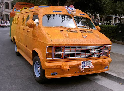
Nod D’Nal-Teews from Fort Worth, has been driving his "Caulk-It" van cross country for over 20 years now. His van is a 1979 Dodge Maxivan and matching trailer, dubbed the "Art Ark" with rooftop solar collectors that power appliances within the van, while a trailer serves as his studio. Most people use caulk to seal up cracks in their homes but he used about 300 tubes of the stuff to cover his art car spread with his fingers then painted over. He has also encompassed a variety of items in his design, from broom handles to rain gutters to pie tins. Nod will be at Art Car Fest weekend.
Danger Car By Reverend Charles Linville at Art Car Car Fest
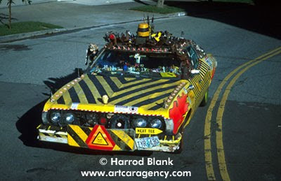
Art Car Fest 09 could be a dangerous event but this year the good Reverend Charles Linville in his Danger Car will be attending to make sure that nobody gets hurt. The purpose of Danger car is to serve as a warning to all of things that are potentially dangerous and worrisome;hence the outer coating of reflective stripes, twisted metal, broken mirrors, ripples, warning lights and police sirens. The interior is festooned with matchbook covers, warning tape and bullet casings. Cant wait to meet the Reverend, its should be a lot safer this year with the Danger Car up front.
Labels:
Art Car Agency,
Art Car Fest,
Danger Car,
Mix Media,
Sedan,
Unknown,
USA
Wednesday, September 16, 2009
"Aqua Mobile" by Don Ehlen - Art Car Fest
photo by Bagel!
The AQUA MOBILE is the creation of Don Ehlen, a Seattle-based entomologist and educator. The car is a great example of a simple concept art car, basically just a great paint job, although 3-D features have begun to creep in: a fully inflated plastic blowfish atop the radio antenna, a crab creeping out over the rear license plate, and a red plastic lobster at the front. Also at this years Art Car Fest.via
Labels:
Aqua Mobile,
Art Car Fest,
car,
Cute Animals,
Hatchback,
Painted,
USA,
VW
Photo Boof Art Car Captures Moment at Art Car Fest
via Burncast
The Photo Boof art car is a mobile photobooth built by Wrybread onto the back of an Cushman parking patrol auto rickshaw. The Photo Boof has been to all kinds of events and is even available to rent and it will be appearing at this years Art Car Fest so come by and get your photo taken with your BFF. In the video Justin Credible is the spokesperson for Photo Boof giving us the story behind this really cool art. I got about nine days until Art Car Fest 09 starts and I need to get my Mercedes Pens art car ready and feature as many attending art cars on ACC as possible.
Sunday, September 13, 2009
Battle Wagon Art Car - Another one for the Apocalypse
Battle Wagon Art Car
Haz-Mat Hatch Art Car
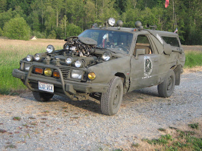
Battle Wagon and Haz-Mat Hatch is another couple of those futuristic apocalypse mad-max art cars created by Todd up in there in Washington State. They might look ugly but they got it were it counts, two high-octane hi-carb Subaru wagons that hall out in a hurry when the mutants come chasing the day after. Todd said "this is the extent of my mid life crises" and "everyday is a parade in this car". Nice work Todd.
Subscribe to:
Posts (Atom)