 Oil on canvas panel, 28" x 22"
Sunday, March 29, 2009
BERNIE FUCHS
In 1958, a staff artist worked patiently in a back room at the famed Cooper Studio in New York, retouching the Pepsi Cola logo on a stack of illustrations. He came to an illustration by a new, unknown artist and stopped dead in his tracks.
Illustrator Murray Tinkelman, who also worked at Coopers, remembers receiving the call: "Hey Murray, come take a look at this." Tinkelman went over to see the new picture. "It was gorgeous" he recalls. The two decided to call in the superstars of Cooper Studios, Joe Bowler and Coby Whitmore. Bowler and Whitmore arrived together to inspect the new painting. Whitmore was "speechless." Bowler said, "I don't know who the hell did this, but the business is never going to be the same."
Bowler was right.

Young Bernie Fuchs arrived in New York and quickly set the field on fire. By the time he was 30, the Artists Guild of New York had voted him "Artist of the Year"-- an unprecedented achievement. His dynamic illustrations for magazines such as McCalls made him famous and attracted dozens of imitators.

So Fuchs was feeling pretty cocky by the time Sports Illustrated called him in the early 1960s to ask him to illustrate an article. Fuchs met with the legendary art director of Sports Illustrated, Richard Gangel. A tough minded visionary, Gangel gave Fuchs an assignment, but as Fuchs was leaving, added-- "Oh-- and I don't want that shit you do for McCalls."
Fuchs could have walked off in a huff. It would have been easy for him to continue working for other clients in the successful style he had already developed. Instead, he rose to Gangel's challenge and became even bolder and more innovative:

Image courtesy of Illustration House gallery

For a later issue of Sports Illustrated, Fuchs turned a portrait of the rather dumpy looking Branch Rickey into poetry.

Fuchs left behind all the imitators who continued to exploit the formula for Fuchs' earlier approach, and instead moved forward to grapple with new challenges. As illustration styles came and went, Fuchs' work was selected each and every year for more than 40 years by different juries from the Society of Illustrators as among the very best work produced that year. No other illustrator can claim such a record.
I am convinced that in order to accomplish what Fuchs has, you need both of the qualities demonstrated in the two stories above. You have to begin with great talent, sure, but perhaps even more important, you have to be prepared to take your initial success and re-invest it in new challenges. There is no guarantee that such a gamble will pay off, but if you are really, really good, that's what artistic success is for.
Illustrator Murray Tinkelman, who also worked at Coopers, remembers receiving the call: "Hey Murray, come take a look at this." Tinkelman went over to see the new picture. "It was gorgeous" he recalls. The two decided to call in the superstars of Cooper Studios, Joe Bowler and Coby Whitmore. Bowler and Whitmore arrived together to inspect the new painting. Whitmore was "speechless." Bowler said, "I don't know who the hell did this, but the business is never going to be the same."
Bowler was right.

Young Bernie Fuchs arrived in New York and quickly set the field on fire. By the time he was 30, the Artists Guild of New York had voted him "Artist of the Year"-- an unprecedented achievement. His dynamic illustrations for magazines such as McCalls made him famous and attracted dozens of imitators.

So Fuchs was feeling pretty cocky by the time Sports Illustrated called him in the early 1960s to ask him to illustrate an article. Fuchs met with the legendary art director of Sports Illustrated, Richard Gangel. A tough minded visionary, Gangel gave Fuchs an assignment, but as Fuchs was leaving, added-- "Oh-- and I don't want that shit you do for McCalls."
Fuchs could have walked off in a huff. It would have been easy for him to continue working for other clients in the successful style he had already developed. Instead, he rose to Gangel's challenge and became even bolder and more innovative:

Image courtesy of Illustration House gallery

For a later issue of Sports Illustrated, Fuchs turned a portrait of the rather dumpy looking Branch Rickey into poetry.

Fuchs left behind all the imitators who continued to exploit the formula for Fuchs' earlier approach, and instead moved forward to grapple with new challenges. As illustration styles came and went, Fuchs' work was selected each and every year for more than 40 years by different juries from the Society of Illustrators as among the very best work produced that year. No other illustrator can claim such a record.
I am convinced that in order to accomplish what Fuchs has, you need both of the qualities demonstrated in the two stories above. You have to begin with great talent, sure, but perhaps even more important, you have to be prepared to take your initial success and re-invest it in new challenges. There is no guarantee that such a gamble will pay off, but if you are really, really good, that's what artistic success is for.
Friday, March 27, 2009
Guy Riding his Motorcycle while Texting in India
This video made me cry laughing because of the response of the guys taking he video. Apparently this guy can ride his motorcycle and text at the same time without holding on to the handle bars. Thats funny.
Incredible Japanese Decotora Trucks Video
Here is a great video about these Japanese Decotora Trucks I posted some time ago. The pictures are great but you really need to seem them live and this video does them justice. They explain the history of how all this got started and they interview some of the truckers and artists who help create these amazing works of art.
Three Singing Japanese Motorcycles
These three Japanese motorcycle riders are using the sound of their bikes to jam in unison. Its by is by far the craziest thing I have ever seeing come out of Japan. Can any one tell me what this is about, its really pretty cool???
Arab Kid Bike Drifting
I don't know why but this Arab Kid Bike Drifting video is really funny.
Honda Hybrids Create Beautiful Headlight Pixel Art Video
via Gizmoto
Honda created an amazing commercial to promote the upcoming launch of a second-generation Insight. They drove a ton of their hybrid cars out into the desert lined them up and created spectacular pixel animation using the vehicles’ headlights. These hybrid art cars are amazing but cant imagine the logistical nightmare it took to create this Headlight Pixel Art
Thursday, March 26, 2009
Wednesday, March 25, 2009
Life Saving Cozy Car Slippers- With Anti Toe Stubbing Devise

via Splunch
Have you ever had to get up in the middle of the night to get a glass of water and on the way you stubbed your pinkie toe on a piece of furniture because you went out in the dark?. Now there is a life saving pinkie toe devise that will enable you to walk far in the dark called the "Cozy Car Slippers". These not only keep your feet warm but have working head lights to illuminate your path as you head out half a sleep.
Jenny Holzer - The Meaning of Everything

There once was a man who wanted to discover the meaning of everything.
He wandered across the world, searching for someone wise enough to explain to him what all this was about, what was the meaning of everything.
After many years, in a distant land, he was told there is one Sage who knows the secret, the meaning of everything.
So he traveled to the huge house where the old Sage lived. He knocked at the door, but there was no answer. He tried opening the large wooden door. It was not locked. The traveler entered the house, to find himself in an enormous hall with walls covered in shelves with books. He walked further in and entered a large room also filled with books. He moved to the adjacent room - and discovered that there, too, shelves were everywhere, and on them - only books. He approached one of the shelves and picked up a random volume. He opened it, and inside it, he saw the letter N, filling the pages. The pages of the book were all but rows of NNNNNN...
He picked up another book, opened it - the book was filled with TTTTTTT.... He tried another one, and another, and each of them was filled with but one letter.
Flabbergasted, the traveler wanted to sit down, when the Sage came in. He was an old, grey-bearded man, just as the fairy-tales have it.
"Sir, said the traveler, I don't understand, there is... I don't understand!"
The Sage smiled, and replied, "Now all you need to do is connect the letters."
Although text is at the heart of her work, Jenny Holzer is not really a writer. She is rather a reader. Her work is not so much about text, as it is about giving body to text. But, as the authorship becomes blundered (Holzer signs the work, but none of the texts that compose it), writing is always re-writing, and thus, it is fundamentally about the embodyment reading.
Somewhat following the path suggested by the likes of Barthes, Baudrillard or Foucault, Holzer is a semiotic DJ, reconfiguring and re-shaping the meaning that seems to have been there long ago. If her own words appear in the works, they seem to remain transparent, undistinguishable from external sources. (Remember the famous line, "Protect Me From What I Want"? Can you say if it was Holzer's own sentence, or an appropriation of someone else's?).
In one of her recent projects included in the Protect Protect exhibition (read an insightful review here), Holzer takes on Iraq and the question of torture. In a work showcased at the TimeOut NY site, she reproduces original, recently declassified documents of the US Army. What is the artist's role? How different is it from strictly political work?
Yes, this is Warholesque. And yes, it is somewhat controversial to have an artist of Holzer's renown decide that this was the right approach and means for this specific subject.
One excellent and cruel review puts it bluntly: if it is about raising our awareness, Warhol's works were good proof that in terms of political awareness this can hardly be a success.
But we can see it from another angle: contrary to Warhol, Holzer gained her reputation on working on questions of morality, and contrary to what she herself claims, values have always been a crucial issue in her work. Thus, as her work can already be seen from this engaged perspective, can't we interpret the careful selection of documents as a sort of curatorial answer precisely to warholian esthetic relativism?
Yet the question remains: do we really need this reader? Do we not see the same documents elsewhere? Our performativity-sensitive eyes are accustomed to seeing the terrific game of language that, say, the map of the Iraq invasion represents. What does purple paint and canvas change in this reading, for us, today?
(image on top from here)
Monday, March 23, 2009
Cathedral of Junk in Austin Texas - Video by iJustine
iJustine internet sensation extraordinaire did a funny piece on the Cathedral of Junk in Austin Texas. A crazy structure made up of you guessed it, junk. The reason its here is because I caught a glimpse of a bunch car parts on Cathedral of junk and because it closely related to art cars in general. Some people with art cars also have gone into to the art house business as well. Anyways its a pretty cool and funny video check it out
Sunday, March 22, 2009
SACRED WRITINGS
Artists sometimes transform sacred texts into visual art by converting words into designs. The result is not intended to be read like a conventional book, but rather experienced as a visual object.

For example, some Korans from 17th-century Turkey, Iran and North India are so ornate they are virtually impossible to read except as designs. The finest artists, calligraphers and craftsmen embellished these books with gold and jewels to inspire reverence for the content.
When I was growing up on the south side of Chicago, a boy I knew was shot and killed on the school playground by older boys from a street gang.
Virgil White and I sang in the choir together. One night, he foolishly tried to take a short cut through the playground alone. The gang members shot him and left him bleeding to death on the cold concrete. Virgil managed to scrawl the names of his killers in his school notebook: "Greg Vincent and Chap Dog killed me." Then he was gone forever, like a wisp of smoke.

They found Virgil's bloodstained notebook clutched in his hand. Years later, I can't look at it without feeling a pang. The terrible beauty of Virgil's marks on paper still touches my heart more than the most lavishly decorated religious text.
Sometimes crude and hasty images are more inspiring than carefully refined ones.
Sometimes an accidental mark-- such as a bloodstain-- is a more powerful design than the work of great artists.
Sometimes cheap materials can create images of greater spiritual significance than images made from the purest gold.

For example, some Korans from 17th-century Turkey, Iran and North India are so ornate they are virtually impossible to read except as designs. The finest artists, calligraphers and craftsmen embellished these books with gold and jewels to inspire reverence for the content.
When I was growing up on the south side of Chicago, a boy I knew was shot and killed on the school playground by older boys from a street gang.
Virgil White and I sang in the choir together. One night, he foolishly tried to take a short cut through the playground alone. The gang members shot him and left him bleeding to death on the cold concrete. Virgil managed to scrawl the names of his killers in his school notebook: "Greg Vincent and Chap Dog killed me." Then he was gone forever, like a wisp of smoke.

They found Virgil's bloodstained notebook clutched in his hand. Years later, I can't look at it without feeling a pang. The terrible beauty of Virgil's marks on paper still touches my heart more than the most lavishly decorated religious text.
Sometimes crude and hasty images are more inspiring than carefully refined ones.
Sometimes an accidental mark-- such as a bloodstain-- is a more powerful design than the work of great artists.
Sometimes cheap materials can create images of greater spiritual significance than images made from the purest gold.
Saturday, March 21, 2009
Answering myself
Writing a post is often like making a test. The etimology of essay comes to mind: an attempt. A blog is a great place for such attempts - yet at times it also gives space to texts I would rather not have written, ideas that were still premature or ungrounded, preconceived...
Yet this, I think, is the perfect space for such struggles, for discovering possible points of view one might feel tempted to adopt.
In my last post, I wrote about the move from product-based thinking about art to research-based thinking. The idea of a cultural universe that looks like a big lab is quite appealing to the artist (discovering is so exciting!), and often problematic for the public.
This is also related to the issue of funding: public money for such a private culture seems absurd. Why give money to people who don't want to reach out to the society that supports them?
The excellent writer Alessandro Baricco recently wrote a very polemic article (here is a poor google-translation) criticizing the elitist dynamics of supporting culture, in which he suggested that public funding should be taken away from the likes of theater and opera, and instead moved to TV and education to create very ambitious programs and actually reach out to the masses and create a true evolving dialogue.
It's a very strong and shocking article.
I went back to it after having written the previous post.
There was something about it that seemed profoundly wrong and unjust.
I think the film Il n´y a pas de Colin dans poisson, by Isabelle Taveneau, Zoé Liénard, and Odile Magniez, tells it wonderfully well:
In all the discourse about elitist art, we often forget that the consumers (yes, consumers) of this art are very often people and communities quite distant from what our stereotipical eyes seem to notice. Culture, when supported in a wise, and smart, way, is an ever-evolving process of education. Open-source, open-ended, and potentially surprizingly democratic. Having been teaching contemporary performance to groups of very varied milieus, I feel it all the time.
PS (22.03.09): I am now in Coimbra, Portugal. Today I discovered the charming and thoughtfuly renovated Museum of Science. It is a unique venue situated in an 18th-century laboratory, on the very top of the highest hill in the city. It was completely empty. Later, I went to the riverside, and discovered to my astonishment that it had crowds of people, mainly families with kids running around and adults drinking coffee. If we were to follow Baricco's ideas, we should shut down the museum (with its great program for kids and parents with kids...), as it seems to be appreciate by an irrelevant minority. Instead, we should invest more in events at the riverside, where the people are. Why, I ask, can't we try and bring these crowds to a higher level? Why are we to forget the centuries of culture we could profit from, replacing them by an «ambitious TV programming» and «education», and allowing product-based thinking to take over?
All this having said, it truly is a shame that the museum was empty. And a little product-based thinking, just a little, couldn't do much harm, could it?
Thursday, March 19, 2009
Extreme Trailer Racing - Trailer Trashed
This is the first ever video I have seen where the trailers were also included in the race. I call it Trailer Trashed in this Extreme Trailer Racing from Britain. Hilarious.
HUBERT GRAVELOT
[Note: instead of writing a blog post this week, I have been playing hooky corresponding with peacay whose great blog BibliOdyssey is a marvelous source of images. Peacay dug up some rare drawings by Gravelot which he generously shared with me, and to avoid work we agreed to post our resulting exchange on our respective blogs. Peacay contributed the intelligent and classy portions. I contributed the mouthy opinions.]
**This cross-posted collaboration features an attitudinal stimulus package by David Apatoff of Illustration Art with peacay of BibliOdyssey on image wrangling and cattle prod detail.**
Hubert François (Burguignon) Gravelot 1669-1773 trained in Paris as an illustrator-engraver under François Boucher and came to London in about 1732. He was friends with William Hogarth and they both taught at the St Martin's Lane Academy, something of a precursor to the Royal Academy. Thomas Gainsborough was known to have studied under Gravelot.
From France, Gravelot brought with him the ornate styling of the rococo, which he helped promote in his thirteen year sojourn in England. He contributed designs for goldsmiths, furniture makers and the commercial print trade, but his book illustrations - for luxury editions - were particularly influential. He illustrated Gay's 'Fables,' Shakespeare and Dryden, and was one of the first artists to illustrate the novel, designing engravings for Richardson's 'Pamela' and Fielding's 'Tom Jones.'
Of the ten images below, the first eight were preparatory sketches for the 'Decameron,' the second-to-last from a Voltaire compilation and the final image is from an unnamed collection (links at the end of the post).


I've been told that one way to measure the quality of an oriental rug is to count its borders. Generally, the more borders around the rug, the more complex it is, and the higher its quality. But I usually find the opposite to be true of drawings: the more fancy borders required to make a drawing look important, the weaker the drawing tends to be. The owners of these Gravelot pictures have surrounded them with up to 14 borders and embellishments (some of them in gold) before you finally hone in on his drawing. Even then, we're not done. Gravelot encircles some of his own drawings with yet another ornate border-- a decorative wreath bedecked with the tools of the arts and sciences, or the symbols of the theatre, or fawning muses overwhelmed by the brilliance of what the reader is about to behold. By the time you finally get through to the drawing itself-- the image at the core where the artist demonstrates what his hand and eye and imagination are capable of-- the viewer has some pretty high expectations.
Unfortunately, I don't see a whole lot here to suggest that Gravelot's drawings satisfy those expectations. These are light, capable drawings. I can understand people preserving and studying them for their significance to the history of the engraving arts, or the manners and customs of his day, but not particularly for the quality of the drawing. Unfortunately, the quality of the drawing is usually the part that interests me the most.


When Gravelot was drawing these pictures, his artistic choices were limited by the fact that the drawings would have to pass through a cumbersome engraving process that was already more than 300 years old. First, the drawing would have to be transposed onto a wood block or metal plate. Next, the plate or block was turned over to an engraver who attempted to carve the image into the surface using sharp and unwieldy tools. This process effectively prevented an artist from drawing in certain styles; Gravelot could not get too spontaneous or fluid with his line, or use half tones in his picture. Finally, the printed picture ended up as a mirror image of the artist's original drawing. The result of this arduous process was a picture several stages removed from the artist's concept.
Not long after Gravelot died, photoengraving replaced engraving as the technique for reproducing art in books and magazines. The new technology set artists free and transformed the entire field of illustration. Delicate nuances in line, subtle gradations in color, detailed images were all reproduced with much greater fidelity, permitting artists to do their very best.


Gravelot may have played an historically significant role as a designer and engraver, but his drawing seems pretty anemic to me. You can see from these preliminary studies how often he has to go back to re-work simple figures he should have been able to visualize and lay out straightforwardly. [title page, outside crowd scene]. Note how tentative his line work is, and how heavily dependent he is upon mechanical tools such as the grid for his vanishing points. [kitchen scene, Imprimerie] Most capable artists could simply intuit perspective in drawings this small, with subjects this simple, but Gravelot's preliminary drawings seem to reveal a well deserved lack of confidence.
One of the purposes of an illustration is to help stretch the reader's imagination by providing an artist's vision of the story. It is ironic then, that illustrating a book as bawdy and rich as the Decameron, we are presented with such wan and lifeless drawings. It's hard to imagine that a reader could not do better on his or her own imagination. These illustrations seem to serve as a visual chastity belt, keeping our minds within legitimate boundaries rather than titillating and unleashing them. There is no commitment or emphasis here, no urgency or merriment in the art to correspond to these stories. By today's standards for illustration, this work seems like a real mismatch between form and content.

**This cross-posted collaboration features an attitudinal stimulus package by David Apatoff of Illustration Art with peacay of BibliOdyssey on image wrangling and cattle prod detail.**
Hubert François (Burguignon) Gravelot 1669-1773 trained in Paris as an illustrator-engraver under François Boucher and came to London in about 1732. He was friends with William Hogarth and they both taught at the St Martin's Lane Academy, something of a precursor to the Royal Academy. Thomas Gainsborough was known to have studied under Gravelot.
From France, Gravelot brought with him the ornate styling of the rococo, which he helped promote in his thirteen year sojourn in England. He contributed designs for goldsmiths, furniture makers and the commercial print trade, but his book illustrations - for luxury editions - were particularly influential. He illustrated Gay's 'Fables,' Shakespeare and Dryden, and was one of the first artists to illustrate the novel, designing engravings for Richardson's 'Pamela' and Fielding's 'Tom Jones.'
Of the ten images below, the first eight were preparatory sketches for the 'Decameron,' the second-to-last from a Voltaire compilation and the final image is from an unnamed collection (links at the end of the post).


I've been told that one way to measure the quality of an oriental rug is to count its borders. Generally, the more borders around the rug, the more complex it is, and the higher its quality. But I usually find the opposite to be true of drawings: the more fancy borders required to make a drawing look important, the weaker the drawing tends to be. The owners of these Gravelot pictures have surrounded them with up to 14 borders and embellishments (some of them in gold) before you finally hone in on his drawing. Even then, we're not done. Gravelot encircles some of his own drawings with yet another ornate border-- a decorative wreath bedecked with the tools of the arts and sciences, or the symbols of the theatre, or fawning muses overwhelmed by the brilliance of what the reader is about to behold. By the time you finally get through to the drawing itself-- the image at the core where the artist demonstrates what his hand and eye and imagination are capable of-- the viewer has some pretty high expectations.
Unfortunately, I don't see a whole lot here to suggest that Gravelot's drawings satisfy those expectations. These are light, capable drawings. I can understand people preserving and studying them for their significance to the history of the engraving arts, or the manners and customs of his day, but not particularly for the quality of the drawing. Unfortunately, the quality of the drawing is usually the part that interests me the most.


When Gravelot was drawing these pictures, his artistic choices were limited by the fact that the drawings would have to pass through a cumbersome engraving process that was already more than 300 years old. First, the drawing would have to be transposed onto a wood block or metal plate. Next, the plate or block was turned over to an engraver who attempted to carve the image into the surface using sharp and unwieldy tools. This process effectively prevented an artist from drawing in certain styles; Gravelot could not get too spontaneous or fluid with his line, or use half tones in his picture. Finally, the printed picture ended up as a mirror image of the artist's original drawing. The result of this arduous process was a picture several stages removed from the artist's concept.
Not long after Gravelot died, photoengraving replaced engraving as the technique for reproducing art in books and magazines. The new technology set artists free and transformed the entire field of illustration. Delicate nuances in line, subtle gradations in color, detailed images were all reproduced with much greater fidelity, permitting artists to do their very best.


Gravelot may have played an historically significant role as a designer and engraver, but his drawing seems pretty anemic to me. You can see from these preliminary studies how often he has to go back to re-work simple figures he should have been able to visualize and lay out straightforwardly. [title page, outside crowd scene]. Note how tentative his line work is, and how heavily dependent he is upon mechanical tools such as the grid for his vanishing points. [kitchen scene, Imprimerie] Most capable artists could simply intuit perspective in drawings this small, with subjects this simple, but Gravelot's preliminary drawings seem to reveal a well deserved lack of confidence.
One of the purposes of an illustration is to help stretch the reader's imagination by providing an artist's vision of the story. It is ironic then, that illustrating a book as bawdy and rich as the Decameron, we are presented with such wan and lifeless drawings. It's hard to imagine that a reader could not do better on his or her own imagination. These illustrations seem to serve as a visual chastity belt, keeping our minds within legitimate boundaries rather than titillating and unleashing them. There is no commitment or emphasis here, no urgency or merriment in the art to correspond to these stories. By today's standards for illustration, this work seems like a real mismatch between form and content.

- 'Drawings for the illustrations of Boccaccio's Decamerone' {Rosenwald 1645} [book published in 1757].
- 'Théatre de Voltaire; dessins par Gravelot' {Rosenwald 1604} [book published in 1768]
- 'Original Drawings' {Rosenwald 1657} [undated]
- Biographical material: one; two; three.
- Art works: one; two; three; four; five.
Burly Pink Pedal Powered Tank that shoots Hotdogs
Burly Pink Pedal Powered Tank

More photos on flickr
This Burly Pink Pedal Powered Tank was built to freak people out at the 2ND annual Kensington Kinetic Sculpture Derby. It is a human-powered pink camouflage art tank vehicle that and can soak onlookers in water or vaporized hot dogs. This Pink Tank is the brainchild of a 30-year-old Philadelphia gearhead Vin Marshall who managed to persuade nine of his friends to build the 2,000-pound replica, complete with a functioning pneumatic cannon. The idea was to make this beast human powered so a computer model showed that it could fit hardware for six pedalers and yield about 1.5 horsepower. Using tires instead of tank treads they gave it bicycle-like gearing to get more power from less exertion. They used a salvaged rear differential (which allows wheels to spin independently) from an old truck axle made turning more efficient. It took them 11 days and $3,000 along with suspension and steering from an old Geo Metro and a Ford 150 pickup. The frame and axles were built from scratch, to ensure the tank would not buckle under the tank’s enormous weight. Six old 10-speeds provided the pedals, cranks and bottom brackets. The group replaced the bicycles' regular chain wheels with industrial-grade chains and sprockets to handle the increased load on the transmission.Official Web Site is Tango Echo
Here is also a video and the funny thing is that the there is a clip of the deathmobile from animal house
Episode 5 of the TE Labs Show: Team Pzkpfw
Good, Honest and Effective
The above excerpt (and pic) was taken from The Cost of Living, a film (and performance) by the British physical theatre company DV8.
I think art is something that makes us look at our lives and to think about them in a way that is more rich. I think there's a big argument for poetry and for the construction of elements. When somebody writes a great essay, they have taken the words and placed them in a certain way to make you think more deeply about that subject. That is for me the very function of art. You get together, you get a group of people, you place things very carefully in order, and the placement is artificial, but if the integrity and the focus is clear, then hopefully it makes people see their roles more clearly. And think about them. And that's what I would like to do.Being honest, good and effective is a rare combination in arts. Most contemporary artists avoid at least one of these concepts: honesty is considered by many as a ridiculous idea from art's perspective, others consider art as being beyond moral issues. But the favorite scapegoat has in the recent years been effectiveness. Many associate it with a commercial, product-based approach that an artist should never accept. Effective, for them, is a synonym for McDonald's. Effectiveness is about price/quality ratio and looking for the best buy. It goes against the spirit of experimental research we are encouraged to follow. Work-in-progress, work-in-process, open art forms and new modes of production are all back. In some milieus it seems impolite to speak of a finished work. This is a twist of the modernist idea of the "independent" artist, and a curious travesty of the fin-de-siècle artist enclosed in his universe and refusing to give in to the evil, ignorant and lost society. In this updated version, the artist retains the independent status, while accepting a parallel funding of his work. If no form of effectiveness is allowed, we can only rely on a funding that is based on some other form of quality. But what is this quality? How far from the spectacular (the show, the product, the work, the to-be-seen) can it go? It is no coincidence that somewhat similarly to the Grotowskis and Allan Kaprows of the 70s, several contemporary artists decided recently to stop showing their work (or creating any sort of showable work, which amounts to the same). The difference seems to be in how one sees one's position in the world. While Grotowski and Kaprow moved away to work in relative seclusion from the art milieu (Kaprow concentrated on academic work, but stopped creating public performances). Today, the very shift from product-to-project-to-research is what the milieu is all about.
- Lloyd Newson, DV8 director, in a great interview.
What is left for the spectator?
The spectator can certainly join the ride and follow each artist's struggle.
Or wait and see what happens.
Or appreciate the DV8s that go on believing art can be good, and honest - and effective.
Wednesday, March 18, 2009
Deathmobile for sale - Animal House fan must have!!!
This deathmobile from the movie "Animal House" is now for sale on Craigslist. If you are a big fan of the movie this deathmobile is a must have for party animal within.
1966 lincoln continental deathmobile animal house


Here is the low down on the car
From the barris star car collection, celebrating the 30th anniversary of the cult classic featuring John Belushi! National lampoon’s animal house is one of the most famous movies made, ever! The edited version is still played regularly on tv. The Deathmobile is by far one of the most easily recognized movie cars ever made! People flock to this car wherever it goes, people 30 and up all remember the car, people younger than 30 still get a kick out of the wild creation! The tank style turret has a roof top hatch door and a prop whistle. The lower section of the turret is made of a tinted plexi-glass so the driver can easily see what’s around him for safe driving. In parades the car is the favorite, take it to a show and you will steal the attention away from the nicest show cars there. It is a great attraction for businesses or a fun piece for any collection. After 30 years, people still get a chuckle when you even mention the name of the movie “animal house”. There are few movies made that stand the test of time, this movie and this car are both legendary!
* year: 1966
* make: Lincoln
* model: Continental
* trim: Deathmobile animal house
* engine size: 462 340hp
* transmission: automatic
* exterior color: black
* interior color: black 1966 Lincoln continental Deathmobile animal house
Here is the Scene from Animal House hen the deathmobile makes its appearance.
Tuesday, March 17, 2009
Art Cars Caught On Google Street View
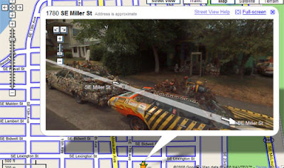
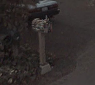
There are many art cars but only few are chosen to be featured on Google Street View by the all seeing eye. Its pretty amazing and and the same time a bit creepy, especially because I live off the beaten path in the country. Anyways these art cars have achieved yet again another level of fame and this time on the world famous Google Street View. I am excited because my Mercedes Pens Art Car covered in 10,000 was selected along with my mail box and the other lucky art car winners chosen at random. Also featured on Google Street View is the Sticker Car, the Post-it Car, Our Lady of Eternal Combustion, Jesus Chrysler and the The Danger Car.
Mercedes Pens Art Car on Google Street View

The Pen Guy Mail Box Covered in Pens on Google Street View
Sticker Art Car on Google Street View

Mercedes Pens Art Car on Google Street View

The Pen Guy Mail Box Covered in Pens on Google Street View

Sticker Art Car on Google Street View

Monday, March 16, 2009
How to show performance on the internet?

The new Performa site is attractive and frustrating at the same time. The fragments of the Performa07 New York biennal are great, they give us an insight into the feel of the festival that was doomed to be famous (and to some extent, doomed to fail to meet the incredibly high expectations).
(My favorite of the excerpts is Stage Matrix 1 by Markus Schinwald and Oleg Soulimenko, which seems like a deliciously elegant and disciplined play with space and contingency. The picture above is from that performance.)
The thing I find frustrating about Performa's site is the way the videos are displayed - one can only move forward (by pressing the space tab), there are no other controls, no notion of what is there in store for us...
Yes, this might come close to the experience of watching a performance. But doesn't it seem a little silly? Isn't it moving us back to the sort of hierarchy the internet has been freeing us from? It does make sense in the historic context of performance, where the utmost respect for the work is frequently an unspoken condition of appreciating the work, and often flirts with the sanctification of the aesthetic. And although there have been exceptions, it won't be an exaggeration to say performance art audiences are usually surprizingly well-behaved and develop a tolerance for time-stretching experiences...
However, the internet has developed a set of rules of its own. One of them is a certain predictability of content. And a non-linear approach to video-watching. The possibility of scrolling forward, or checking several things at the same time, is today as "natural" as reading a book and listening to music, or being able to read the last page of a novel first. The sort of proposal Performa makes goes against this. And gives stage to a difficult exercice of disciplined watching - with no pauses, no repeats, no selection. Take it or leave it.
It is an interesting exercise to perform (pardon the pun).
And yet, in practical terms, doesn't it limit the actual audience of the performances (virtual, and later, real) to the viewers already accustomed to be the well-behaved time-stretched spectators of contemporary art?
The step from live performance to showcasing it on the internet is huge and very tricky. It requires feeling the dynamics of the "aesthetic experience of the net", and that is still a very fresh ground. The trick is, if one of the greatest motors of performance art has been the idea of the avantgarde, entering a new platform will eventually (and once again) have to mean redefining what this idea(l) means.
ps.: For more info on the Performa 2009 biennal and many other events happening now in NY, see their blog here.
Thursday, March 12, 2009
Thong Car from Russia, With Love
This sexy thong art car is brought to with love from Russia and will hopefully be the only risky entry I ever have to deal with. I guess its Russia's version of Fashion Week but I can't imagine the thinking that went into creating this beast. The question that begs to be answered is where on this good earth do you get a thong that big and who would be big enough to wear it. I guess if you buy a bra for the front of the car you can now get a thong for the back of the car. Makes sense to me.
Thong Car from Russia With Love

Thong Car from Russia With Love

Japanese Decotora Truck - Art Trucks in Disguise
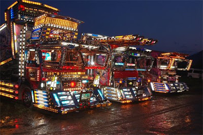
I did an entry about this long time ago but didn't know much about these art rucks from Japan called Dekotora Trucks . These trucks are highly customized and are found in Japan often made to look like they’re straight out of the movie Transformers. These trucks are made for fun to be used as art trucks at special events.
Japanese Decotora Trucks


great post via off beat planet
Japanese Decotora Trucks


great post via off beat planet
Wednesday, March 11, 2009
Car Rim Hat revealed at Paris Fashion Week
Shocking fashion wear made with a car hub cap was made by British fashion designer Alexander McQueen. This hubcap wearing model caught my eye only because of the car rim fashioned into a hat for this pour model who had to balance a ton of aluminum on her head. The article was written by Liz Jones and goes on to describe the rest of the show with many more pictures that I dare not post. I am no fashion writer but to me it looks like the fifth element landed in a scrap yard, which is exactly were it was held at this years Fashion Week in Paris. Why post this on Art Car Central you ask? Its car related and its on the artistic side of the spectrum, therefore it belongs as the wackiest thing thus far. Next year I really would like to see Alex give us something in spinner rims and a sound system. Or maybe cover the model in rubber duckies and barbie dolls. Can you imagine a model wearing hydraulic pumps bouncing down the runway?
Model wearing a car rim hat at Paris Fashion Week

via
Model wearing a car rim hat at Paris Fashion Week

via
Blaubak Gallery - Art Showing
From March 12th until April 9th, five of my paintings will be on display at the Blaubak Gallery in Kirkland, WA, as part of the City of Kirkland's Public Art Walk. On Thursdays, from 7pm to 9pm, art lovers may stroll the streets of Kirkland in search of art and crafts on display.

To find out more info call: Jill Sonsteby / Project Coordinator
Blaubak Gallery
133 Lake St. S
Kirkland, WA 98033
mobile: (206) 265-0401
studio: (425) 822-2313
Map

To find out more info call: Jill Sonsteby / Project Coordinator
Blaubak Gallery
133 Lake St. S
Kirkland, WA 98033
mobile: (206) 265-0401
studio: (425) 822-2313
Map
Zen and the art of goofing off at work - Office Supply Art Car
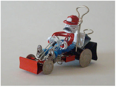
If you ever need more ideas on how to spend your valuable time at work not actually working yet looking real busy with those TPS reports, this is the blog entry for you. It should be called "zen and the art of goofing off at work" and for good reason because its so easy to do with so many office supplies at your disposal. I am sure studies have shown that finding inner calmness is good for health and mental stability. When you get caught making say one of these office supply art cars, you just tell your boss you have high blood pressure from all the stress and that by doing so you lessen your risk of having to take sick time off thus strengthening the companies bottom line. Or you can just say its part of the creative process of the project you got roped into working on for your bosses big proposal next week. Regardless of what you say these little office supply art cars are simply adorable and deserve their place here on Art Car Central.
Office Supply Car

for more office supply ideas see MAKE article
Office Supply Car


for more office supply ideas see MAKE article
Tuesday, March 10, 2009
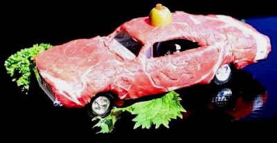
Nasty Cars Made from Raw Meat - And How to make a Meat Pirate Ship
I was again minding my own business surfing the internet when I run into an article on how to make yourself a pirate Ship entirely from MEAT on Geekologie. Then decided to Google, you guessed it, a Meat CAR and here is what I found: Two more meat cars, a meat shoe and my favorite the meat coffee cup. I am really sorry about this, but it's the most disgusting entry I have ever made on Art Car Cenral. Don't get me wrong I love "cooked" meat but this is really , really bad. I hope you come back to ACC when all this blows over.
Meat Car Plain

Meat Car with Garnish
Pirate Meat Ship

Meat Shoe Art

Meat Coffee Cup Art

Meat Car Plain

Meat Car with Garnish

Pirate Meat Ship

Meat Shoe Art

Meat Coffee Cup Art

Hello Kitty Art Car - A Revolution is taking place
Around the world a revolution is taking place, one that is so revolutionary that no revolution in the past could have revolutionized the world as much as this revolution taking place right now. Its the Hello Kitty Art car revolution, its true people are covering their vehicles in this revolutionary symbol unlike that of past generations. Its bigger than Che Guevara, bigger than the iMac and even bigger than slice bread. Behold the Hello Kitty Art Car revolution. They have a leader, soldiers of every age with guns, guitars, cars, bikes, motorcycles, planes, trains and sowing machines for their uniforms. This army is unstoppable and one day they shall rule the world together as one.


The Making of A Hello Kitty Prius Art Car Video


The Making of A Hello Kitty Prius Art Car Video
Subscribe to:
Comments (Atom)


