Wednesday, October 31, 2007

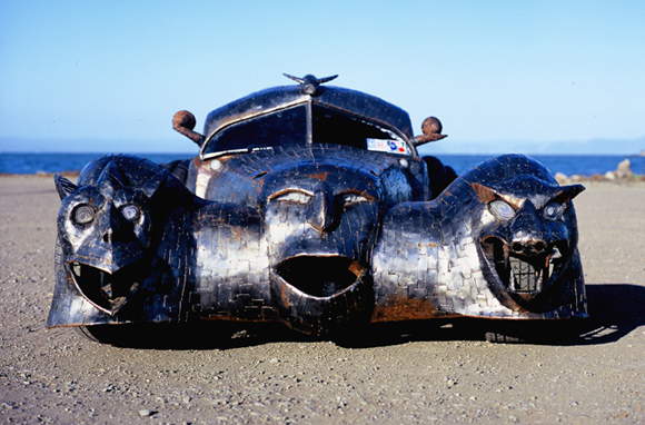
The Phantom by W.T. Burge

The Phantom by W.T. Burge - Art Car Central

The phantom is a replica of a 1936 Bugatti Atlantic and was built by W.T. Burge from Truant Studios. A steel bodied wraith with gargoyle headlights, and was built from the ground up using only a Volkswagen motor, trans axle, steering and suspension. The Shell of the car is made up of small pieces welded together. The eyes glow at night for the scary look. An amazing art car!!!!
The Phantom by W.T. Burge - Art Car Central

The Phantom by W.T. Burge - Art Car Central

The Phantom by W.T. Burge - Art Car Central

The Phantom by W.T. Burge - Art Car Central
Photos via Truant Studios

Tuesday, October 30, 2007

ONE LOVELY DRAWING, part 14

This beautiful drawing was done in 1915 by Rudolph Schindler, an architect in Taos, New Mexico. It was part of a proposal for an adobe home for a local doctor, Paul Martin.


This is a museum quality drawing, but it was far too useful to hang in a museum.


.

Saturday, October 27, 2007

Thursday, October 25, 2007

EDWARD HOPPER'S VERSION OF THE INTERNET


Edward Hopper loved to ride the elevated train through the city at night. As the apartment buildings raced by in the dark, he would catch flashes of unearned intimacy: lonely people staring at the walls... desperate couples... people whose privacy was protected only by their anonymity.


Sometimes I think that artists, like philosophers, are keyhole peepers at heart. They are observers, once-removed from the primacy of experience by the burden of consciousness.


If Hopper lived today, he might get the same glimpses of humanity from Google. He could access an endless supply of private moments, intimate photographs, agonizing diary entries and personal confessions, efficiently organized and served up with the speed of an electrical pulse. He could download and catalogue them without ever leaving his chair.

But art calls for a little less information and a little more rumination. Or, as Carl Sandburg said, poetry is "the opening and closing of a door, leaving those who look through to guess about what is seen during that moment." Hopper's fleeting views from the train left him plenty of time afterward for slow meditation.

Perhaps that is how he was able to transform a glimpse of a naked human into a painting of naked humankind.
.

Wednesday, October 24, 2007

Sashimi Tabernacle Choir Art Car

Sashimi Tabernacle Choir Art Car Central

This video was shot recently at ArtCar Fest 2007 on the first day of the event in San Franscisco. Its called Sashimi Tabernacle Choir Art Car and its volvo covered in over two hundred and fifty computer controlled lobsters, bass, trout, catfish and sharks. the Choir performs a repertoire ranging from pop tunes to classical opera. All songs are tightly choreographed by an energetic orchestral conductor, The Lobster Formerly Known as Larry. Exceptional solos performances are, of course, provided by The Three Basses: Jose Carperas, Placido Dolphingo and the incomparable Luciano Ichthyology.
Sashimi Tabernacle Choir Art Car Central

Sashimi Tabernacle Choir Art Car Central


via

Inside the Art Car Mind Video


Here is a very cool video about what it means to have an art car and the mind set behind it. Featuring the writer of the Art Car book Harrod Blank, and Artcars such as Daisy Springer, Mondrian Mobile, Colt-mobile, Vain Van, Carthedral, Cinnabar charm, Cailfornia Fantasy Van, Cardalabra and Truck in Flux.

Shuttle Van Art Car by Bill Viereck


SHUTTLE VAN is made by BILL VIERECK using a 1996 Caravan. It has a 42" tailfin, and 3,600 handpainted tiles, 3 thrustercones and a 1700 watt fog production system. I met Bill recently at artcar fest 2007 this year who came all the way from Texas. This is an amazing car in terms of the electrical set up in the trunk. My wife has a minivan but she wont turn it into an art car...Yet:)

Tuesday, October 23, 2007

Dirty Art Car ???


This image featuring Leonardo's "Mona Lisa" with Vincent Van Gogh's "Starry Night" is shown at its peak. These images drawn in the dust are obviously quite impermanent. One of the cool things about them is how they change over time. More dust accumulates as the car is driven down the road. Early morning dew streaks and dots the image, creating a patina. A light shower creates a deeper patina...
by Scott Wade

Saturday, October 20, 2007

A note on the artist, her art and what she is allowed to say about it


(Thank you for the patience, the comments, the e-mails and links. I appreciate it all.)


Should we resist the myth of an art without a context?
Doris Solcedo's Shibboleth at Tate's Turbine Hall has sparked controversy for an unusual reason: one blogger found her work to be much better than what the artist had to say about it:
There is little in the world of art more deflating (...) than hearing an artist tell you what a work represents.
Considering the way Solcedo appears to have been talking about the work, it seems only fair to consider it a turn-off. You get this huge, rich piece, and a comment, a perspective that seems simply poor. One begins to wonder if it's really worth all the fuss. After all, it's a difficult exercise to go back from the work to the idea that

Doris Salcedo would like you to know that a crack in the floor represents borders, the experience of immigrants and the experience of racial hatred. She would also like you to know that racism is bad and that Europeans are bad for being racist.

However, I wouldn't give up on Doris that quickly. For several reasons.
For one, every artist has the right to think of his work what he wishes. And if the work surges from a need to fight racism, then be it. Many a brilliant work of art has been made through a very local inspiration. Why should she censor herself when speaking about it, then? Oftentimes, we can hardly agree with the artist's point of view, and from time to time the artist herself criticizes her standpoint after a certain lapse of time. But this does not necessarily discredit the work. Rather, it shows how the very limitations of an artist can participate in the creation of wonderful works (for some extreme examples, think of Leni Riefenstahl or the Soviet constructivists).
The artist's work is the artist's work. This is not as always as obvious as it might seem, given the various avantgarde adventures into questioning the work as work and/or the artist as the artist, on one hand, and the value the art market seems to give to the meta-work level, on the other. Still, we are free to go back to the work. To the object, the sign, the gesture, the mark. To what we consider of relevance. The work is there to be eaten up, to be devoured no matter what it takes. If we need to abandon the artist to do it, so be it.
I re-read what I have just written, and I don't always agree with it. The principle is fine, but in practice things aren't as simple. How can I forget what I hear, what I read, what I see? Whatever the context, it is present. And the less we get from the work, the more we are bound to bind ourselves to what is around it. Which is why a conceptual work is so difficult to isolate from its references. And why a crack can be so many things.
But here are two other points:
//considering we do listen to the artist, even if we don't want to, let us first go and see the title up. A 'shibboleth' is a custom, phrase or use of language that acts as a test of belonging to a particular social group or class. To someone attentive to the context, this can very well be a guide. You might consider it too narrow already, too restraining and bluntly political, but then again, you might just embrace it as a proposed "appreciation reference". And then, it's a new game, isn't it?
//why does a crack need to be so many things? What is this constant necessity we, artists, feel to not say what something is to us? Of course, it can be more than anything in particular. And we don't want to ruin the experience for the spectator. But then again, it might just come out of a particular urge, question, opinion. What is so unacceptable about admitting that? Does every (good) work of art need to have a hundred possibilities, and does its creator need to embrace them all? Mind you, we are not in the zone of imposed lectures any more, only, maybe, of an honest artist's statement that gets to the point: this is what I had in mind.

Another issue comes to mind. Considering we do accept the artist's "pragmatic" and political point of view, and see it as (I'll dare and use the word) a metaphor of a socially unfair world, what are we left with? What are we supposed to do about it? Will this act change a single thing? What sort of conscience do we develop through these marvelous poetic politics? Or does it chiefly bring us closer to the appreciation of our total incapacity to do anything about what we see? Can this despair be fruitful? And what can this fruit actually be?

Friday, October 19, 2007

THE IMPORTANCE OF A FRAME


There's only one thing that all art has in common: a frame.

The frame may be made of metal or wood or it may be purely conceptual, but it is a perimeter that defines where the art ends and the rest of the world begins. No matter how outlandish or varied the art is, no matter whether it is an antique painting or the latest performance art, it is always framed by a boundary that separates the art from the rest of the natural world.

It's pretty easy to locate the borders of a work of art if it's on a piece of paper or canvas. However, some artists provoke their audience to think by playing tricks with the location of that border. The great Saul Steinberg jumped off the paper and created illusions, drawing on a bathtub:


or a box:


The clever artist Peter Callesen escapes the bonds of the page another way:


Even the art of Andy Goldsworthy, who makes temporary sculptures in nature using all natural materials, depends on his framing a space where he makes aesthetic choices and alters the natural order of things for the consideration of the viewer:


A few inches to the right or left of this sculpture there are rocks balanced on each other that are not art, but this one has became art because of the conceptual frame around it offered by Goldsworthy.
The iconoclast Jean Dubuffet dreams of a day when there is no longer a thing named "art" because the frame is gone:
What is true of art is true of many other things whose virtues fly away as soon as their names are spoken.... [I]t is quite probable that soon the painting, a rectangle hung with a nail on a wall, will become an outdated and ridiculous object-- a fruit fallen from the tree of culture and henceforth considered an antique....[T}he notion of art... will have ceased to be conceived of and perceived when the mind will have ceased to project art as a notion to be gazed upon, and art will be integrated in such a manner that thought, instead of facing it, will be inside it....


Until we live in Dubuffet's utopia, the role of art will continue to depend in part on where we draw the frame .

Truck in Flux by Philo Northhrup


Truck in Flux created by Philo Northrup.Its a pick up truck decorated with parts from other ArtCars(Come Play w/Me, the Duke, RatGirl, the Grape, and others). Philo says "It's not just a rolling assemblage; it's a rolling scrapbook - a rolling library." It's also the first ArtCar to get a living garden.

Monday, October 15, 2007

For Matt

Credit goes to Matt for the wacky-fun creature designs, i only added colors, and giggled alot :P
View his original lineart here.

Friday, October 12, 2007

ONE LOVELY DRAWING, part thirteen

The illustrator Bernie Fuchs erased this lovely drawing in 1964


1964 was the beginning of an era of bold experimentation in the United States. The Beatles and Bob Dylan were revolutionizing popular music; Martin Luther King won the Nobel prize as the civil rights movement gained momentum; humans were orbiting the earth and headed for the moon; Cassius Clay became the heavyweight champ and changed his name to Muhammad Ali; clothing and hair styles became adventurous; and all across America, students began protesting the war in Vietnam and experimenting with meditation or mind expanding psychedelic drugs.

In this climate, Look magazine commissioned Fuchs to create portraits of the leading civil rights leaders of the day. Fuchs began with the sensitive pencil portrait above. Then he paused, erased the drawing and turned the illustration board upside down. Starting fresh, he selected a large crayon and used slashing purple lines to come up with this much larger and bolder version:


You can still see the traces of the original discarded drawing below his signature.

The final version published in Look magazine was bolder still, a strikingly innovative work .


Welcome to the 1960s!

Monday, October 8, 2007

NOT ALL THE GOLD IN THE VAULT CAN SMILE LIKE THE NIGHT-WATCHMAN'S DAUGHTER

.


Sounds like an improvement to me.

(Quote in title is a paraphrase from Walt Whitman's poem, A Song for Occupations)

Saturday, October 6, 2007

Part of the Decampment series by the now 16-year-old photographer Megan Baker.

What I like most about this picture is the grayness.

ARTISTS IN LOVE, part twelve


Pierre Bonnard was a part time law student and a part time painter. A man of diverse interests and little focus, he also considered a career as an interior decorator, or possibly a set designer. But mostly he enjoyed an active social life, spending much of his time at the theatre or chatting with friends at the cafes.

Then one day Pierre saw a striking young woman getting off a trolley. He followed her to a small shop where she worked stringing beads on wreaths. Friends later described Marthe de Moligny as a "washed out Ophelia type...unstable and eccentric and morose." But Bonnard saw something special in her and persuaded her to leave the shop to become his model, his mistress, and ultimately his wife.

Pierre and Marthe were two very different people. They quarreled bitterly at first. Pierre was unfaithful to Marthe. Marthe was melancholy, a reclusive hypochondriac and a scold. When Pierre invited his friends over, Marthe would slam the door in their faces. And yet, Pierre and Marthe held on, gradually working out their differences. Each surrendered the things that were less important to them. Bonnard gave up his mistress and his social life for the reclusive Marthe. They made a home together in a small apartment with almost no furniture. There, they retreated to their inner sanctum, the tiny bathroom where Marthe loved to take long baths every day while Pierre watched and painted her again and again.


In the cramped space, his own hand or leg sometimes ended up in the picture:


But it did not matter. Bonnard had found his focus, and was on his way to becoming a great painter. The couple shed friends, entertainment and other distractions as they went deeper and deeper. As Norman MacLean once noted, Everything gets smaller on its way to becoming eternal.
Pierre worked on one painting of Marthe in the bath for two years. Altogether he is reported to have made 384 pictures of her. The couple stayed together for 50 years, and when Marthe died Pierre was disconsolate.

Marthe never cared much for material possessions, but she did covet a grand bathroom, one with windows and running hot water so she wouldn't have to heat water in a pan on the kitchen stove. For most of her life, her bathroom had just an iron bathtub, cracked plaster and wooden floors. So I find it revealing that Pierre painted her bathroom as very large, with shimmering rainbows of color and beautiful tiles, mirrors, luxuriant towels and sunlight streaming through big windows.


I imagine that's what he saw, and that's what he gave her.

Tuesday, October 2, 2007

RECOVERING THE SENSATION OF PERCEPTION

Victor Shklovsky, who was a pretty smart guy, wrote:
Habitualization devours works, clothes, furniture, one's wife... and art exists that one may recover the sensation of life; it exists to make one feel things.... The purpose of art is to impart the sensation of things as they are perceived and not as they are known. The technique of art is to make objects unfamiliar, to make forms difficult.
It's easy to understand what he means when you look at these brilliant pictures by illustrator and watercolorist Winslow Homer.

If you saw a boy in the woods with dogs, your eyes would recognize the subject and move on. But aaahhh, not so fast. Look at the wonderful service Homer has performed for you:


He has made commonplace objects unfamiliar, merging the patches of color on the dogs with the patches of color on the leaves. By showing us the abstract design in the world, Homer "increased the difficulty and length of our perception."


These stray branches would not be nearly so astonishing if Homer had not studied them with new eyes:


Another example is Homer's lovely watercolor of two girls standing in an orchard:


Homer seems to say. "Have you noticed the effect of the bonnets illuminated white from above and pink from behind? Or the shapes created by the dappled sunlight on their blouses?"


Your mind habitually allocates just enough attention to low hanging branches to keep you from walking into them. Homer shows you a display of leafy illumination that puts the grandest stain glass window to shame:


These pictures make you realize the extent to which we stumble like sleepwalkers through a world of familiar sights.