Thursday, March 31, 2011

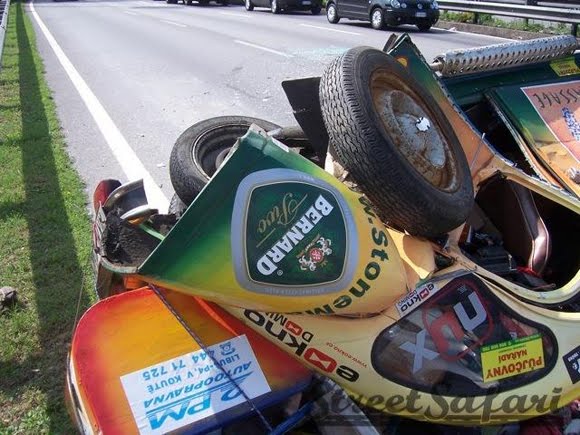
Car Accident + Paint = Instant Art Car


Just found a great way to make an art car on the way to your next event. Get yourself a few five gallon buckets of paint and take the lids off. Get in your car and then find a way to get in car wreck and PRESTO!!!! the entire inside of the car will be covered in paint in no time. Not very efficient and cost effective in the long run but it does get the job done:)

These pictures were taken by Allan Hollister of a gnarly paint car accident on St Johns Bridge in South Africa.

via


Wednesday, March 30, 2011

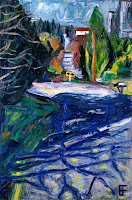
James Marshall Hendrix

Oil on canvas, 18" x 24"

Giant Shoe Art Car Kicks Butt

Giant Shoe Art Car Kicks Butt

Kang Shoe, a shoe manufacturer in China went all out and created a massive electric powered leather shoe art car that kicks some serious butt. It can carry two people up to 250 miles at speeds of up to 20mph on a single charge of the battery underneath the driver's seat. The body is made of real leather and cost about $6,500.

Once they they made it they took it out for a demo outside its headquarters in Wenzhou in eastern China's Zhejiang Province. Workers lined up for the chance to drive the shoe car which is 10ft long and more than three feet high.

The manufacturer created this shoe art car as a promotional tool with plans to make 40 for stores around the country.
Posted on Art Car Central
Original Post Via

Mangled Madness Rally Car - The Duck By Jaryn part 2

Mangled Madness Rally Car - Art Car Central

In the last installment of a StreetSafari ArtCar we showed you the Citroen 1CV. We even left a cliff hanger! How's that for blogging?

The long and short of it is that Mr Ducks, owner of the Duck, knows these cars like the back of his hand. Which he should since he hand builds these things from scratch.

So whenever he goes missing on an event we don't unduly worry. He's probably in some town somewhere repairing the Duck. Doesn't matter what it is, he can repair it 9/10. No problems at all.

Even when teams tell us in the evening "it looked terminal", short of the car being on fire, we tell them that he'll make it, and most times he turns up late into the evening looking worse for wear, looking a bit grimier, but with a great story to tell (we think - as we don't know Czech).

On this particular event, he had genuinely gone missing though. But again, we weren't too concerned as he'll pop out somewhere. Which is exactly what he did. At the end in Prague, in a proper Citroen 2CV. Which was odd. He was sporting a rather large plaster on his head as well. This can only end well.

He then proceeded to show us the following pictures. He even brought a translator for the evening.

The outcome was that when a crate fell out of the back of an Italian lorry, all the cars dived left and right, including the Duck.

But with a suspension travel in excess of 12 inches, the car simply flipped over, rolled 4 times, and spilled it's contents across an Italian Autostrada. As he was off the main route, no one on the rally had actually seen what had happened.

The Italians put him in hospital overnight before flying him back to Prague the following day. The day after he drove into Prague (not far from his home) to see us, and tell us about his great adventure.

Please be careful with your Art Cars!
By Justin Clements Street Safari 
Original posted on Art Car Central
Mangled Madness Rally Car - Art Car Central


Mangled Madness Rally Car - Art Car Central

Mangled Madness Rally Car - Art Car Central

Mangled Madness Rally Car - Art Car Central

Mangled Madness Rally Car - Art Car Central


Mangled Madness Rally Car - Art Car Central

Tuesday, March 29, 2011

Allan Kaprow on installation and performance


Now, I think those two words, installation and performance, mark accurately the shift in attitude toward a rejection or sense of abandonment of an experimental, modernist, position which had prevailed up to about, lets be generous, up to about 1968-1969, and began gradually becoming less and less energized. So, I think what you’re getting there is the flavor of modernist exhaustion and incidently a return to earlier prototypes, or models, of what constitutes art. And it’s no accident that the majority of most performance nowadays, there’s not much installation anymore, by the way, the majority of those performances tend to be of an entertainment, show biz, song and dance, in which the focus is on the individual as skilled presenter of something that tends to have a kind of self-aggrandizing, or at least self-focusing, purpose. It is artist as performer, much like somebody is an entertainer in a nightclub. And they’re interesting. Some of them are very good. I think Laurie Anderson is very good. She’s got all the skills that are needed in theater, which is what this is. Many others who jump on the bandwagon, coming from the visual arts, have no theatrical skills, and know zilch about the timing, about the voic about positioning, about transitions, about juxtapositions, those moment by moment occurrences in theater that would make it work. But it’s another animal, whether good or bad, from what we were doing, and I think, in general, even the good ones are a conservatizing movement.


- Allan Kaprow, 1988 (full interview is here)

TIME RUNS OUT

The artist Pavel Korin centered his life around one grand ambition: to paint a masterpiece about the impact of the Russian Revolution.

Preliminary study for "Farewell to Rus"
 Korin worked for 42 years in preparation for his painting, developing sub-themes, experimenting with  various compositions and painting detailed sketches.  He researched the science of art conservation to make sure his masterpiece would last for centuries without restoration.  He ordered an immense canvas specially made and installed it on custom built stretchers.  Then he died before he could apply his first brush stroke.

Korin's blank canvas, with preliminary studies
A tough break, but at least fate was more generous to Korin than it was to poor Masaccio, one of the most promising painters of the Renaissance. Vasari described Masaccio as "the best painter of his generation," but after he began work on his famed frescoes at the Branacci Chapel, Massaccio took a side trip to Rome and died unexpectedly at age 26.  He never had a chance to finish his work, and the laurels went to Michelangelo and Raphael instead. 

Many an artist has fallen short of his or her potential by miscalculating how much time they have left to complete their "best" work.  So you have to admire the audacity of artists who gamble on creating one epic work, rather than a lifetime of smaller pieces.  They leave themselves no margin of error; it's all or nothing.

Of course, even if an artist calculates his or her allotted time accurately, they still get no guarantees.  Alexander Ivanov was another artist who built his career around one major painting (The Appearance of Christ Before The People).  Ivanov was called "the master of one work."  He succeeded in completing his painting after twenty years,  but unfortunately the painting turned out to be second rate.  And who could forget artist Bill Pappas who worked methodically for ten years, from 1993 to 2003, on a single pencil drawing of Marilyn Monroe?  Pappas drew every pore on her face in excruciating detail, using 20x magnification lenses.  When he finished his picture on schedule, Pappas had demonstrated a great talent for precision, but little else.

The muse, it turns out, is not always flattered by good time management skills.

Many an artist produces lesser work in order to pay the rent, secretly planning to redeem themselves later.  This requires them to gamble on notoriously fickle actuarial tables. Still, it is impossible to have children and remain insensitive to some of the excellent reasons for compromise.

As philosopher Walter Kaufmann suggested,
One lives better when one expects to die, say, at forty, when one says to oneself long before one is twenty: whatever I may be able to accomplish I should be able to do by then; and what I have not done by then I am unlikely to do ever.  One cannot count on living until one is forty-- or thirty-- but it makes for a better life if one has a rendezvous with death. 

Thursday, March 24, 2011

Patricia Van Lubeck Dazzling Array of Art Cars

Citroen Visa Art Car By Patricia Van Lubeck

I found this really amazing looking Citroen Visa Art Car all the way from New Zealand by artist Patricia Van Lubeck . This Painted Citroen art car is based on the use of opposite colors that make it really hard to focus and in that note she succeed in giving me headache:)

About Patricia
In such a short time, Patricia Van Lubeck has quickly become a leading neo-surreal artists. Born in Amsterdam in 1965, Patricia’s life has quite recently changed dramatically. She used to be book-keeper until 2000 when she started the 21st century by becoming a full time professional artist. She moved to the Bay of Plenty in New Zealand in 2005. Since then her work has taken a new direction. Although her style is often regarded as surreal, her work does not strictly fall in that category. Her paintings are apparently simple in composition but executed amazingly detailed and visually very dynamic. Her paintings have realistic elements, but above all an alienating atmosphere. Her works in recent years show landscapes and weird plant species which she calls her psychedelic gardens. `` I consider my work an invitation to explore the ways we experience our environment. My inspiration comes from the ordinary things around me, the artist in me just sees things in an unusual perspective. Picture a baker looking at a corn field. He sees bread, cookies and pies. I see shapes, patterns and colors. I like to zoom in on an everyday object such as the pins of a hair brush and imagine a tiny landscape with rows of hairy trees.’’ Remarkably, Patricia is a self-taught and self-starting artist. She sets a high benchmark for all her works and seeks to achieve a high level of craftsmanship. It takes her up to eight hours just to prepare the surface on some canvases. Then she oils up to 10 layers to achieve rich colors and a smooth finish. ``I am always trying to achieve high contrast within an unlimited color range. I love working with geometric patterns. Before I started painting on canvas, my cars had always been willing victims to this passion. Consequently patterns, natural or artificial, form the foundation of a lot of my images.’’ Due to her time-consuming technique Patricia is only able to create about 10 paintings a year. She loves painting at night in her rural studio setting with no distractions – just the call of the ruru (a New Zealand native owl) to keep her company. Patricia thrives on the repetitiveness of her patterns. She feels the calming aura in concentrating with a small brush in her ‘psychedelic botanic garden’. Since 2002, Patricia has exhibited in The Netherlands, Luxembourg, Switzerland, Portugal, Hong Kong, Australia and New Zealand.

2010 grantee of the Pollock-Krasner foundation in New York
finalist 2010 NZ Adam portraiture awards, 2007 NZ Painting and Printmaking Award and 2006 James Wallace Art Awards
2nd place Tivoli Audio PAL Case design contest
Citroen Visa Art Car By Patricia Van Lubeck

Citroen Visa Art Car By Patricia Van Lubeck

My boxy little Panda was just the right car for an intricate tartan pattern. It took some careful planning and a couple of days of concentrated painting but in the end all my efforts payed off..... the car looked like a shopping bag on wheels! We crossed many borders all over Europe with the Tartan Panda without being stopped by customs once. This is the ideal design for smuggling purposes!

Fiat Panda Art Car By Patricia Van Lubeck
Fiat Panda Tartan Art Car By Patricia Van Lubeck

Fiat Panda Art Car By Patricia Van Lubeck
Fiat Panda Tartan Art Car By Patricia Van Lubeck

Dazzle Painted Cars
'Dazzle painting' was a camouflage technique used by allied forces during World war I. Ships were painted in large geometrical patterns and contrasting colors in an attempt to confuse the German navy. Most important function of this camouflage was to disguise the front of the ship and its sailing direction to enemy submarines. Although visually very effective, sadly this kind of painting did not prove to be a major advantage in battle. There's a good article about art & camouflage (featuring this car) on the Tate Museum site. An excellent source of info is the book 'Dazzle painting' by Albert Roskam (ISBN 90 71893 02 2). It's written in Dutch but it has lots of images. I gave my cars this urban camouflage to maximize my chances of survival in the inner city traffic.

Opel Kadett Art Car By Patricia Van Lubeck
Opel Kadett Dazzle Art Car By Patricia Van Lubeck

Opel Kadett Art Car By Patricia Van Lubeck
Opel Kadett Dazzle Art Car By Patricia Van Lubeck

Opel Kadett Art Car By Patricia Van Lubeck
Opel Kadett Dazzle Art Car By Patricia Van Lubeck

Fiat Ritmo Art Car By Patricia Van Lubeck
Fiat Ritmo Dazzle Art Car By Patricia Van Lubeck

Fiat Ritmo Art Car By Patricia Van Lubeck
Fiat Ritmo Dazzle Art Car By Patricia Van Lubeck

copy and photos via
Posted on Art Car Central

Wednesday, March 23, 2011

WORDS THAT SHOULDN'T BE ILLUSTRATED


God separating light from darkness in the book of Genesis (Michelangelo)

Illustrations can enhance words, but not everyone is interested in having their words enhanced.  In fact, translating words into pictures sometimes provokes people to violence.  This reaction is a tribute to the power of illustration (although many illustrators, given a choice, might prefer the second prize). 

 Some reasons for hostile reactions to pictures are obvious.  Thomas Nast's political cartoons were more effective than written articles in ending the corrupt regime of William "Boss" Tweed of New York. Tweed is reported to have cursed, "Stop them damn pictures! I don't care what the papers write about me. My constituents can't read, but they can see the pictures."


Later when Tweed was convicted of fraud, he  fled to Spain where the authorities reportedly used one of Nast's cartoons to identify and capture him.

Another reason for objecting to illustrations is that they can seem more vividly offensive than the words they illustrate.  Norman Lindsay's illustrations for the classic play Lysistrata were censored although Aristophanes' words were not.


Similarly, the authorities censored Aubrey Beardsley's illustrations of Oscar Wilde's play, Salome.  Such pictures can cross the line even when their accompanying text does not. 

Readers are free to imagine anything words describe, as long as the images remain in their heads.  Once an artist puts those images in tangible form, he confirms his enemies' worst suspicisions about what goes on in his lurid mind, and provides them with evidence to use against him at trial.

Some argue that pictures are more dangerous than words because they are more accessible to young, impressionable audiences.  The slightly demented Frederic Wertham urged censorship of comic books in the 1950s out of concern that pictures containing plural meanings might corrupt America's youth.

When I first read Wertham's book as a boy, I couldn't figure out what I was supposed to be seeing here.  Now that I understand, he seems even crazier than he did back then.

But perhaps the most interesting argument against illustration is that certain subjects are too important to be pictured at all.  That's the topic I'd like to chat about this week.  According to this view, any visual form created by human imagination can only limit or debase certain subjects, no matter how talented the artist, no matter how moral, respectful or chaste the image.  We get this argument most often from theological circles, where true believers argue that drawing or painting a divine subject necessarily limits something that by definition is unlimited. 

The Prophet Muhammad is repeatedly quoted as saying that artists should burn in hell for painting pictures:
Verily the most grievously tormented people amongst the denizens of Hell on the Day of Resurrection would be the painters of pictures...." (Sahih Muslim vol.3, no.5271)

The painter of these pictures will be punished on the Day of Resurrection....'" (Bukhari vol.9, book 93 no.646)
Last year, gentle Seattle cartoonist Molly Norris, dismayed by growing censorship of drawings of the Prophet Muhammad, suggested a "Draw Mohammed Day."  She did not urge that the drawings be disrespectful or unflattering, only that artists exercise their right to draw anything, including Muhammad, lest artists wake up one day and discover that their rights had disappeared altogether.  Her impertinence earned Norris a death sentence from the thoroughly demented cleric Anwar al-Awlaki who instructed his followers, "her proper abode is Hellfire."

Pakistanis burning cartoonist Norris in effigy

While this position appears contrary to  
mainstream Islamic thought about pictures, the resulting threats against Norris' life were sadly real. 
Her employer reported that on the advice of the FBI, Norris was "moving, changing her name, and essentially wiping away her identity."

The notion that drawing an object can be a sacriligious act is not confined to Islam.  This is an age old battle, spanning many religions, between cataphatic and apophatic theology.  The Ten Commandments (Exodus 20:3) contain a pretty broad prohibition against creating likenesses:
Thou shalt not make unto thee a graven image, nor any manner of likeness, of any thing that is in heaven above, or that is in the earth beneath, or that is in the water under the earth. 
Different versions of this prohibition recur throughout the Old Testament, where we learn that a wrathful God may go so far as to punish an artist's great grandchildren.

God creating the earth in the book of Genesis (Michelangelo)
The Commandment against making a likeness carried through to early Christianity; it's difficult to find Christian images prior to the third century, at which point many Christians seem to have accepted that illustrations of holy subjects could be an important tool in promoting the young religion.  Centuries later, there were still traditionalists who feared that images could violate the second Commandment, resulting in idol worship. Others became alarmed because visual depictions sometimes exposed apparent inconsistencies in church dogma. There were repeated periods when  religious leaders, believing that  "misinterpretation of religious images often leads to heresy, banned all pictorial representations and began a systematic destruction of holy images."

It is easy to understand Boss Tweed's resentment toward political cartoons, but are there any thoughtful observations to be made about this more impassioned view that certain subjects are just too important to be pictured?

For me, the Book of Job is one of the most profound poems about the human condition.  It speaks to both the religious fundamentalist and the dedicated atheist.  Job searches for meaning from the whirlwind, looking for answers in a form that could make sense to his poor human brain.  The whirlwind responds that there are no answers for Job, and that he'd better get accustomed to disappointment.  Job learns that God has no intention of explaining himself to humans until we are able to create a bird or a fish, as God does.  Discussing efforts by Job and his friends to understand the universe, Princeton's Michael Sugrue states, "the book of Job suggests that in a way, all theology is blasphemy because it seeks to make God comprehensible to the mind of man.... The answer to why God sent evil into the world is: don't ask."

I suspect opponents of sacred illustration are telling us, "don't ask" how divine things look.  Don't try to define God as having a long white beard and a white bath robe with a gold "G" on the pocket. Divine subjects are inscrutable and need to be defended against callow and presumptuous artists who believe they can define the undefinable with glib visualizations. 

But this seems a pretty shallow reaction to a pretty profound subject. By focusing on physical likenesses, they address the religious experience at its most superficial level.  Artists such as Frazetta or R. Crumb have done powerful, inspirational-- some might even say divine-- work, but it certainly won't be found among their representational pictures of deities, which are so lame it is comical to think they could alter anyone's thinking.

Frazetta's "King of Kings"

R. Crumb's God of the Old Testament

There may be much that is sacred in art.  (For example, some people claim that meditating on a large Rothko painting puts them in touch with sacred feelings.)  And some art may be legitimately unsettling to some religions views.  But those who claim to protect the sacred from physical likenesses may be more concerned with protecting the bureaucracy and infrastructure of  religious institutions (and perhaps the prerogatives of clergy) than preserving the experience of the divine. 


Seattle Center Key Arena

Oil on canvas panel, 22" x 28"

Wednesday, March 16, 2011

Art Showing - Pintxo


Three of my paintings are on display at Pintxo located in Belltown for Seattle Artwalk.


Pintxo
2207 2nd Ave | Seattle, WA 98121
Seattle, WA 98121
206-441-4042

Drink & Dining Hours: Daily 4PM - 12AM
Website
Pintxo Food Reviews
Map

Eric and John

Oil on canvas panel, 28" x 22"

Crazy Chopped Czech Citroen Rally Car - The Duck By Jaryn

Crazy Chopped Czech Citroen Rally Car - By Jaryn

One of StreetSafari's events is called CzechWrecks. We take our colorful cars to France, rag them down to Switzerland and over the Swiss Alps, into Austria, and then up into Prague in the Czech Republic. (Not Czechoslovakia, as after they got independence the Czechs and Slovaks decided that they really didn't like each other, and went their separate ways, hence Czech Republic and Slovakia today.)

This vehicle is from our first ever CzechWrecks, entered by a slightly mad Czech guy called Jaryn.

Now, we've never actually had a full and proper conversation with Jaryn as he doesn't speak a word of English, and we don't speak whatever he speaks. So we talk via translators when/if they are around. Jaryn can be best described as an artist, and a very talented one at that. We think he makes stained glass windows for churches, and he does more or less come from Bohemia which is quite fitting.

One day, (we're not sure when) Jaryn took delivery of a Citroen 2CV that had had a head on into a tree. It was a in a bad way; he did what any perfectly normal person would do, and cut it down the middle, and welded it all back together to create a Citroen 1CV. You were thinking that right?

So what we have here is possibly a one off creation, although we think he may have made a few before this 1CV, although he definitely made a few afterwards as we'll show you next week.

If you know the 2CV you will know that it has very wallowy suspension in the first place. Imagine what it's like when it's half the width! On a hairpin the suspension has over a foot of travel! Even a Ford F150 Raptor doesn't have a foot of suspension travel. As Jaryn takes a hairpin corner, he can put his hand out of the window, and literally drag his hand on the tarmac road surface! See what angle your car has to be to do the same thing!

This car also has a party trick - stick the steering on full lock, put it in gear, and jump out of the car. The result is an impressive car that drives itself in circles. Trouble is that the circle moves and its not before long that you will see a very slightly mad Czechman running after his car before it piles into something solid.

Enjoy the pictures!
By Justin Clements Street Safari 

Crazy Chopped Czech Citroen Rally Car - By Jaryn

Crazy Chopped Czech Citroen Rally Car - By Jaryn

Crazy Chopped Czech Citroen Rally Car - By Jaryn

Crazy Chopped Czech Citroen Rally Car - By Jaryn


Monday, March 14, 2011

Black Square: Malevich and The World That Wouldn't Die


Here it is: the end of the world.
I am standing in front of it, and it looks like shit.
It is Kasimir Malevich's "Black Square", it hangs at the New Tretyakov national gallery in Moscow, and it is dirty, tired, bleak, so unimpressive it is embarrassing to see.
And yet, that is the end.
This can well be seen as the point where art enters the other world zone, leaving our poor miserable world of bodies behind. This art is spiritual, declares Malevich, and I am ready to believe him, not on faith, but because at this point faith is the only thing that can carry me as a viewer. To appreciate it - I think while standing in front of the painting - I need to believe that what my mind brings me when looking at this painting, it brings thanks to the painting. (And that it's worth the trip). Any thought, then, is a belief.
The painting is all cracked, it seems like it lived through terror, two wars and a revolution (it did).

For a while, I wonder what disturbs me in all this. I take Malevich's painting as an ever-returning challenge. We are challenged to accept this or go beyond this. We are challenged to deal with the out-of-this-worldliness of aesthetic creation. Supreme it is.

I thought all this quite disappointing, a concept I would have rather kept as a concept, a story, rather than seeing it translated into a poor somewhat-black square. But what about the painting? Doesn't it have anything to say? The cracks are most probably the result of the artist being in a hurry (it seems he put the black layer over the white one before the latter dried out). The strokes, we can clearly see, are uneven, quick, there is nothing uniform about this, and even the outside lines of the square are uneven (he is said to have painted it free hand, and very free it was). It is not a good square. Or, no: it is not the square we are told it is. It is a square that tells the history of its creation, the story of the tension, the energy, the impatience. It is a clear window into something that happened, into a performance of painting and a moment of life. In that sense, the painting appears better than we ever could have dreamed. It goes back to this world. The painting outdoes the painter - through unveiling something more than what he had planned.
Inside of the cracks, if we watch carefuly, we see another color, it is not black or white, and at moments it seems like it's not grey either. It varies from spot to spot, it is reddish, brownish, somewhere close to the color of flesh. It is the color of revenge. The revenge of the painting.

Sunday, March 13, 2011

Seattle Union St at Bellevue and Minor Ave

Oil on canvas panel, 22" x 28"

Happiest Bottle Cap Covered Van on Earth - Ever!!!!

Bottle Cap Van front
Bottle Cap Van front Photo by Damgaard
On a driery rainy day and the end of long and painful week for those affected by the tsunami in japan this van covered in colorful plastic bottle caps is a welcome relief. This art van has got to be one the happiest looking van I have seen in a very long time. May the emense joy that this art van gives out, come back to the owner 1000 times over:):):) Totally inspiring and joyful. Thank you!!!

Bottle Cap Van Side
Bottle Cap Van Photo by mhuffman
Bottle Cap Van front
Bottle Cap Van Photo by mhuffman
Bottle Cap Van Side
Bottle Cap Van Photo by mhuffman
Bottle Cap Van Rear
Bottle Cap Van Photo by hksmith02
Bottle Cap Van Rear
Bottle Cap Van Photo by tracymadaj
Bottle Cap Van front
Happy Face Bottle Cap Van Photo by Wolfram Burner

An here is a rare you tube video that capture this amazing happy bottle cap covered van.