| ||
| These painted airplanes have what you might say a lot of "character", that is cartoon characters all over them. Some airline companies have decided to brighten the sky with airplanes completely covered with animated cartoon characters like Mickey and Minnie Mouse, Pokemon, Woody Woodpecker, Homer and Marge Simpson, I know I would love to fly in one of these. via Dark Roasted Blend | ||
| ||
| ||
| ||
| ||
| ||
| ||
Thursday, September 30, 2010
Painted Planes with Character
Blocked Keys
The etude by Gyorgy Ligeti I would like you to pay attention to is the second one. It starts at 2'15".
Here is what a competent source has to say about the work:
The third etude, "Touches bloquees" ("Blocked Keys"), uses the same technique that first appeared in "Selbstportrait," the second of the Three Pieces for Two Pianos. Certain keys are held down silently with one hand while the other hand plays a very fast chromatic line on and around the blocked keys, which of course do not sound. The result is a complicated rhythmic pattern that gives the music a somewhat mechanical quality. At first the silent gaps are all the duration of a single eighth, but eventually the gaps are two eighths, then three, and continue to increase in length until the texture becomes increasingly sparse. Again, this etude is about the creation of illusion; we see a continuous pattern of eighth notes on the page, but what results in performance are quirky rhythmic patterns that are not discernible to the eye and would be all but impossible to notate in a more traditional fashion to achieve the desired effect.Actually, it wasn't so much about the listening for me. What put me in a state of awe was the seeing. It is the clear struggle between the hands, the tension between the immobile one and the one that runs crazily above it or under it. Also, the tension of the one that is supposed to stay immobile, simply blocking some keys, but cannot resist the opportunity and spurts out sounds now and again, as if to underline it has total power. And then they switch. And we hear it, we hear this body negiation, we hear it once we see it, once we understand the game, it becomes obvious.
The music becomes obvious. Because it's about music, right?
And the soldier-fingers, constantly attempting to design the space through movement. A movement whose purpose is not something else - like a sound - is a dance. If you ever needed proof, here is one.
Tuesday, September 28, 2010
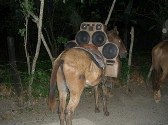
Mule With Crazy Car Stereo System
This Mule has found its self strapped down with an entirely new type of load. A brand new crazy car stereo system.
Porsche 356 Art Car painted with M.C Escher Reptiles
This Porsche 356 was painted by Author and Graphic Designer Jasper Fforde with M.C Escher's famous reptiles. This art car was based on a car driven by a character in one of his books.
Sunday, September 26, 2010
Saturday, September 25, 2010
Art Showing - Vino at The Landing


Vino At The Landing, in Renton, WA, is showing many of my paintings for this fall/winter season.

Vino at the Landing
800 N 10th Place, Suite E
Renton, WA 98057
(425) 282-0382
Hours of Operation
Sun - Wed: 3pm-10pm
Thurs - Sat: 11am-11pm
Website
Map
Labels:
art showing,
expressionism,
landing,
Renton,
vino,
Washington
DRAWING ATTENTION TO A WHISPER

Illustrator Robert Blechman's tiny, distinctive drawings became a phenomenon in the 1960s.
Blechman graduated from college with virtually no artistic training and no portfolio except the work he had done for a college literary magazine. He later recalled,
Nothing could have been more impractical than becoming a professional illustrator. My style--such as it was-- had no precedents and therefore no clear outlets.Blechman showed one of his school assignments, a hand sewn booklet ("got a B-") to the editor at Henry Holt, who asked if Blechman could make a similar book on a holiday theme. Blechman chose the medieval theme of The Juggler of Our Lady.
I set to work immediately. Clearing the kitchen table of everything but the white paper and Will Durant's Age of Faith as reference, I started the book that evening and finished it the same night. In the morning I took it to Holt, and it was accepted for publication. An epic event in my life.His feeble, neurotic line, combined with a brilliant concept, caught on immediately and Blechman was launched on a long and profitable career doing books, cards, advertisements and television commercials in his distinctive style.


Blechman never raises his voice. His special talent lies in compelling huge audiences to stop and listen to his whisper. To achieve this result, he seems to follow a two step process: first, he gets people to pay attention by using empty backgrounds as boldly as his peers emphasized their main subjects. All that negative space surrounding Blechman's tiny little drawings drew more attention to them than a drum roll, a crash of cymbals and a spotlight.


Second, once he has the attention of the audience, he has to deliver a concept that makes it worth their while. Below, Blechman explains how he misunderstood, after his first, immediate success, that he would have to start all over again with something fresh and original:
When the Juggler of Our lady was published and met with great acclaim, I associated success with the book not with me, whom I considered undeserving. Convinced that success lay in producing other Jugglers, I set out to do more of them. Son of the Juggler, Grandson of the Juggler, Grand Nieces and Nephews of the Juggler....They were stillborn, all. In the meantime, the years went by, and, still desperately trying to produce offspring-- Cousin of the Juggler, Bastard of the Juggler-- I would not stop: I could not stop. I did not realize that I was changing from the 22 year old who had sat down at the kitchen table with a pad of paper, The Age of faith, and a vision. No longer the same person I could no longer produce the same work.Once Blechman returned to wracking his brain to put fresh creativity and honest effort into each new concept, his success was assured. The following illustration from later in his career is only about four inches wide:

...yet Blechman still cared enough to make a microscopic adjustment to the length of a nose to make sure the drawing was as funny as possible:

That's how he became a success.
Cattelan's Finger

Yet again, Maurizio Cattelan achieved his admitted goal: he is on the covers of magazines.
The finger, called L.O.V.E.*, has been erected in front of the Milan stock exchange for the duration of the Fashion Week happening in the city.
Everyone is happy: Cattelan gets his attention, the public is proud of such a daring representative, the city gets its Fashion Week (kind of) publicized, and the brokers... well, the brokers have a good laugh and continue their business as usual.
That is not to say the work is not good. It is poignant. The finger that is sticking is the only one remaining on the hand. The others seem to have been severed. So is this hand telling the bankers to go fuck themselves, or is that the only thing it can say? Or maybe it's that when you have next to nothing, the middle finger is the one to resist longest.
Oh, but of course, it's made of marble and put on a pedestal.
But that, really, is not the work at work here. The work is to have been able to put it in front of the Stock Exchange. To have shown them the finger and have them accept it. This is what makes a real contemporary trickster - not the sculpture, but the context.
"We want to be confirmed as the capital of contemporary art", the city's administrators officially stated, "and we have to not only mediate but also accept what we do not like".
Which is a hilarious comment, and only confirms Cattelan's intelligence. One wonders how he did it. Maybe what he said was, let's cut the crap, it is a criticism, but it will attract more tourists than you can ever imagine, and will not hurt you in any way whatsoever, because no one is going to take their money out of the stocks after seeing my work. On the contrary, the tourists will leave their money in Milan.
But the controversy remains. “It is unacceptable that the City sticks its finger up to the Stock Exchange" – said the councillor for Town Planning Carlo Masseroli in a fervent discussion.
Masseroli says: "the administration cannot be culturally subordinate to a self-styled artist like Cattelan who wants to use Milan to earn money”.
Oh, that's right, Cattelan made money off this! I wonder who payed him.
So the question is, who is Cattelan showing the finger to?
I'm not sure, but the pictures suggest that the finger is in front of the stock exchange. And is not pointing towards it, but from it.

Which could end this text. But will not. Because even if Cattelan laughs in our face, even if he plays a trick on all of us, he still plays out the crucial role of catalyzer - he materializes the tensions that are already there. He makes us go "Hey! Wait a minute!" He sticks the finger where it hurts.
*The title was originally supposed to be "Omnia munda mundis" ("To the pure ones everything is pure").
Friday, September 24, 2010
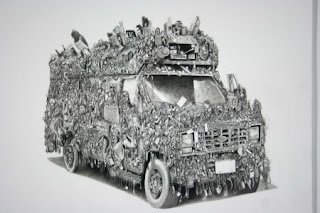
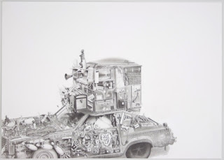
3 Amazing Art Car Drawings by Eric Carlos Bertrand
 |  |
| Wow Bus | |
| These Art Car drawings were created by artist Eric Carlos Bertrand who was inspired by real Art Cars. He currently resides in Montreal and has taken the art car as a source of inspiration for researching the possibilities for viable version of the "ship of fools", a old imagery related to the tradition of the carnavalesque. Read his web site detailed info. Three of the art cars I found were posted on Art Car Central a while back so I wanted to show the world how good his art work is. Eric has some really impressive drawing skills and a hole lot of patience, personally I would rather glue stuff on my art car. | |
 |  |
| Duke Art Car | |
 |  |
| Mobile DJ Art Car | |
Thursday, September 23, 2010
Octapus Saab Art Car Reaching Out in Rhode Island
This Octapus 1987 Saab 900turbo art car has been seen reaching out in Rhode Island recently created by Aly of Killer Car Kustoms.
Wednesday, September 22, 2010
Tuesday, September 21, 2010
Old-Time Avantgarde
Oh, and on a different note, here's a little bit of pre-mash-up mashing up, for your listening amusement, the one and only John Oswald:
It is a fascinating feeling, to realize that today's contemporary is tomorrow's retro, that no matter what, everything we wear, listen to, appreciate or create today will be looked at in just a few years with a paternizing, if not condescendent, smile. Timeless art? Pl-lease. The very feeling of them not being timeless, of being dated, is part of the pleasure of appreciating them. Age can work for the work, but it is still at work.
Monday, September 20, 2010
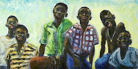
Boys
Labels:
boys,
children,
expressionism,
figurative,
kids,
oil painting
Art Showing - Krush Tanning Spa and Art Gallery

 17 of my paintings are on display this month and next at Krush Tanning Spa and Art Gallery in Renton near the New Castle area.
Krush Tanning Spa
and Art Gallery
1717 NE 44TH ST
Renton, WA 98056
Tel: 425-277-2826
Map
Labels:
art showing,
expressionism,
krush,
Renton,
salon,
spa,
tanning,
Washington
Sunday, September 19, 2010
ARTISTIC TASTE CONVERTED TO BINARY CODE
When people talk about computer art, they usually focus on the "supply" side: artists using computers to create and distribute art.
But computers have major consequences for the "demand" side of the equation: what viewers want.
We have already witnessed the first primitive applications of computers to understanding what kind of art viewers like and why:
1. In 1994, artists Vitaly Komar and Alexander Melamid conducted a statistical analysis to calculate the ideal painting for U.S. audiences. They discovered that 60% of the population preferred paintings that are "realistic looking" while 88% preferred outdoor scenes featuring lakes or rivers. 53% preferred paintings to have visible brush strokes. Komar and Melamid "translated the numbers into paint on canvas." Their analysis produced the following picture:

2. Information technology is being used to rank the greatest artworks of the 20th century: Economist David Galenson has proposed quantitative methods to rank art, such as the number of times pictures appear in art history textbooks. Other economists, such as Michael Rushton and Charles Gray feel this approach shows great promise. Says Gray: "We all want to believe that there is something special about the arts but I don't buy that there is any difference between artistic and economic value."
3. Other computer scientists take a different approach, claiming that "with the use of mathematics, computers and massive data bases of attractive faces, we have been able to quantify facial attractiveness in a consistent mathematical computer model...."

Building on historical archetypes of beauty, companies now claim to have calculated the formula for beauty and attractiveness: "it is a mathematical ratio that seems to appear recurrently in nature as well as other things that are seen as Beautiful. The Golden ratio is a mathematical ratio of 1.6180339887:1, and the number 1.6180339887 is called phi." Using computer programs and a trademarked "golden grid," an artist might tailor an image to what viewers would find most attractive.
But these early, sometimes laughable efforts have given way to more sophisticated applications of information technology. Rather than gathering raw data through telephone surveys the way Komar and Melamid did in 1994, science has gained the ability to monitor brain, blood, skin and other biological reactions to art. Until now, these nascent technologies (especially electroencephalography and infrared optical tomography) have found uses in the gaming and neuromarketing industries:
Computers can identify the electrical activity in the brain that accompanies the thrill of seeing a good work of art. They monitor localized changes of oxy- and deoxy-hemoglobin concentrations in the brain in response to various images. With increasing precision, computers are likely to explain the pharmacological activity that accompanies a diverse range of artistic thrills.
From there, it will become much easier (and more efficient) to stimulate those same reactions by skipping over that obsolete middle man between the work of art and the audience: the artist, who struggled for centuries relying on nothing but highly fallible intuition.
But computers have major consequences for the "demand" side of the equation: what viewers want.
We have already witnessed the first primitive applications of computers to understanding what kind of art viewers like and why:
1. In 1994, artists Vitaly Komar and Alexander Melamid conducted a statistical analysis to calculate the ideal painting for U.S. audiences. They discovered that 60% of the population preferred paintings that are "realistic looking" while 88% preferred outdoor scenes featuring lakes or rivers. 53% preferred paintings to have visible brush strokes. Komar and Melamid "translated the numbers into paint on canvas." Their analysis produced the following picture:

2. Information technology is being used to rank the greatest artworks of the 20th century: Economist David Galenson has proposed quantitative methods to rank art, such as the number of times pictures appear in art history textbooks. Other economists, such as Michael Rushton and Charles Gray feel this approach shows great promise. Says Gray: "We all want to believe that there is something special about the arts but I don't buy that there is any difference between artistic and economic value."
3. Other computer scientists take a different approach, claiming that "with the use of mathematics, computers and massive data bases of attractive faces, we have been able to quantify facial attractiveness in a consistent mathematical computer model...."

Building on historical archetypes of beauty, companies now claim to have calculated the formula for beauty and attractiveness: "it is a mathematical ratio that seems to appear recurrently in nature as well as other things that are seen as Beautiful. The Golden ratio is a mathematical ratio of 1.6180339887:1, and the number 1.6180339887 is called phi." Using computer programs and a trademarked "golden grid," an artist might tailor an image to what viewers would find most attractive.
But these early, sometimes laughable efforts have given way to more sophisticated applications of information technology. Rather than gathering raw data through telephone surveys the way Komar and Melamid did in 1994, science has gained the ability to monitor brain, blood, skin and other biological reactions to art. Until now, these nascent technologies (especially electroencephalography and infrared optical tomography) have found uses in the gaming and neuromarketing industries:
[neuromarketing is] a new field of marketing which studies consumers' sensorimotor, cognitive, and affective response to marketing stimuli. Researchers use technologies such as functional magnetic resonance imaging (fMRI) to measure changes in activity in parts of the brain, electroencephalography (EEG) to measure activity in specific regional spectra of the brain response, and/or sensors to measure changes in one's physiological state (heart rate, respiratory rate, galvanic skin response) to learn why consumers make the decisions they do, and what part of the brain is telling them to do it.Would a CGI picture evoke a better reaction if the hero's shirt was blue rather than red, or the heroine had longer hair? Would a CGI animated kiss come across as more passionate if it were five seconds longer or shorter?
Computers can identify the electrical activity in the brain that accompanies the thrill of seeing a good work of art. They monitor localized changes of oxy- and deoxy-hemoglobin concentrations in the brain in response to various images. With increasing precision, computers are likely to explain the pharmacological activity that accompanies a diverse range of artistic thrills.
From there, it will become much easier (and more efficient) to stimulate those same reactions by skipping over that obsolete middle man between the work of art and the audience: the artist, who struggled for centuries relying on nothing but highly fallible intuition.
Friday, September 17, 2010
ALL THIS JUICE AND ALL THIS JOY

Seymour Chwast
Some readers didn't like the traditional figure drawings in my previous post:
I can't believe such pointless work is still being appreciated today. Anyone can achieve the same thing in half a second with a camera...Some scolded that to qualify as genuine Art, "The act of interpretation should be in service of something more" than merely "perceiving form" with pencil or charcoal.
My camera is capable of interpretations too, I can set it to add filters and thus alter the actual captured photons. After all, you can call every human drawing an interpretation...
But I can't help it, I'm a sucker for perceiving form. For me, the melodies that arise from the perception of form can rival the most elaborate intellectual construct.
Take the most famous figure painting of the 20th century:

Picasso wasn't merely capturing a likeness of the human form. He deconstructed the form, moving in stages from mere likeness to the jagged underside of reality. But deconstructing a row of human figures is nothing new. Rembrandt did the same thing 300 years earlier:

Rembrandt's intent differed from Picasso's-- Rembrandt abstracted his figures in the service of speed and design rather than to express a sociological concepts-- but the outcome is just as scary:


I am not deaf to the conceptual potential of figure drawing. There is probably no subject more ripe than the human figure for conveying "something more" than mere form.

John Cuneo explains "Why I Went to Art School" from his book, nEuROTIC

Kathe Kollwitz used human forms as icons to convey strong political messages.
But whether an artist is merely trying to achieve a likeness or to convey "something more," every considered line represents a choice and therefore has meaning. Sometimes it's difficult to find a line that is not "in the service of something more." Consider this phantom figure drawing by Rembrandt:

The background contains ten thousand lines

...yet none of those lines attracts our attention the way these few stray wispy lines do:

Physically the lines are all similar, all made with the same etching needle, but psychologically some lines weigh more than others. Rembrandt couldn't avoid conceptual content if he tried. And even if he succeeded, the viewer would still perceive it (but that's OK).
So when I hear that "real" Art requires something more than perceiving form with a stick of charcoal, I just can't agree. I look at the torrent of figure of drawings produced over the years, from ancient Egyptian walls to the earnest labors of George Bridgeman's students, to today's artists posting their latest sketch on their blog, and it makes me happy-- even without a conceptual "something more."
What is all this juice and all this joy?
A strain of the earth's sweet being in the beginning.
...............................-- Gerard Manley Hopkins

Matisse

Rodin

The Provensens boldly transformed the figure for their wonderful illustrations of children's books

Robert Fawcett used a dry felt tip marker to search for the rhythm in the bodies of construction workers
Arkady Roytman posts a new drawing each day


Subscribe to:
Comments (Atom)


