Monday, September 5, 2011

ONE LOVELY DRAWING, part 37

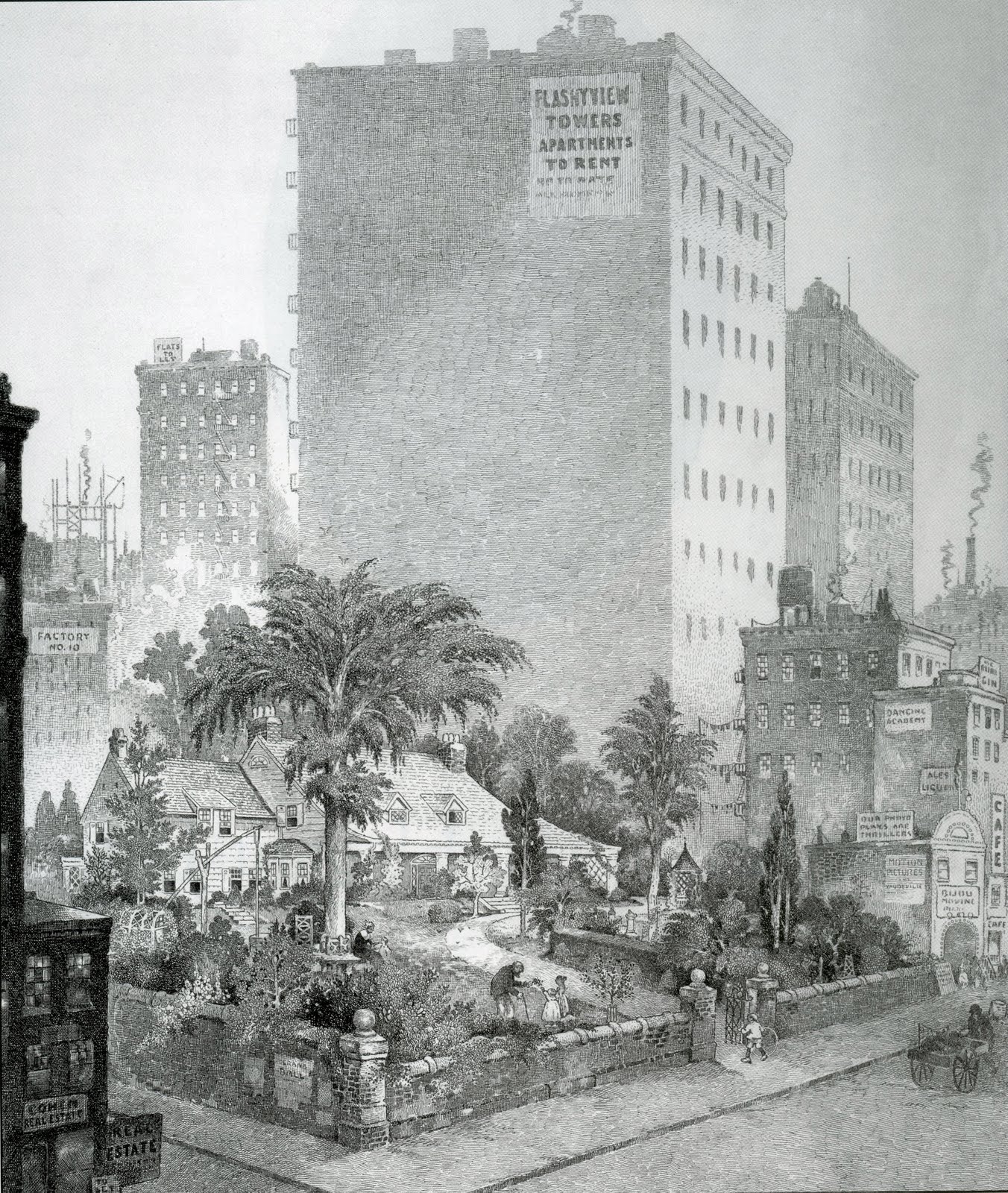
I love this drawing by Harrison Cady of a small house standing in the way of urban progress:

from the Kelly Collection of American Illustration  (24" x  20")

Cady was famous for simple cartoons of funny animals, but this large, complex drawing is a virtuoso feat of draftsmanship.  Note how Cady maintains total control of the value scale, from those faint buildings in the distance to the dark edges of the building in the foreground.


Cady used tens of thousands of tiny hatched lines to create subtle gradations in value from the top to the bottom of that looming skyscraper:


From one point of view, the hatching on the skyscraper is mindless repetitive work.  But it is also a marvelous tightrope walk.

Pen-and-ink is an unforgiving medium; Cady would be screwed if he progressed too quickly from light to dark, or drew the lines in one area too close together-- or too far apart apart; or if he failed to maintain consistent values from left to right.   He had to keep up a steady rhythm, which is especially difficult with a drawing so large that Cady could not see the entire building as he drew.

The drudgery aspect of this kind of work was eliminated long ago by machines.  24 years after Cady's drawing,  Prometheus brought Zipatone to earth.  From that day on, a gradient tone could easily be peeled from a handy plastic backing:

Al Williamson
The stains and cuts from aging zipatone are now viewed as part of the charm of original artwork from that era:

Frank Godwin
Today the world has moved even further away from old fashioned hatch marks.  Zipatone has been replaced by Photoshop.  Cady could've created the shading on that building simply by opening a grayscale screen and customizing it with the gradiant tool.  This is a huge boon for efficiency.  It saves artists from hours of mindless work; it makes them more productive, enables them to meet shorter deadlines (and enables clients to make more changes on shorter notice). These are commercially sensible, perhaps inevitable developments.

But let's not overlook what we lose with all this efficiency.  Artists who spend hours making marks like this often let their minds wander free while their eyes and hand take over.  The rhythm of the linework can put you in a trance-like state while you go to deep places.  Those places may not help meet deadlines but they can be very valuable for an artist.

Fine artist Jasper Johns, who never had to worry about an art director's deadline, made a series of large paintings  delving into the metaphysics of the common hatch mark:  

  Cady                                           Johns

Zipatone and Photoshop are wonderful inventions that help to set artists free.  But as I look back at Harrison Cady's lovely drawing, I am reminded of the words of G.K. Chesterton:  "You may, if you like, free a tiger from his bars; but do not free him from his stripes."

Darla


Oil on canvas, 24" x 18"

Old British ArtCar


Old Car, originally uploaded by vermegrigio.

Via Flickr:
Camden, London, UK.
August 2011

Shooted by Nikon Coolpix S620

Thursday, August 25, 2011

ROBERT RIGGS (1896 - 1970)


Nobody talks much about Robert Riggs anymore, but he was once one of the nation's most highly regarded illustrators.

As Walt Reed wrote, "Robert Riggs was awarded the Gold Medal for Excellence by the New York Art Directors Club for ten consecutive years and received many additional awards." He was elected to the Society of Illustrators' Hall of Fame.  His work is in the permanent collections of the Metropolitan Museum of Art in New York, the Philadelphia Museum of Fine Arts and the U.S. Library of Congress.

What made Riggs so special?  If you went through a checklist of factors that normally make an illustrator stand out, Riggs seemed to have none of them.   His work was not flashy or innovative or glamorous.  He had no special talent for anatomy or facial expressions.  His compositions and colors weren't stylish or bold.  If anything, he favored basic, symmetrical compositions with conventional color schemes:


Note how frequently Riggs plants his subject right smack dab in the middle of his canvas.

Furthermore, his subject matter was hardly topical or crowd-pleasing.  No one would describe his work as romantic or witty or trendy--  no pretty girls, no heart-warming family scenes, no attractive couples in passionate clinches.  And Riggs didn't try to show off with a lot of details and frills.  To the contrary, he simplified and stripped away unnecessary detail.


For me, the special appeal of Riggs' work is in its distinctive weight.  He imbued every subject with a great feeling of solidity and substance-- what Reed calls "monumental" compositions.  Riggs' figures in the following picture are made of the same granite as the mountains behind them.


Riggs didn't follow the recipe for popular illustrations of his day.  He viewed the world in a powerful, muscular way and conveyed his vision as honestly as he could.  That was enough to capture audiences and the respect of his peers. 


Riggs had very few imitators, perhaps because other illustrators just didn't see the world through his eyes.

Saturday, August 20, 2011

JAMES GURNEY GETS HIS CAR INSPECTED

Illustrator James Gurney wrote:
"Yesterday I took my car to the shop because it needed an inspection. The rain was pouring down. There wasn't much space in the waiting room. So I sat under the awning out back between an old rusty engine and a forklift.
While I waited, I sketched the mud puddle beside me. The rain streamed off the corrugated roof  and splashed the water, making big bubbles. The puddle was a sea of overlapping ripples."

I love this little study, not just for how it looks but for what it signifies. 

Gurney is the creator of the famed Dinotopia series, whose books, calendars, posters, prints and collectibles have become a publishing sensation.   He is renowned for his illustrations for National Geographic and his more than 70 book covers, as well as stamps and animated films.

Gurney working on one of his carefully researched illustrations for National Geographic,
with his parakeet on his shoulder 

He authored two excellent books on art, Color and Light and Imaginative Realism and in his spare time he writes one of the best, most informative art blogs around.    I get exhausted just reading about his accomplishments.  Here is his work plan for the 160 illustrations he created for Dinotopia: The World Beneath:


So when Gurney finally gets a few minutes of respite from the easel to take care of routine car maintenance, what does he do?  He becomes so intrigued by the effect of rain drops in a mud puddle that he pauses to produce the lovely study above.

Gurney's fans ask him about his work habits.   He tells them, "I typically work from 8:30 to 5:30 five or six days a week."

Nonsense.

The problem with Gurney is that he can't distinguish between work and play.   Robert Frost wrote about that state of grace, where the thing we need to do and the thing we love to do "are one."
My object in living is to unite
My avocation and my vocation
As my two eyes make one in sight.
Only where love and need are one,
And the work is play for mortal stakes,
Is the deed ever really done
For Heaven and the future's sakes.
Some of the most successful artists are the ones whose eyes can't help but see-- and whose hand can't help but investigate-- the beauty of a rain puddle even while they are waiting in a dreary line for their car to be inspected.

Friday, August 12, 2011

Art Showing - The Bel Red Paintings


Exhibit opens.

Watch a slideshow of the paintings here

KOMO News Article

Bellevue Reporter Article

Bellevue Patch Article

City of Bellevue Press Release

Marketplace at Factoria:
August 13 - September 23, 2011.


The Bel Red Paintings, An Expressionist’s View, is an art project funded by the
City of Bellevue, WA, Arts Program and 4Culture. The City of Bellevue Arts Program
serves Bellevue residents through direct funding to artists and organizations for
arts programs and events in Bellevue, a public art program, cultural policy
development and other activities.

The 14 paintings depict cityscapes and landscapes in Bel-Red, a 900-acre area east of
downtown Bellevue, characterized by low-rise retail and light industrial businesses.
Included in City plans for its future development is an arts district focusing on
art-making, developing new works, and arts education.


Map of Bel Red 900-acre area (Right click to download PDF map)

City of Bellevue Special Projects Information

Marketplace at Factoria

Tuesday, August 9, 2011

Seattle AsiaTown Exhibit

Seattle AsiaTown Paintings
An Expressionist’s View


Teia Pearson's - Escape Into Life
Joey Veltkamp's Art Blog - Best Of
Seattle's The Stranger

Seattle’s International District (a.k.a. Chinatown) is an excellent
subject for painting with its vibrant color and energy. This part of town
holds many cherished memories for me. As a child, my parents brought me
here to do their shopping and to dine in its delicious restaurants. This is my
tribute to Seattle AsiaTown’s beauty and mystery.

Exhibit runs: September 11 - November 11, 2011
Artist Reception: Thursday, September 15th, 6-9pm

Belltown Lofts Gallery | 66 Bell St, Seattle, WA 98121
(Belltown Lofts Gallery is located on the corner of Western and Bell in Seattle.)
Curator: Megan Woodward | 206-919-1360 | btlart@yahoo.com
Viewing by appointment only.
Map