Wednesday, October 11, 2006

ONE LOVELY DRAWING, part eight


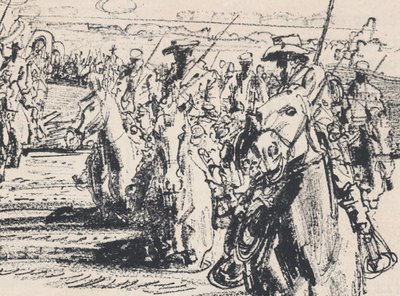
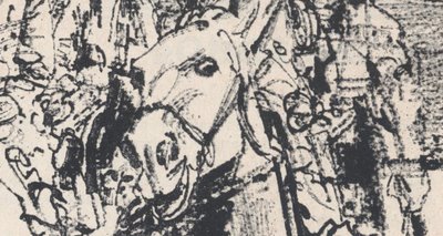
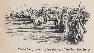
This lovely little drawing by Robert Fawcett appeared in Look Magazine in the 1960s. It was just a spot illustration, about 2 inches across. It is not likely to be reproduced ever again.

In the 1960s, illustration went wild. Innovators used psychedelic colors and bold new styles to create increasingly abstract work. Representational art was declared obsolete. Fawcett, who was trained in a rigorous traditional style, remained unperturbed. In fact, he was amused by the "misconception that abstract qualities are new to contemporary painting, whereas they have been the comparision of excellence since painting began."


Today, all those daring 1960s illustrations with the LSD-inspired paisley designs seem quaint and dated. But if you revisit this tiny little drawing by Fawcett, you will see art that is wild in a more lasting, meaningful sense.


Fawcett often drew conventional subjects using conventional media. He was known for scenes of cultured people in English libraries. But don't be fooled by his subject matter-- he drew them with a powerful, vigorous line. This little drawing is like a DNA sample of the pagan force in Fawcett's drawing. It remains far more wild and frightening today than much of the work that "revolutionaries" such as Peter Max or Bob Peak were producing with the "new freedom" of that era.

Tuesday, October 10, 2006

Carsten Höller at the Tate: Are we having fun yet?

A rose is a rose is a rose. Only each time it appears in a different light, in different hands, in different eyes, the name of the rose changes. If the above statement was as obvious as we would like it to be, if it encompassed all possible interpretations (of the world, of art), the world would be boring. Relativity only goes that far. Fortunately, things have a tendency to take shape. To taste, to appeal, to be somethings. And I wonder if this is not exactly why a lot of contemporary art works so well for me: this tendency to be defined - and not the opposite tendency to be all-relative or blurred!- is what gives it the tension, the controversy, the attraction and power.
A slide, in art, can hardly be a slide, can it?
We feel its tendency to be a slide, but it's this very change in definition, this provocation of designing it as something-else, something-more, some sort of hidden being, that brings about the blush of art experience.
There are several reasons why this slide can't just be a slide. 1) It is set at the Tate Gallery Turbine Hall; 2) It is considered a sculpture by its author; 3) It is considered a sculpture by the art milieu; 4) I feel like seeing it as something else (a sculpture, a performance, a social experiment, an undefined set).
Each of these reasons has an entire theory attached to it. Points 1) and 3) are closely related, they belong to the "institutional definition of art". Points 2) and 4) are both part of the "subjective definition of art", with some important differences.
But why bother defining? What does it matter? Can't we just enjoy the ride?
We can. Yet, we don't need to. And since art is to be an enriching experience (even if not always and not necessarily a pleasant one), why limit ourselves? Thus, the art amateur will know (what a scary word!) what he is dealing with. He will take pleasure in discovering all the undiscovered worlds that a quasi-ready-made (post-ready-made?) gives us. He will be extatic about the many directions, readings, he will talk about verticality, and danger, exhilaration, and pleasure... It has to do with enthusiasm and letting go, with laughter as an aesthetic experience, be it of the one laughing or of the one watching others laugh. The problem is, the deeper we go into the theory, the more concepts we use to describe the slide, the further we seem to get from the first purpose of the slide - to make us slide. Sure, we can consider it a wonderful performative installation, we can stay contemplative and look at how grandiose and imposing it seems. But all this would be nothing if there wasn't the sliding.
It seems only logical that the installation be presented at the Turbine Hall. This is another turbine, a machine that we fuel. By forcing ourselves to forget the conceptual grid, with its heavy chunks of grey cell mass, and diving in. Only then does it seem possible to believe in the
utopian vision of a world in which slides are a means of getting from one place to another, an alternative to stairs, lifts and escalators.
And only then does this whole affair appear as fun, appealing, and something that actually works, rather than as a funny but futile game. (Unless, of course, we accept art as being futile anyhow.)

Is there a difference between this slide and any other slide in the world? Any substantial difference? Not to me. Which doesn't in the least take away the value of this particular work, as art and as slide. Because thanks to this one, I will cherish watching slides, and sliding, even more. It brings a new starting perspective, like a paradigm that allows to see things with a previously unfelt freshness. I could hardly expect more from art.

There is a lot of time to visit the installation: Carsten Höller's Test Site, as the work is called, will stay at the London museum until April 9, 2007. More about the work: good article, excellent interview with the artist, medium article with a flash/podcast presentation, medium article but with the only note of criticism, original Tate site. Finally, the source of the photos.

PS.: A friend pointed out that to go on the large slides one needs a free ticket. Now that's a way of making you feel you're sliding art.
Friday, October 6, 2006

A HERO'S ROLE AWAITS THE RIGHT ARTIST


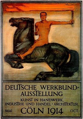
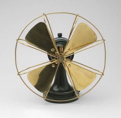
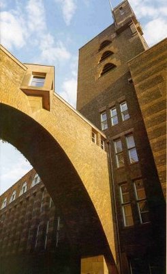
At the start of the 20th century, artists and designers were excited by the prospect of a new era filled with miraculous inventions such as telephones and cars. Science promised a world where humans could begin to create their own environment. But artists with vision recognized that there was also a danger: a man-made world could easily devolve into an industrial wasteland of purely functional objects unless artists were up to the task of creating new designs and forms suited for the machine age. Only designers could preserve beauty in an era when industrialization and mass production began to replace nature. Perhaps the greatest visionary of this period was Peter Behrens, an illustrator for the magazine Jugend, as well as a designer, architect, typographer, teacher and author. He has been called "the first industrial designer."


Behrens designed buildings, stationery, electrical appliances, silverware, typefaces, furniture and environments. He served as the design advisor to one of the world's largest manufacturing concerns, helped to found the German Association of Craftsmen and taught classes that would later become the conceptual underpinning for the Bauhaus. Most of all, he nurtured young apprentices who went on to become the titans of modern design, including Mies van der Rohe, Gropius and Le Corbusier. Behrens said he designed for the modern world by returning to "the fundamental principles of all form creating work."


Behrens also designed several typefaces that became standards for the 20th century.


When designing type, he compared the process of the human eye reading text to

watching a bird's flight or the gallop of a horse. Both seem graceful and pleasing. But the viewer does not observe details of their form or movement. Only the rhythm of the lines is seen by the viewer, and the same is true of a typeface.
We all owe a debt to Behrens for helping to preserve a place for design in the human enterprise during the machine age.

But now the 20th century is over. Today's artists and designers face the new challenges of the 21st century. Who will be the new Peter Behrens who develops an aesthetic for the information age?

Information technology has deluged us with more data than we can assimilate-- a capability so dazzling that information has supplanted the role of wisdom or knowledge. As Karrie Jacobs noted,

Computers have seduced us into thinking about ideas-- the intangible stuff that comprises our culture, our mental universe, our homegrown organic realities-- as information. Information has become the end product, rather than the means to achieve that end.
Just as Information can overwhelm our ability to convert data into knowledge, it can overwhelm our ability to process sensory input in aesthetic form. Information streams are added one on top of the other, like ornaments on a Christmas tree.


The typical modern TV screen has a "crawl" with a message along the bottom, a "bug" identifying the station in the lower corner, and pop ups announcing the weather or the next show or the late breaking news. Anyone who has witnessed a message promoting the Gilmore Girls superimposed on the closing poignant moments of The Godfather knows that the domain of aesthetics has been overwhelmed by information. The same could be said of the cacophony of gateways to databases on websites, or even the designs appearing in many magazines. They are not integrated into our lives in an organic or intuitive way.

For those artists who feel that the glory days of art and design are behind us, here is a challenge: whoever finds the artistic vision to apply "the fundamental principles of all form creating work" to the new information age will earn our undying gratitude.


Wednesday, October 4, 2006

Levels

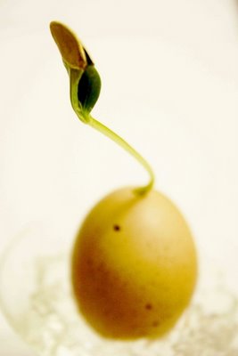
The new work by Verónica Conte is called Stratification. It is what I would call a 10-day sculpture, or rather, an evolving sculpture captured in a picture. More frequent visitors to this blog will immediately recognize that I am hinting here at the dramatic - and yet so necessary - moving from object to picture. That actually puts the virtual spectators in a great position: it admits the value of the experience of seeing a picture of a thing, like a document, instead of a real thing.
But what is the real thing? Or rather, what is the value of the real thing? It is barely the touch, the touch that can be done in so many ways. Of course it matters. Take, for instance, other pictures from the same series, only re-mastered by me:
This seems like an entirely different universe. It is leading us towards a different experience. The neutrality of the object is gone, as is its distance. It is now an intimate shape, a playful image, a play with sense and senses where what is shown is just hidden enough to be curious. It looks pretty - but also somehow fake. The lack of context takes away the pleasure of believing that it's real. Sure, it's a nice idea, but not much different from a drawing, or a photomontage. And as such, it might be too little to actually hit the soft spot. But take another example (also a Vvoi remastering):

The intimacy is blatantly clear. But more than that, the link to the ground is there. The egg is just an egg-shape, it suggests, but doesn't really reveal. This could still be happening. Then, there is the gel, here in the form of a mass, maybe like boiling water? And then, where is the secret? Is it deep down? Or is it in the dark zone between the tender leaves?
There is one last detail these particular pictures don't show: there is a root coming from under the egg. Nice touch. The Grund - reason, grounds, basis - is here. Nearly transparent. But not quite.

Good news


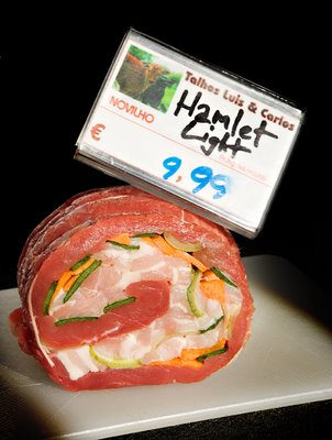
I am absolutely delighted to inform you that the project Hamlet Light, which I direct, is one of the winners of Jovens Artistas Jovens, a contest/cultural program produced by the Centro Cultural de Belem and 14 other theater venues across Portugal.
picture by José Manuel Soares

Tuesday, October 3, 2006

The Aftermath - looking for a reaction

The student, Wojciech Pustoła, has been studying sculpture for several years. He openly rejects the more avantgarde sculptors currently playing with art in Poland. He thinks they are rarely more than bluffing baffoons. He likes wood. He likes the texture, maybe, and certainly the idea that it's already there, that you have to deal with it, like you deal with anything you actually handle. A conversation, maybe, but a concrete one. Taking away the matter. Forming the form, shaping the shape. Finding the hidden layer. Maybe.
Wojciech Pustoła likes tension. He is an avid listener of Shostakovich - and not of the pretty fugues of the composer's last period. No. He likes when the guts are spilling over, when the pain isn't even sublimated, when it's there, bare. He sculpts dogs. Various positions, sizes. There is a nervousness in the form, an irritating intensity, like when someone keeps the flashlight pointing to your eyes.
Wojciech Pustoła prepares his final presentation - the one that will correspond to an academic thesis. The dogs are ready.
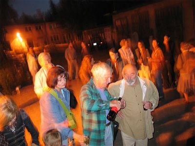
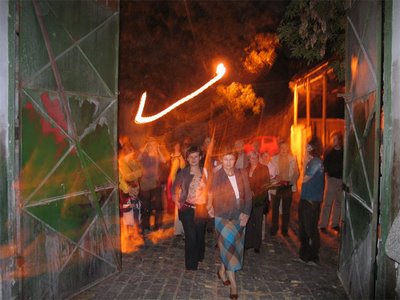
But he doesn't wait till the day of presentation. Instead, he organizes a vernissage a few days earlier. He invites the broadest range of people possible: art curators, family, security guards, businessmen, construction workers from a site nearby, distant relatives...


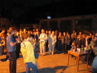
There is, of course, an opening ceremony...

...during which the artist speaks about everything one expects him to - and more...


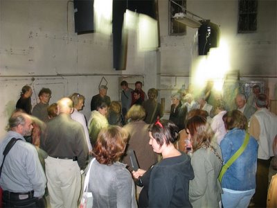
...then everyone procedes to see the sculptures


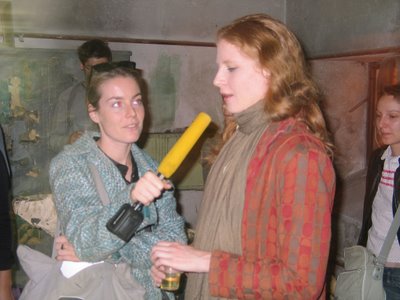
While the spectators are discovering the works, a few people with microphones circulate, asking questions.


Some of the questions are: Can you descroibe the best work here to someone who isn't seeing it? Why is it so dark in here? What texture do you like objects to have? Why? Do you ever feel like touching objects? Do you think it depends on you or on the objects? Doesn't this pink wall irritate you? Why dogs? Is there any work you don't like particularly? Can you describe it to someone who isn't here?
The jury is also invited. I haven't received any information on whether the jury was present or not. But this is not the presentation. The presentation, as I mentioned, comes a few days later. The jury arrives. You guessed it: the room is empty. Not a sculpture in sight. There are a few speakers spread through the space. Each of them has fragments of the recorded interviews. And that is all the jury gets.
Here is what happened:
"it all went great, very human, people started talking and having conversations, the jury was completely blown away, all these simple folks discussing about the meaning of art, like children"

Like children. This is what I like about it. What could have become a somewhat annoying conceptual work about absence became a reminder of the experience of art. Of our contact with it, and how much an unfinished dog with square legs can mean to us. Even once its gone.

Monday, October 2, 2006

2 single events by Fernando Ortega


Fernando Ortega introduces himself by letting go a cry. During a Sonic Youth concert. And whoever looks at him - or doesn't - is unknowingly performing the choreography for an introduction.
One beautiful thing about this work is that it's seemingly uneffective. The limit of Ortega's cry is all too clear. Nobody is paying attention. Except this guy there in the middle. And the one to his left. And those two on the far right. And the one above them - is he looking here?
This is the common space. The space of the exchange of looks. The anonymous, planned but improvised meeting takes place between these few people, as they are looking in the direction of the screamer, the artist.
I like this work. Recently, I discovered that this blog feels similar. It feels like screaming your guts out during a Sonic Youth concert, and if you're not paying attention, it seems like nobody really cares. But as you look closer, there are some individuals who actual do give a damn, a few of them I meet personally, some of them I bump into by coincidence, others I discover on the net. Not that many, if you eliminate all the completely accidental visits, and the people interested in cutting the penis. But more and more.
Going back to Fernando Ortega, one qualityhis work has is that a lot of it consistently develops one theme: the impact of the single occurance, maybe an anonymous one, or apparently not even an event. Something happens, somewhere. The beauty of the artist's role is then to put this forward. To make us realize the potential importance of that event. Paraphrasing the Polish poet Wisława Szymborska, we discover that the unimportant can be of more importance than the important.


More of Ortega at the Lisson Gallery site.