Friday, September 8, 2006

BEN JAROSLAW


When I was younger (and dumber) I didn't pay much attention to illustrations of cars. Sure, the illustrators had great skill, but I saw them as technical specialists rather than creative artists. If there was ever a subject matter that cried out for photography, it had to be cars.


I began to pay closer attention when I realized that some of the best illustrators of the day-- Austin Briggs, Fred Ludekens and Robert Fawcett-- were doing car illustrations. But my eyes weren't fully opened until the day I heard the illustrator Bernie Fuchs discuss car illustrations the way a poet might rhapsodize about a flower.


Fuchs is famous for his lush, impressionistic paintings, but in the 1950s he worked in a Detroit studio painting backgrounds for car advertisements (including these). He worked closely with car painters and still holds them in the highest regard. He recalls one car illustrator as "a great observer of light and color" and another illustrator as "terrific at painting values using payne's gray. He was able to create sunsets reflected in the side of a car, or a sky reflected in the hood."


Fuchs reserved special praise for the work of Ben Jaroslaw, the illustrator whose car paintings are reproduced here. Fuchs admired Jaroslaw's talent and high standards. He credits Jaroslaw with showing him the ropes and helping him develop into the artist Fuchs later became.


Photography made car illustration obsolete in the 1960s. However, it will not surprise you that years later, the fine art community suddenly discovered the beauty and abstract qualities of photo realistic car paintings when "fine" artists such as Richard Estes began painting cars for posh galleries and museums:


All it took to transform car painting from commercial art to fine art was to move the picture from the pages of the Saturday Evening Post to the walls of a museum and hang it in an impressive frame. ArtCritical.com does not mention Ben Jaroslaw, but it does heap praise on Estes:
Richard Estes is a god among artists today, with legions of followers acknowledged and unacknowledged, aspiring to his masterly style (and few, if any succeeding) and decades of lofty prices in the commercial market place also attesting to his preeminence.
In my view, Richard Estes is not as talented as Ben Jaroslaw, but Estes became independently wealthy because he had the good sense to package his art properly and sell to a less discriminating market.

Thursday, September 7, 2006

Próżna 2006 (translation of review by Dorota Jarecka)

I rarely do it, but it's worth it. The following is my translation of an article by Dorota Jarecka that appeared yesterday in the Polish newspaper Gazeta Wyborcza.

The Project Próżna 2006 breaks with the sentimental-folk climate of the "Singer's Warsaw" festival. Nobody here tries to prove that one can return to the past, bring it back to life or play it back.

The Ulica Próżna 2006 Project
curator: Krystyna Piotrowska
until September 10, Warsaw

Every year the "Singer's Warsaw" festival attracts people to the otherwise deserted Próżna street and creates a fiction. The forgotten climate of a forgotten Warsaw appears again. The artistic project in the building at Próżna 7/9 is a whole other story: no orchestra rhythms, no singing cantors, no Jewish cuisine or cut-outs. Here nobody tries to make anyone believe that the one can go back to the past.

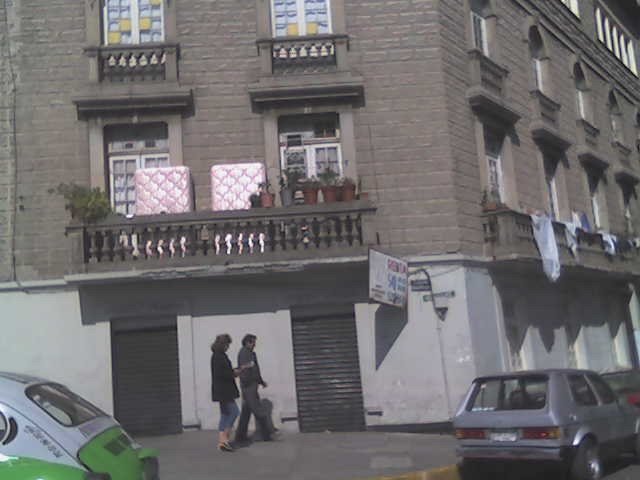
It's a rather painful than happy contact with the past, and the pleasant feeling of participating in a fiction is questioned and treated mistrustfully. The building was designed in the 1880's by the architect Brauman for Naftal Perlman. It was later bought by Zelman Nożyk, founder of the synagogue on Twarda street, the only one in Warsaw to survive the war [WW2]. The building extends along Próżna street, it has several entrances and reaches as far as the Grzybowski square. In 1940 it was inside of the first large ghetto. In the summer of 1942 the ghetto border was diminished and the building was left on the outside. That's why it wasn't brought down after the collapse of the 1943 [Jewish ghetto] insurrection. After the war it had state-owned apartments. Nine years ago it was bought by the Lauder Foundation, who sold it two years ago to a developer called Warimpex.

The house, together with a few neighboring ones on Próżna street, are something unique in Warsaw, since it survived both the Warsaw Insurrection [in 1944] and the reconstruction of Warsaw, but they also didn't undergo nearly any remodeling or improvement. They look just about the same as they did in 1945. When the Lauder Foundation bought the house, the locators renting apartments had to move out. There is always someone there in the abandoned houses, ripping out the old tiles or stealing the balustrade. The water pours in through the roof. We can check by ourselves: in the last years the house at Próżna 7/9 turned into a ruin. It would require an archaeologist to distinguish between war damages and the devastation of the last few years. All the signs mixed together. The house is a conglomarate of damage.

That is the house that artists have entered. Since the very first meeting with art here, we are nearly swept off our feet. Katarzyna Krakowiak, a young sculptor (teacher at the Academy of Fine Art in Poznań), filled the floor of one of the entrances with sidewalk tiles. They give to the first step, caving in. We discover they are laid on an air-filled, rubber foundation. We walk as through concrete waves, on a shaking ground. The work is called "Swindle of Balance".

Another work present was Artur Żmijewski's "Our Songbook". It consists of a film made in Israel - emigrants from Poland, 60 to 80 years old, sing Polish songs. It is an astonishing document. It shows there are no easy national qualifications. Żmijewski says: there are limit identities, fluid ones, impossible to name by a political or media language - and even less by the language of official passports. In his film, the artist shows the counsciousness of a specific group of people living in Israel, but one which is neither the consciousness of all Jews, or of all Poles.

The "Ulica Próżna 2006" project is exactly such a collection of individual messages. Krystiana Robb-Narbutt created a narration about her family which didn't survive the ghetto. It is made of toys inside of glass aquariums. The history is told with a naive language, seemingly inadequate to the events. Yet the subject is the very search for a language. The props used in this story (the toy wagon stands for the transport, the Christmas decoration "angel hair"[bands of very thin stripes of translucid plastic] is the grey hair of an old woman) are a conscious choice of an immature language. Because any other language lost its value and can no longer tell the story.

The common language becomes ridiculed. Something is "Jewish", something is "Polish" - but what does that mean, exactly? In Krystyna Piotrowska's installation, a real, live carp swims in the bathtub. Next to it, the artist put two recipes for carp taken from an internet cuisine book - carp "Polish style" and carp "Jewish style". The Polish one is a little more caloric, but it's pretty much the same. And the carp doesn't know what nation it belongs to.

A wooden model of Próżna street, as it is to look after the remodeling (to be made in near future), stands in one of the rooms. The developer wants to create a luxurious hotel in this building. The empty, enormous apartment on the second floor where I managed to enter, with the traces of the old life, with the colors of the old paints still on the walls, will be gone.

Próżna street cleaned of its junk and cleanly painted is a problem for me. In Poland what tells something about history is not reconstructed antiquities, but crumbs, wrecks, litter. The flashy, crystal clean street will stop being Próżna [meaning "Void" or "Vain"] and become Empty street. Yesterday, walking through the house at Próżna 7/9, I had the feeling that I'm walking through the real museum of the history of Polish Jews. How can we save it?

- Dorota Jarecka


Extra: from the curator's note:

The way Próżna street looks makes it completely visually autonomous from its surroundings, the current center of Warsaw. It puts it in an aesthetically and historically provocative oposition to the contemporary city. It constitutes a dramatic shock of a dead and decaying fragment of the city of the past with the live and indifferent city of today. It is the image of a conflict that is both ethical and aesthetic. It is the fruit of a German crime from times of War and of the post-war indifference.
Such a dramatic tension in the city space is an inspiration for the creation of the Artistic Project "Ulica Próżna 2006". The goal of the project is to show how the newest language of art can relate to this past and this present, which the opposition of Próżna street with its surroundings calls upon. (...)
The Artistic Project "Ulica Próżna 2006" is also open to interpreting it from the perspective of such contemporary phenomena as cultural, religious or political foreignness and animosity. Also today, they lead towards crime on a mass scale. - Krystyna Piotrowska (Polish fragment here)

Wednesday, September 6, 2006

Art that speaks for itself

One of the most important issues I have been struggling with recently is the question of commentary within the artwork. Take a conceptual work and leave out the comments. What do you get? What is a life of a concept without a conceptual framework? Behind the rhetorical question lies a complicated issue. First, it's with the relation between the esthetic experience and the contextual, often intellectual approach. Then, going more specifically toward a commentary that is included in the work itself, we have questions of self-reference and self-presentation, and things get messy. Several issues: isn't it a sort of self-publicity, or rather, a self-justification, which serves as an excuse for any "misreadings", that is, readings different from the one intended? Of course, an artist's text (also in the case of an artist's statement) can get quite smart and distanced, so as not to get too involved. People like Cattelan or Matthew Barney are masters at that. But sometimes the work lives off the description. It seems to only make sense through the concept - and not because the concept is the work, but because either a) the work seems an excuse for the concept, or b) the concept guides us through the work like a map. It's the second case I'm interested in. Take Book, a formally simple work developed by four artists, two of them in the U.S., two in Belfast. Look at book. It is an artist's sketchbook exchanged every week for 36 weeks, creating a sort of an artistic dialogue between the two sides. The conversation of images, so common these days, might tell us little (especially given the small size of the images, which doesn't allow a more patient analysis). But everything changes dramatically when we receive guidance (I recommend the audio version, which is very pleasant and, well, human). Things become clear, make sense, and... sometimes appear as obvious (!).
Yes, an auto-guided work. Isn't it something problematic? Do we need a guide?
What's the problem with a guide? Well, for one, he makes it difficult to drive by ourselves. He also intervenes in the very aesthetic experience we're having, and can easily spoil it. In the case of Book, we can turn the comment off. But it's not that easy (like turning the TV off for someone I know). And then, there are works which impose this guidance. Sometimes it's a subtle comment by the author, other times, the curator makes his ideas all-too-clear, but at times it's simply there, put so clearly within the image, the film, the play, we can't miss it. Does it always make the work poorer? Because we're not driving? Can't someone else drive?

Tuesday, September 5, 2006

Darker

I have just played the internet version of Russian Rulette, by Carlos Katastrofsky. This is what I got:

Monday, September 4, 2006

Easy still


Yes, we are still in the slow, gentle recovery zone. That's why all these really sweet links. Here is another one:

The story is too easy, etc etc. But let's just let it go for now.
Enjoy the fall of an angel. By Geoffroy Barbet Massin, produced by the digital editing studio Mikros Image.
I once asked Alex Kelly from Third Angel, who was a teacher of mine, what he did when he found something was too pretty, so pretty it was unbearable, like kitsch, but not really kitsch, only too pretty. He answered, "there is no such thing as too pretty. Enjoy it."

FOLDS I LOVE


The world offers unlimited numbers of cool things to draw. Yet, artists seem to have special affection for drawing folds in fabric.


Folds dominate so many pictures, it is clear that artists are fascinated by them. Their complexity, their movement and their abstract quality give artists a lot to play with. Sometimes folds are such fun to draw that artists go a little overboard:


Although folds in cloth have remained basically unchanged through the ages, the artist’s treatment of them has changed dramatically. Folds in medieval art were generally angular, while folds in Renaissance art were rounded. For a contrast between two different cultures, compare the carefully controlled, tightly rendered folds drawn by the great illustrator Durer in 16th century Germany...


...with the lush, spontaneous lines of another great illustrator, Bernie Fuchs, in the U.S. in the 1970s:


Today, Christo brings the artist's obsession with folds into the modern era with his brilliant wrapped works...


...or his running fence, where fabric stretched and flapped in the breeze:


When Christo wrapped the Reichstag building in Germany, he said:

From the most ancient times to the present, fabric forming folds, pleats and draperies is a significant part of paintings, frescoes, reliefs and sculptures made of wood, stone and bronze. The use of fabric on the Reichstag follows the classical tradition.

By my calculation, there are 8,743,921 absolutely great drawings of folds. When I woke up this morning, the following six were foremost in my mind:


Leonard Starr stoically insisted that writing and drawing his daily comic strip On Stage was "a business" but his pleasure in painting these folds is almost palpable.


Here, Austin Briggs' folds of cloth dominate the outline of the figure.


Any fan of the Godfather knows what Mort Drucker has concealed under these well rendered sheets


Kyle Baker takes a more restrained but very interesting approach to folds


Alex Raymond's bold treatment of the folds in this smoking jacket elbows everything else out of the picture


Finally, one more (very different) approach by Mort Drucker where the folds ran away with the drawing. Talk about a knock out ending!

Saturday, September 2, 2006

Oh, why not


All paintings are by Esao Andrews. He also designs skateboards, in case you're interested. Here is an interview with the talented young man. Oh, and if you see his photos (on his page), mind you those are ballerinas' feet.