Saturday, March 11, 2006

WOWEE, LOOK AT THOSE HANDS!


Nobody draws hands like the great Mort Drucker.

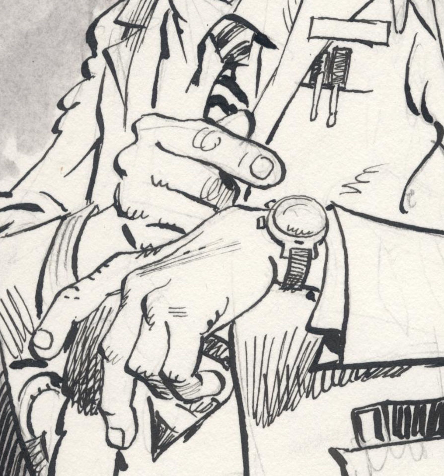
close up, with pencil lines

If you study Drucker's stories for MAD magazine, you will see a wonderful ballet of hands from one panel to the next. Note in the following drawing how, in a tiny space crammed with Marlon Brando, Robert Duvall, Al Pacino and other superstars, a hand still dominates center stage.


There are at least two important lessons to draw from Drucker's treatment of hands.

First, Drucker constructs hands like a master architect-- he understands the structural foundation of his subject, and that gives his drawings solidity. But that's only the start. For some artists, extensive knowledge of anatomy can have a deadening effect. It locks them into a certain mechanical way of thinking. It becomes an anchor that weighs down creativity.


But if you're really good-- like Drucker-- your knowledge of anatomy sets you free. Drucker could never achieve his springing, bouncing joyful line if he had to slow down to consult reference every time he drew a hand. He has internalized his knowledge, and it has given him a solid foundation from which he can launch his trademark "slapdash" line with confidence. There's no other way to achieve that effect.


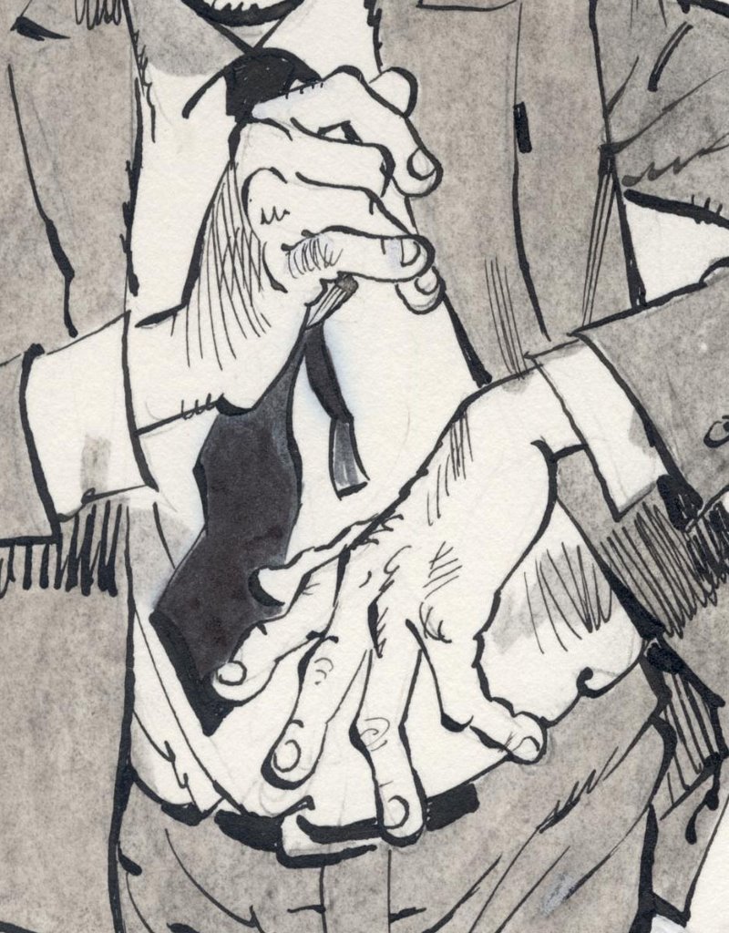
The second lesson is that Drucker did not need to draw all those hands in order to get paid for the job. The picture below would have been quite complete without one hand knocking on the door, a second hand grasping the door knob and a third gesturing in mid air.


Look in the following close up at the work that went into drawing three hands that could just as easily have been cropped from the bottom of the panel. These were not drawn for the sake of the editor.

That, my friends, is the real definition of art for art's sake.

Tuesday, March 7, 2006

Ernesto Neto's latest fluff


Ernesto Neto's Humanoids are my favorite piece of his. Most of his pieces are somewhat creepy. Yes, there is light in them, and a playful spirit, but there is also something sleazy, the smell is often intensive, and they seem distant, almost inhuman. It is not the case with these funny, soft creatures. They have a wonderful, light spirit, while remaining somewhat enigmatic and out-of-this-world. I wish they were available in stores. Wouldn't that be an amazing armchair? Design and fine arts couldn't be closer...
The work is part of a whole "labyrinth" of forms called the Malmo Experience (you guessed it, it's exhibited in Malmo).

Monday, March 6, 2006

A game for those who like to take it slow, get a little confused, a little charmed and above all, who find there is magic in the keyboard.

Friday, March 3, 2006

Pretty plagiarism?


As much as I like this picture by Nicoletta Ceccoli, which adorns the cover of the last Born Magazine, it seems like...well, I'll say it - plagiarism. The Lithuanian-Polish artist Stasys Eidrigevicius painted incredibly similar pictures some 30 years ago or more, in a children's book I have somewhere in Poland. Here is an example of a similar book, though slightly different.
The pictures I'm refering to show a boy with his head covered in birds that fly away out of it. The book is a poem by Joanna Papuzinska about a boy that instead of having toys or adventures has ideas.
Even the birds look similar.
Then again, Bach's copy of Vivaldi's violin concerto was apparently a great tribute. How are we to judge?

Monika Hoinkis: humanizing the object

Why is the metronome only listening to its own rhythm? Can't it ever listen to me? React to me?
And this compass? Why should it always point to the North, ignoring me completely?
What if it actually lived with me? Monika Hoinkis decided to live with the objects and see if they will also accept to live with her. And they did.

The compass points at the person holding it. The metronome reacts to physical presence. Even water vibrates to... you guessed it, to your own heartbeat.
And this umbrella? Come on, you know you want it. Give it a hug. It's the only way to be well protected anyway.

See the whole Living with Things series.

Thursday, March 2, 2006

Women by women

Billboard (2003) by Heta Kuchka

Billboard (2003) by Liv Carlé
Part of the Billboard project www.women2003 :
From 23. March to 4. April [2003] one hundred and two Scandinavian female artists will present their own personal and artistic female image in the public space ? entering a dialogue with the images created by commercials. (...)
In that way the new female images created by this project will form a solid and diverse contrast to the monotonous representations created by the commercial market.
What is strange is how many of these works (the ones above included) define the woman through her relation to the man.
Both these images are disturbing. And they say somewhat similar things - the fear of rejection, the question of being appealing or not, the scary idea that the author, a woman, is completely wrong, just because she is herself.
And while it's supposed to question our values as men (and women who accept this), I'm not sure if it doesn't do exactly the opposite, provoking us to answer, "Get a grip on yourself girl! If you can't make him appreciate you for who you are, if you can't gain respect, if you get a guy that sees you as a toy, you better look around. There are plenty more of us, you know".
But, look at it from another point of view. The two works I present are part of a series of actual billboards put in and around Copenhagen and Malmö. They are not as much a statement, as they are an answer. They laugh at the myth. At the plastic imagery we know all-too-well. And if that answer tells more about men than about women, it might be giving us a hint about the images it aims to reply to.