Tuesday, February 26, 2008

HAROLD GRAY: AN APPRECIATION


No one bothers to think too much about Little Orphan Annie anymore. Decades ago, Harold Gray's classic comic strip was analyzed, categorized and handed over to the domain of the archivists and historians.

Yet, judged by today's artistic standards, LOA is fresher, more powerful, and visually stronger than many current graphic novels and underground comix. Gray's epic saga of America during the Depression, World War II and the cold war is downright fashionable:

1. Today, slick artistic skill isn't valued as much as a distinctive personal voice. Gray's art was about as distinctive and personal as you can get. He drew human beings that looked like tree trunks (and what's with those eyeballs??) His art appeared freakish compared with other strips of his day, yet today it seems perfectly at home next to the art of R. Crumb or even Gary Larson's Far Side:


2. Today's readers adore Frank Miller's noir style, with his dark view of human nature and his anti-establishment rhetoric. Gray used similar ingredients (minus the garter belts) to make equally gritty, noir pictures. Note how beautifully Gray depicts Death at the door:


I love the hoodlums in this depression-era train yard:


And here is Gray's equivalent of Sin City, circa 1944:


3. Today's readers favor stories by opinionated writer/artists who spin out personally meaningful sagas. Gray probably invested more of his personal philosophy in his strip than any other comic artist of the 20th century. An endearing combination of Ayn Rand, John Bunyan and Charles Dickens, Gray hardly let a week go by without sermonizing about the virtues of self-reliance or the hypocrisy of society.


He also never stopped banging the drum for his own crackpot version of anti-communism:


Some readers complained bitterly about his politics but Gray would not be deterred. Al Capp, creator of Li'l Abner, recalls that Gray took him aside when Capp was just getting started:

I know your stuff, Capp. You're going to be around a long time. Take my advice and buy a house in the country. Build a wall around it. And get ready to protect yourself. The way things are going, people who earn their living someday are going to have to fight off the bums.
No matter where he is categorized, I will always view Gray as an extremely talented and insightful artist. In the following panel, I love how the word balloons curl around the corner, how the cluster of eavesdropping hoodlums form a parabola, and how two random alley cats occupy center stage:


Another typical Gray panel: a surrealistic discussion between an eight foot mystic and a war profiteer, while (a rather freakish looking) Annie listens:


Gray's work may seem crude at first, but it has many nice and subtle touches. Note how Gray conveys the spinelessness of the two lackeys in the following panel:


Little Orphan Annie is an epic American achievement by a vivid storyteller and a genuine eccentric. It might be a good choice for a modern reader of graphic novels looking to upgrade to something better.


After Gray died in 1968, the strip was continued (sometimes under the name Annie ) by a series of different artists (including the great Leonard Starr) but talent can only go so far to compensate for natural born weirdness.

Sunday, February 24, 2008

Japanese Art Truck


Not to be left out, but art trucks are pretty amazing also, brought to you by PingMag

Saturday, February 23, 2008

Thunderfalls Crossing: River Guardian

another entry (and WIPs) for the Art Crusades on ca, i wonder if i can keep up the boobies theme for the next round :P

Friday, February 22, 2008

Wood Gas Car

Wood Gas Car

This Swedish car that runs on wood gas is simply a must see video. The engineering is superb and even the artistic qualities are on the rustic side of things. You could probably take this thing camping and cook food right on the trunk and on those cold nights, stick in another log. I love it and well done guys.

Tuesday, February 19, 2008

ONE LOVELY DRAWING, part 17

I love Alexander Calder's depiction of Charles Lindbergh flying solo over the Atlantic Ocean.


Calder made pictures with wire. His lines hovered in mid-air, set free from paper.

Our last lovely drawing was a major construction project, planned and executed by Orson Lowell with all the craftsmanship of a master bricklayer. For contrast, I thought it would be fun to visit the opposite extreme: Calder's simple, joyful line.

You'll find no dense cross hatching or shading here. No buttons, shoe laces or fingernails. But what Calder loses in detail, he gains in universality. This image is truly Homeric; it could symbolize any human being tempting the gods by braving the unknown.

It is often difficult for artists to remember that there is no connection between seriousness and profundity, just as there is no connection between the number of lines in a drawing and the importance of its message. This lovely little image from Calder is a good reminder.

Sunday, February 10, 2008

THOMAS FLUHARTY


One of my favorite contemporary illustrators is Thomas Fluharty, whose excellent work has appeared on the cover of Time Magazine, The Weekly Standard, U.S. News & World Report and the Village Voice.

Don't get too distracted by the technical virtuosity of his finished paintings-- that's not the real measure of his talent. To see what Fluharty is made of, look at these wonderful studies:


Fluharty draws with strength and conviction. He injects personality, character and insight into his images. And despite the fact that he is truly a nice guy with a gentle spirit, he creates the most scalding caricatures I've ever seen.

These studies should not be viewed as incomplete fragments. Each is a finished and excellent work on its own. This is true of every really good artist I know: the preliminary sketches or underpaintings may indicate just the beginning of a nose or a hand, but they can still stand alone as well designed, coherent images. Check out the studies of Rembrandt or John Singer Sargent or Leyendecker. Their drafts are obviously incomplete in one sense, yet they contain a full microcosm of a finished artistic statement. Beware of artists who strive only for accuracy at the early stages and leave the "design" part for the end.

This is one more way in which the creative process in art seems to mimic the creative process in nature. As the science writer Arthur Koestler said about the rules governing organic life:

"Parts" and "wholes" in an absolute sense do not exist anywhere in the domain of living organisms.... [P]arts... at the same time... function as quasi-autonomous wholes.
In other words, nature organizes the world so that each part of an organism contains the independent properties of a coherent whole. Despite its limitations, a component is endowed with all the properties necessary to be complete and consistent with regard to its own parts. Art that is built from components this way is more likely to end up with the balance and harmony and other aesthetic attributes we find and respect in nature.

For example, if we deconstruct this lovely painting of a gangster, you will find that each stepping stone on the way to the final painting is a true and clear statement.


See how Fluharty uses rapid strokes and a few colors to rough in the shadows and highlights on the knife and fork below. A lot of this vigor will be lost in the final painting, but in the interim version it has a beauty all its own.


This ability to infuse design in the picture from the beginning stages is one of the most reliable tests I know for a picture of quality.

the Watcher and the Watchtower

entry for the Art Crusades on ca, i'm still trying to do new style/design elements

Wednesday, February 6, 2008

CULTURE COMES TO COUNCIL BLUFFS, IOWA

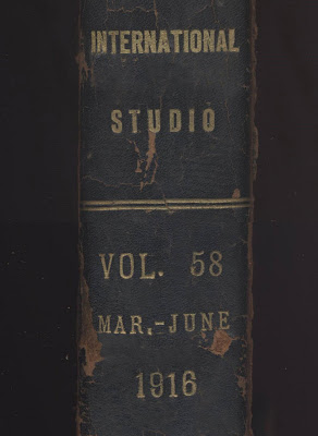
Nearly 100 years ago, a farm boy stole a nude picture from this issue of International Studio Magazine in the public library of Council Bluffs, Iowa.


He left only the foot behind.


Council Bluffs was a small, old fashioned town where farmers stored grain on the way to market. The citizens followed strict social and religious rules. Their librarian must have hoped that a subscription to International Studio would bring the town some much needed culture.


There weren't many places in town where a young man could see what a naked lady looked like. Some farm boys would soon march off to die in World War I without ever experiencing the sight or touch of a female body.


I had to smile when I discovered the missing picture. The boy's heart must have pounded as he tore it out and smuggled it past the stern librarian. When he got home to his tiny unheated bedroom in a sparse Iowa farmhouse, the secret picture must have given him precious clues to a new world.

I love the smell of old magazines. New magazines are the braying of capitalism-- the latest fashions and trends clamor for reader attention in order to sell merchandise. But once the pageant of capitalism has moved on -- once a periodical has outlived its period-- it takes on an entirely different tone.  Outdated advertisements and faded styles seem humbled and mortal. Even the silliest magazine becomes worthy of profound reflection after 20 years.

Most of all, the aroma of old magazines reminds me that regardless of whatever timeless truths may be printed on them, magazine pages are inevitably returning to wood pulp on the forest floor.  The farm boy who risked everything to steal that picture is surely wood pulp too, or well on his way to becoming so.

Pictures enlighten us in many different ways. It's easy to revere large gilded paintings on Renaissance altars, but the revelations we receive from baser forms of art are sometimes harder to recognize.


The cold farmhouse bed where that boy pondered the mysteries of nature is an altar no less sacred (and no more profane) than the gilded church altar.  In fact, if you measure art by its impact on life, there's a good argument that the crumpled picture torn from the magazine had the greater impact.

Monday, February 4, 2008

Ketchup Art Car

Have you ever been caught without Ketchup or Hot Sauce? This guy will never eat another plain burger or nasty old leftovers from a week ago. This guy took a stand, right on!!!!!!


Photo by groovehouse

Sunday, February 3, 2008

Lego Art Car - Happy 50th

Thank you lego for all the joy you have brought to so many of us over the past years. May we never grow up and always remain childlike the rest of our lives.


Photos by Paula Wirth

Friday, February 1, 2008

Inside the Art Car Mind


Do you ever see an art car and wonder "what where they thinking?". This short video about art cars will help answer some of those nagging questions. Some of the cars featured in this video are: Carthedral, Mondrian Mobile, Daisy Singer, The Colt-mobile, Truck in Flux, California Fantasy Van, Vainvan, Cinnabar Charm, and Cadalabra.

How to make an Art Car in 77sec.


If you ever wondered how to make an art car or what it looks like making one, here is the 77 second version. The amazing thing about art cars is that some take years to complete, up 18 years for Mosaic VW made from cut glass.

BMW Art Car - Roy Lichtenstein

Art Car Fest 07 - Santa Cruz

Art Car Fest - Mount Dora