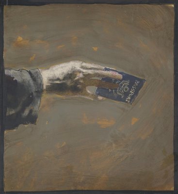
more Open Canvas stuff (finalized in Photoshop).
process vid (raw OC) : http://www.youtube.com/watch?v=Xeet35EHIDU
Friday, March 30, 2007
Thursday, March 29, 2007
The object-driven touch: Robert Wechsler
What can we control?
What is the part of reality that is actually controllable?
Say, when we take things in our hands.
There is a point where reality simply will not be tampered with. It says only so much.
And the beautiful thing is when someone manages to feel this point and use it, changing the vectors, but keeping the power, the energy, the impulse that the world drives through us.
Does that sound esoteric?
What is the fish doing in the church? What is the Holy water doing around the fish? Within the fish? It is all here, and the transgression is only a small part of the game. The name Sanctuary, to me, is not ironic. It is playful, yet strong.
Where do we go from here?
Here?
Good work, Robert Wechsler.
(via)
Technorati: design, fine art, installation, art installation, photography, visual art, art, contemporary art, vvoi
Tuesday, March 27, 2007
KENT WILLIAMS
I love these powerful pictures by Kent Williams, one of my favorite artists working in graphic novels today. These kinds of images have their roots all the way back in the urschleim.
Williams is also a magazine illustrator, a gallery painter and an art teacher. He teaches contemporary figurative painting in Pasadena, California.
Some of his pictures are more successful than others, but Williams is one of the very few sequential artists who I think makes effective use of the technical tools and creative choices now offered by graphic novels. For example, the following panel from the graphic novel Tell Me Dark displays far more nuanced color and shading than was possible in previous generations of comic books.
As another example, Williams used a kneaded eraser to mold a figure by lifting highlights from a background of vine charcoal. This delicate technique was not possible with the printing technology for earlier comic books.
The golden age of illustration began in the late 19th century as a result of the invention of photoengraving. Prior to that time, art could only be published in a book or magazine by painstakingly tracing the original image onto a wooden block which was then carved by hand by an engraver. The artist was at the mercy of the engraver (who often co-signed the finished block) as well as the printer. Photoengraving inspired a mini-renaissance because for the first time, books and magazines faithfully captured the artist's true talent (for better or worse).
Comics have now gone through a similar renaissance. For most of their history, comics were drawn in pencil by one artist, then traced in ink by a second artist for reproduction. Often, a third artist applied color on a separate page or guide sheet as a reference tool for the printer. Now graphic novels have overcome all these limitations of the medium. Today's artists are free to work with delicate line, or subtle gradations in color and value, or mixed media.
While many writers have taken advantage of the freedom of the graphic novel, very few artists have risen to the challenge. Most sequential artists treat the graphic novel like a super sized comic book on glossy paper. Even successful painters such as Alex Ross, who use the new image quality to convey slick, photo-realistic art, don't add much artistic integrity. Their art may be dazzling but it seems thin and lacking in humanity.
Apart from Williams, there seems to be only a handful of artists-- McKean, Miller, and perhaps half a dozen others-- who are doing artwork worthy of the medium.
Monday, March 26, 2007
OpenCanvas sketches/vids
some photo-ref'd practice sketches i've been doing. The pics above have been fixed up in Photoshop of course. The raw OC stuff i've uploaded on youtube if anyone's interested in the process :
http://www.youtube.com/watch?v=9CXQT69U1Nc
http://www.youtube.com/watch?v=T1cmhgsqx0k
http://www.youtube.com/watch?v=x_IkxsQkCYY
http://www.youtube.com/watch?v=V2QNiHHSU6I
http://www.youtube.com/watch?v=9CXQT69U1Nc
http://www.youtube.com/watch?v=T1cmhgsqx0k
http://www.youtube.com/watch?v=x_IkxsQkCYY
http://www.youtube.com/watch?v=V2QNiHHSU6I
Saturday, March 24, 2007
Using walls (p.2): the Splasher controversy
There are several excellent Polish sites about art. They focus mainly on Polish art and the Polish contemporary art milieu, and have a certain tendency toward a specialized and a high-brow discourse, but they have lots of good discoveries and insights and are a great reference point. And they're in Polish, which makes me one lucky bastard. Lucky for most of you, they also have lots of images of new Polish works. I recommend two: art.blox.pl and strasznasztuka ('terrible art')
From time to time, they also put on things happening outside of Poland. Below is a translation of one of the articles:
(text by strembol)
more on Splasher here
And here is the idea that Splasher is a marketing ploy by the very people who promote street art as a commercial art form - this way they get free publicity (with a street-art war twist to it, apparently?).
The very idea shows us something new: that these are real people, existing in a real society, and obeying its laws. Whether they are perpetrators or victims, they participate in a social context. And its a relief to see how clearly they are integrated in it through the Splasher affair.
From time to time, they also put on things happening outside of Poland. Below is a translation of one of the articles:
"Splasher" is now the hottest street-art name in New-York. Not because of what he makes, but because of what he destroys. Stencils, stickers and posters on the streets of Brooklyn and Manhattan have been for over a month the objects of the attack of the anonymous 'vandal'. Street art created by people as famous as Banksy or Swoon are destroyed in the same way - by a cruel splash of color paint.
The street art works, once considered only as acts of vandalism, are now themselves victims of a vandal. But is Splasher really just a street hooligan? It seems not. He chooses his goals very carefully - they are always the works of known artists, who have also often entered into the regular gallery circuit, and their works are sold at auctions for big money.
The mysterious Splasher is being looked for on the internet. Bloggers are looking for the motive of his actions. Many believe Splasher simply protests against the commercialization of street-art and against putting it in the same pot with classic works of art.
But what are Splasher's actual motives? Next to many of the works there were manifestos glued to the wall (one of them is reproduced below). They have references to dadaism and expressions like 'True creativity is the joyful destruction of this [existing] hierarchy'. Is Splasher the conscience of contemporary street art? Or a conceptual artist, who as part of an adopted theory of 'destruction' creates a new work of art?
New Yorkers don't appreciate Splasher's "art". The destruction of the works of known artists, such as Banksy, results in disapproval, and even anger. Splasher is not seen as the "savior and renewer", but as a simple vandal. Vandal among vandals? Or could Splasher be the last real street artist, who sacrifices famous murals and stencils in the name of a fight for the purity of the art form? Because what is the difference between street art and gallery art, if we can't destroy someone else's work at will in either place? After all, street art is based on an idea of destroying and lawlessly occupying space. Always at the cost of someone else. After all, the street is not a museum - every street artist, even Banksy, is subject to the same rules and accept that his work can be removed at any moment.
The question remains - do Splaher's desperate gestures make sense? Is it better to fight for a pure street-art, or to cherish its highest achievements?
(text by strembol)
more on Splasher here
And here is the idea that Splasher is a marketing ploy by the very people who promote street art as a commercial art form - this way they get free publicity (with a street-art war twist to it, apparently?).
The very idea shows us something new: that these are real people, existing in a real society, and obeying its laws. Whether they are perpetrators or victims, they participate in a social context. And its a relief to see how clearly they are integrated in it through the Splasher affair.
Friday, March 23, 2007
Using walls (p.1)
Can emotions shape our morality? Not only they can, but according to the great Portuguese neuro-scientist António Damasio, they do. Damasio has recently published an article in Nature which further develops the idea that our moral choices are very closely related to our emotions - also on a neurological level.
Face2Face is a simple idea: make both sides of a conflict see each other in the most human way possible. Show faces. Show them up close. Show them together. Show them as similar and - make them look funny.
So, if emotions can shape our moral decisions, the laughter could make it just a little harder to see the other as barbaric - unknown, distant, too-different.
Can this work? Can it be that simple? And I don't mean to suggest peace will happen because of a few posters. But can anything change? And why would we not believe in it, other than out of bitter and failing experience?
Two small details. One: the use of a 28 mm macro lens. It is very hard not to look funny and cute seen from that angle. Two: the faces we see are combined in pairs of people with the same jobs (e.g. barbers, doctors, etc.).
See the video:
Technorati: photography, art, contemporary art, vvoi
Thursday, March 22, 2007
MEET BOB & BOB
Bob & Bob was a flaky performance art team in the 1970s. They painted themselves yellow and silver and conducted "happenings" in rooms filled with popcorn or foam rubber. They named their happenings "Sex is Stupid" or "Forget Everything You Know." Sometimes Bob & Bob would perform songs against materialistic society:
People go to school and learn from booksBob & Bob had no apparent drawing skills. A booklet of their work describes the team's technique for drawing:
Then they get degrees
Then they get a job and drive a Porsche
The drawings were nothing more than scribbles but the two found something harmonious there so they decided to draw together on the same sheet of paper.They also performed comedy routines. Fortunately, Bob & Bob faded away like disco with the dawn of the 1980s. So why am I wasting your time with them? Because recently I looked at some of their drawings and was astonished to find they were truly excellent. I think these deserve a wider audience.
As part of their campaign against capitalism, Bob & Bob copied photographs from the annual reports of banks and large corporations. They drew the corporate executives and boards of directors with magic markers in a crude way. The results were absolutely devastating.
Said Bob & Bob:"These poor bankers have spent their whole lives in classrooms and offices and all they have to show for it is money and wrinkles. We wanted to turn them into art." I find these drawings more lacerating than the art of widely acclaimed social critics such as George Grosz, R. Crumb or Gerald Scarfe.
I am surprised that two goofy featherweights like Bob & Bob were able to produce something so dark and trenchant. These drawings seem close in spirit and quality to the work of Francis Bacon and Marshall Arisman.
.
The alchemy of art is so unpredictable, unlikely artists sometimes produce surprising results. Were these drawings intentional or just a lovely accident? I don't know, but they are another reason why (as if another were needed) the time to stop looking with fresh eyes at new artists is never.
Figuratively speaking
Finding the human form is easy. If you know where you're coming from. In some of Meinbert Gozewijn van Soest's recent work the head becomes just an apparently chaotic mash-up of lines and stains. One is tempted to think this is a head. One is tempted to empathize. But if we don't know anything else, what have we really got here? What is apparent? What remains?
The beauty of lineage is that it tells you more than you should know. The figures entangled in their own lines, buried in a mass of accidents, undefined by the very form that describes them, tell us the story. The narrative, the line, the hermeneutic* identity of what would-have-been, all this appears to us if we go beyond the simple drawing of havoc. But can we actually defend this as a principle? Maybe not, but in pragmatic terms, if even the site invites us to a general, overall lecture, to a combining of various phases of Research, then I say, hey, go for it, beyond the Pandorra's box of a depressing painting, into the line that completes it, giving it an entire universe to refer to.
*I can't believe I'm actually using this creepy word...
Tuesday, March 20, 2007
Artsing human-scale design
The Tea Bag garden is a landscape made of stacked bags of garden soil. The bags, padded like a bench, are essentially soft plant containers. There were holes in it for planting herbs. Bey had planted mint at Z33 and left a boiler and tea set so that visitors can sit and make their own tea. Whenever a bag is empty, it is easily removed and replaced by another bag/plant pot. The bag garden can thus be peeled off, layer by layer.
The Vacuum Bag Furniture gives a real and surprising value to dust. The chair-shaped refuse bags can be connected to vacuum cleaners. Once filled with dust, they provide comfortable seating.
Different seats are packed in an elastic synthetic fibre to shape Family Cocoon.Regina over at WMMNA recently wrote about an exhibition by Jurgen Bey where these wonderful objects appeared (all descriptions are by her).
My favorite is the Family Cocoon, because it doesn't pretend to be practical. The Tea Garden could be considered as practical (although there seems to be something very not-real about it)(then again, I didn't drink the tea, did I), so it comes in a close second.
Jason Young's Curling Stones
The thing that fascinates me about the Geostationary Banana Project, beyond the craziness and the scale, is the fact that it is a constant work-in-progress and is already functioning in the art world as a model of a work-to-be. This way of working is very inspiring.
There is something about taking away the edge of the Art Work that makes it, well, easier on the digestive system. When the experience of the work can be dissolved, so we don't just get it in one big lump, it can sometimes give a much-needed space of habituation. By that, I don't necessarily mean a context, an explanation, but more like a creative play between various aspects, levels, possibilities of something that otherwise risks being seen as, well, just a thing.
For instance, showcasing works on New Art is, for me, a way of seeing them in that space. Of seeing their possible links, connections (and readings as well...).
But in some artworks the dialog between various areas is what gives them a very rare power.
I probably wouldn't have noticed Jason Young's work.
This type of work is something I would probably like to make - playing with resin has been a
personal fixation for a while. But I rarely actually stop to appreciate abstract plastic work, if it doesn't have a twist to it - some sort of a hidden agenda, so to speak. Of course, you might say if it's a good piece of work it only takes time and some effort to discover all the hidden agendas. Well, let's just consider that this can be ineffective.
On the other hand, I probably would have missed out on the fresh and creative video director Pascal Franchot. There is something about both of them that seems too slick, too cool...
Now, join them.
The above are stills from a film called The Curling Stones (or here in Quicktime). A film about creating a work of art. A film that is a documentary, because it documents the process of creating a work. But it is not a documentary (compare it to this), in that it clearly stages the whole thing. And doesn't even aspire to seem objective. It is a quasi-fiction. More: it looks, feels, moves like a commercial. The difference being - the result is a work of art. And maybe because the play stopped being about the pure material, the resin, the touch, or, on the other hand, the issue, the goal, the punchline, there is an artistic dialog here that gives value both to film and installation/performance. Brilliant.
Technorati: painting, performance, visual art, movies, art, contemporary art, vvoi
Sunday, March 18, 2007
Saturday, March 17, 2007
Texas Space Banana
At this stage, the blue-prints for the construction of the bamboo structure were finalized. The whole structure was developed with 3D software. As a result of this development, we know the amount of bamboo poles needed, we can zoom in to conflicting joints and see the details, we know the weight of the structure, the volume of gas needed, and so on. Also at this stage, we built and tested the gasbags that will be sandwiched between the bamboo rings that compose the structure. Finally, as a structural test, we built the smallest ring of the final banana - 16 meters in diameter.
Getting a 300-meter banana to float over 30 km up in the air, somewhere in the stratosphere. To be seen from all around Texas for a month.
The work, Geostationary Banana Over Texas, is by a known Canadian artist, Cesar Saetz. Its budget is about 1 million dollars. So far, they have a little more than 1/8, but the work keeps developing.
Comparable to... what? Cattelan's Hollywood? Christo and Jeanne-Claude? Smits' Cloud? Art-in-space programs? Surrealist games? Dada?
Wednesday, March 14, 2007
ARTISTS IN LOVE, part eight
Edward Galinski, a Polish student, scratched this portrait on the wall of cell 18, block 11, at Auschwitz.
Edward was imprisoned by the Nazis in 1940 for opposing Germany's invasion of Poland. He worked at forced labor in the camp. One day, Edward was assigned to repair buildings at the women's camp next door. There he met Mally Zimetbaum-- a beautiful, doe eyed girl imprisoned for being a Jew.
Edward was completely smitten. He started talking with Mally under the watchful eye of the guards. After several weeks of furtive exchanges, the couple found a way to pass secret notes back and forth between the two camps. Against all odds, through the barbed wire and brutal guards, love bloomed.
Edward realized that Mally would eventually be killed in the gas chambers, so he came up with a daring escape plan. On June 24, 1944, he put on a stolen SS uniform and escorted Mally through the front gates using forged paperwork and passes that Mally had obtained. Once outside the camp, they disappeared into the tall grain and headed for the Czech border.
In his book about Auschwitz, Polish author Wojciech Kielar wrote that when the escape was discovered, every prisoner in Auschwitz spoke about nothing but Edward and Mally. The young couple in love became a symbol of freedom and hope for a new generation.
Edward and Mally had twelve days together. It would have to be enough.
Mally was captured by a German patrol at the Czech border. Edward was safely in the clear, but when he saw that Mally had been captured, he returned and surrendered to be with her. Back at Auschwitz, Edward and Mally were thrown into isolation cells in the basement of block 11. There they were tortured for details of their escape and the names of any accomplices. Another prisoner in block 11, Zbigniew Kaczkowski, recalled that Edward had a secret way of checking at the end of each day to see if Mally had survived: "Every night, pressing his lips to a crack in the door, [Edward] would whistle a certain melody; he would get a reply, the same melody from Mally in a distant cell."
Edward was held in cells 18, 20 and 23. There he paced, desperate and helpless while his beloved Mally was tortured down the hall. In each cell, he drew a portrait of Mally on the wall and wrote their names together.
Edward and Mally never did betray their helpers. Their captors executed them in front of the entire camp to discourage future escapes. Edward was hung from the gallows in the male prison yard. He shouted his last words, "long live Poland," with the noose around his neck. One historical account recalled that at the moment of his death, "an anonymous voice shouted out from among the prisoners: 'Hats off!' and the entire camp, as one, removed caps in a defiant salute." Mally tried to kill herself on the gallows but was intercepted and stomped to death by SS men in front of the women prisoners.
I would like to say two things about the sad story of Edward and Mally.
The first has to do with the role of art. I find it strangely moving that human beings turn to pictures for solace in times of great distress. When the woman he loved was being tortured down the hall and there wasn't a thing he could do about it, Edward drew a picture of her face. There is no logical explanation for this. Why should lines scratched on a wall make him feel closer to Mally? Images contain powerful magic, even at the outer extremes of bearable human experience.
My second point is about-- for want of a better word-- love. Sometimes I think about what Edward and Mally were able to condense into their twelve desperate days of freedom.
Rabindranath Tagore once wrote, "the butterfly counts not months but moments and has time enough." Generally I take little comfort from this because humans are different from butterflies.
But in the case of Edward and Mally one hopes that whatever they shared during those twelve days was enough to sustain them during the ordeal ahead. Years ago Richard Kennedy wrote a fairy tale called the Dark Princess, about two would be lovers, a princess and a jester. The two could never have a life together. In fact, they could not even look at each other or talk to each other. The sum total of their life together was one brief moment as they jumped off a cliff and were able to touch once before perishing in the sea below. Kennedy wrote the following about that touch:
And in that moment they touched, the sun rose a million times for them , and the Princess and the Fool could see each other and all the things of life and the world.... And that moment they touched outlasted the life of the King and Queen, and outlasted the life of the Kingdom. And that moment they touched is lasting still, and will outlast us, too.
Tuesday, March 13, 2007
Marlene Dumas: taking sex seriously
Marlene Dumas, whose watercolor painting was featured here a few days ago, is worth going back to.
Not because she is the most expensive living female artist. And not because she "embraces the totality of the human experience" (wow, people still actually write this sort of stuff...).
Oh, bloody hell.
Oh, bloody hell.
I am as filthy as I am pure.
I think things, imagine things, crave for them or despise them.
This explicitness, this seeing more, or need to see more, is what brings me here.
To this site, to this artist. To this constant search for a name, a form, a way of channeling thirst.
Is it about sex? Is it about the blatancy of exposition?
Is it about humanity? About the loss of innocence? The search for meaning?
Is it about who we are? About our place in the order?
It certainly is about where the technique takes us. Yes, the technique. The way of putting things, of joining the clay.
One thing that irritates me is the often-repeated idea that Dumas is an artist "who knows no taboos". This is not only silly and sensationalist - it takes away the pleasure of discovering the exact lines of her taboo, her notions of decency, quite present and rich. Look at the above pictures as at a map of impossibilities, of what is not said. The form as subtraction.
See more Marlene Dumas here, here and here.
Technorati: painting, erotic art, sex, erotic art, art, contemporary art, vvoi
Subscribe to:
Posts (Atom)