Wednesday, March 29, 2006
ONE LOVELY DRAWING, part two
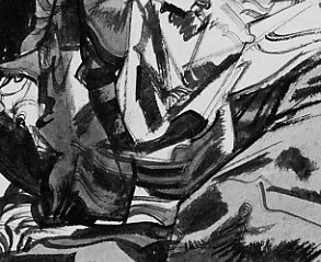
This jewel of a drawing by the great Robert Fawcett was a spot illustration for the story Mutiny in Paradise which appeared in This Week magazine in May 1957.
The original magazine was printed on cheap pulp paper, and most copies have long since crumbled into silt. I am posting a scan of the original so that this fine, arrogant drawing will continue to get the audience it deserves. Contrast Fawcett's use of drybush to convey the depth of the jungle outside the hut with the slashing brush strokes of the wall which energize the whole drawing.
Fawcett understood anatomy so well that he was able to depict the feet of the character with speed and confidence, despite their odd angle.
Most important, note how the subject matter was subordinated to the abstract design of the picture. Fawcett always said that the longer an artist could work on a representational drawing at the purely abstract level, the better.
Gerhard Richter: the self-critical optimist
Of course I constantly despair at my own incapacity, at the impossibility of ever accomplishing anything, of painting a valid, true picture or even of knowing what such a thing ought to look like. But then I always have the hope that, if I persevere, it might one day happen. And this hope is nurtured every time something appears, a scattered, partial, initial hint of something which reminds me of what I long for, or which conveys a hint of it - although often enough I have been fooled by a momentary glimpse that then vanishes, leaving behind only the usual thing.
I have no motif, only motivation. I believe that motivation is the real thing, the natural thing, and that the motif is old-fashioned, even reactionary (as stupid as the question about the Meaning of Life).
- Gerhard Richter (20 February 1985)*
Several things strike me in the text above. One of them is how distant Richter seems from any sort of affirmation of having found something (he's so incredibly distant from Picasso's "I don't search - I find"!). It is much more than humbleness. It seems an actual feeling of worthlessness. And, all the same, persistent.
Another thing is the wonderful phrase: "a momentary glimpse that then vanishes, leaving behind only the usual thing". The usual thing. Great stuff.
Yet another nice touch is the identification of "the natural thing" with "the real thing". Coming from Richter, it sounds just out-of-this-world. I'm too tired to explain this, I hope you can think of what I mean.
*quoted from:
Monday, March 27, 2006
Breast
picture by Viktor Ivanovski
What other artist does this remind you of?
Sunday, March 26, 2006
ONE LOVELY DRAWING
While it is great fun to talk about the larger landscape of art, sometimes you can see more by looking through a microscope than by looking out the window of an airplane.
That's especially true when you are talking about the intimate art of drawing. As I have noted elsewhere, I think art critic Roberta Smith got it exactly right when she wrote about the special quality of drawing:
Drawings are the most overtly delectable of all art forms...Drawings in general are like love letters. Personal in touch and feelng, physically delicate, they reflect the artist's gifts, goals and influences in the most intimate terms... [They are] a direct extension of an artists's signature and very nervous system.So I think it makes sense to take time out from bloviating about the art world to reflect on an individual drawing. I will be doing this on a regular basis, to bring attention to selected examples of long forgotten treasure and to give my detractors a better understanding of what I mean when I write about the great potential of drawing.
The illustrator Austin Briggs was featured this week in Leif Peng's excellent Today's Inspiration blog (http://todaysinspiration.blogspot.com/) which I heartily recommend to you. I am posting here a drawing by Briggs which has hung outside my bedroom door for ten years. This drawing of a World War II monument in Paris was executed with a dull crayon, yet it conveys astonishing subtlety and sensitivity. The virtuoso Briggs could've threaded a needle while wearing boxing gloves.
Notice in the detail above how Briggs has captured the man's stooped posture, his raised shoulder encircling his companion, his neck projecting from his collar, the bald crown of his head, and how efectively the simple indication of an ear conveys the man's reverse profile. With a crude tool and a primitive line, Briggs conveys more wisdom and insight about his subject than a thousand other artists might have conveyed using modern, precise tools and the most labored approach. Now that's drawing!
The statue, too, is rendered in a marvelous, vigorous way. Using nothing but talent and the simplest of tools-- a single black stick of wax-- Briggs created a symphonic range of effects to convey great power: shading, smearing, applying different pressure for different values, all applied with a confidence that reinforces the power of his subject. I hung this simple drawing outside my door ten years ago and I still learn something new from it almost every day.
Wednesday, March 22, 2006
Two Iranian women by Shadi Gadhirian
(From the Qajar series)
(from the Like Every Day series)
I am a woman and I live in Iran. I am a photographer and this is the only thing I know how to do. I began work after completing my studies. Quite by accident, the subjects of my first two series were "women". However, since then, every time I think about a new series, in a way it is related to women.
It does not make a difference to me what place the Iranian woman has in the world because I am sure no one knows much about it.
Perhaps the only mentality of an outsider about the Iranian woman is a black chador, however I try to portray all the aspects of the Iranian woman. And this completely depends on my own situation.
- Shadi Gadhirian
The two images above are my favorite ones from each of the series. The first one, because it's delicate. I find many of the other pictures in the Qajar series too obvious, too aggressive and thus too simplistic. The idea is explicit, and the contrast between modernity and "timelessness" looks more like a Hollywood time-travel film than a piece of reality. And that's fascinating - how carefuly reality needs to be managed in order to appear as reality. In this particular picture, the time contrast fades to second plan. We have a duo - the phone and the girl. The phone seems to somehow upstage the girl. Its silence is stronger. It attracts the girl without her knowing about it. We know she is waiting for a call, and that is the reason for her being serious. And only now, after "reading" this, do we realize we exist in a strange time zone, the picture is old, very old, the girl is "timeless", and the phone is the only connection to... us. At the same time, it is a somehow outdated phone, one we rarely see around us (depending where we live, of course!). And once again, time is suspended: is it the local object-time? Or is it really going back? When is the story being told? How far are we?
The second picture is part of an entire lot of kitchen appliances. Do I need to spell out what it does? I like this particular objects, because it hurts. In this context, it could very well be an instrument of torture. Isn't it?
Snail on Zebra
(Click on the image above) The video is apparently by one Johan van Hensbergen.
Jack Vettriano as wall decorator
from an interview with Jack Vettriano"I just consider myself a trader. I take my goods to the marketplace and try to get the best price I can."
The greater glory of art doesn't come into it, he confirms. "That's not why I paint," he said. "It's wall decoration for me, I don't regard it as this big meaningful thing. My subjects are men and women getting off, that's all. Mind you, some people don't think sex is serious, but I happen to think it's terribly serious."
(via)
Saturday, March 18, 2006
Women Say No To War
(found here)
Friday, March 17, 2006
THE BATTLE BETWEEN GOOD TASTE AND GOOD ART
When the illustrator Robert Fawcett decided to abandon fine art for illustration, His painter friends objected that illustration was coarse, vulgar and tasteless. Fawcett responded that "good taste" is often the enemy of creativity:
the creative act in art involves a kind of courage which good taste might easily modify. It almost seems as if the creative impulse involves a large ingredient of vulgarity to be a vital statement. In drawing, an excess of what we think of as good taste can only result in an anemic product, while the more vulgar statement... is invariably stimulating.
Pulitzer prize winner Michael Chabon sided with Fawcett, praising comic art as straddling "high art and low art [at] the margins of trash and quality....There's something stimulating about hanging out at the borders there."
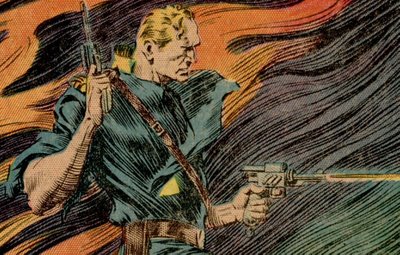
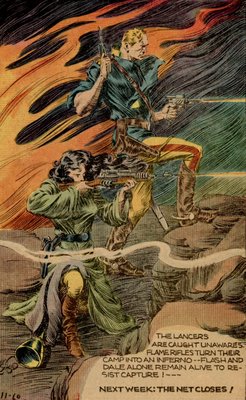
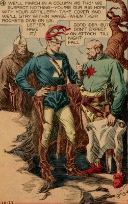
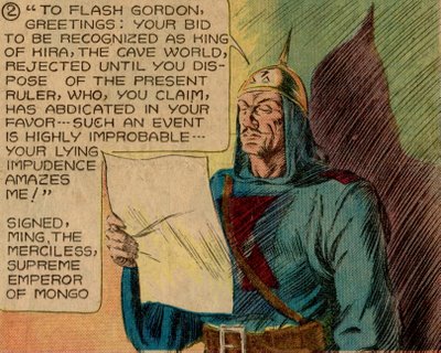
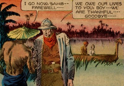
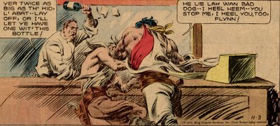
One of the most marvelous inventions to spring from the borders of trash and quality was Alex Raymond's comic strip, Flash Gordon. These virile drawings with their gorgeous lurid coloring are from a Sunday page in 1935.
Unfortunately, vulgarity has few defenders left these days. The priests of high art have learned to tolerate many forms of marginal art but have never quite overcome their aversion to rocket ships and ray guns. Even illustrators who should know better often pull up the ladder behind them once they achieve some legitimacy. When Edward Sorel, a caricaturist of modest skill, had a show at the National Portrait Gallery he quickly changed uniforms. I asked his opinion of his fellow caricaturists at MAD magazine and he sniffed with derision, "those people are vulgar."
Once upon a time, vulgar (meaning uncouth and unrefined) art was not such a problem. The greatest works of western culture were filled with slapstick humor, violence and sex. Homer, Chaucer and Shakespeare are riddled with vulgarity. Chaucer, for example, loved flatulence jokes more than Howard Stern does. Here he writes about how a woman, after cheating on her husband with one lover, sticks her naked bottom out a window to trick a second suitor who is standing outside begging for a kiss in the night:Dark was the night as pitch, aye dark as coal
And through the window she put out her hole...
With his mouth he kissed her naked arse
Right greedily, before he knew of this.
Aback he leapt-- it seemed somehow amiss,
For well he knew a woman has no beard...
And said, "Oh fie, alas! What did I do?"
Compared to Chaucer, Flash Gordon seems positively refined. I don't recall Dale Arden resorting to anything so uncouth. Yet, pale critics weighed down by too much history and too much taste look at the excess in Flash Gordon and recoil.
Vulgar art flourishes even without defenders for the best of all possible reasons: because its strength commands an audience. It is robust art in a great cultural tradition. Some of the best ideas come from just outside the borders of good taste, wearing a little too much rouge, and we should not be so quick to take offense .
Thursday, March 16, 2006
Tuesday, March 14, 2006
The Search for the Perfect Dress
Burkha, by Spanish designer/artist Alicia Framis, is made of Twaron, also known as kevlar or aramid fiber, an ultra-resistent material that is bullet-proof, but also resists flames and dog bites. This is to protect its wearer in dangerous extreme right-wing neighbourhoods where violence against immigrants and religious minorities often takes place.
Looking at the picture, Linda Zacks' question "Burka or Bikini?" comes to mind.
Why does this answer scare me even more? Am I being way too conservative? Besides being an artistic work, it is also a social statement. Yet, somehow, it seems to provoke both sides, the islamic culture and the "Western rationalism". Yes, I think I like this chill down my spine. There is something wrong with the picture, because there is something wrong with the sudden proximity of tradition in its most limiting sense and modernity in its most limiting sense. Seen from the point of view of the other, they both might seem ridiculous. And they could, if they wished to, listen more carefuly to who the other one is. On both sides.
We cannot escape having divided personalities. Having our culture invaded by the culture. I always tend to think of the times of the Roman Empire, when latin invaded the world. The ridiculous nature of civilization is so clear in these periods of overcoming, swallowing... A recent lecture, Coetzee's Waiting for the Barbarians, comes to mind: are we better because we wash twice a day? Are we better because we have a method for writing down our history? Because we own what we call rationalism? How many of us own it, to be precise? But, if we accept the "barbarians", if we embrace the other, either in our tolerance and/or in our wish to enrich ourselves, who are we? And if we are the other, and decide to take some of this otherness in parantheses, as the vast majority of religious people do today, as do people from influencial cultural backgrounds, who are we then?
Double-headed monsters?
About Performance Art (I)
My idea is that, beyond the fact that it's so ill-defined it can be practically anything, and so "whatever you do, it works", several more specific characteristics make it a great means of expression for groups with a strong sense of identity (as is the case with minorities).
- First, its rebellious nature. This is probably the most commonly known quality of performance, which, in my eyes, has done it just as much harm as it has publicized it. True, it puts performance art on the side of the underdogs, giving the "rebels" a chance to speak up. But how "up" is it? Who listens to them? Other performance artists and a tiny crowd of admirers. At least, that was the case with performance art (as it was defined by those who did it and saw it) for the past decades. A scandal is good every once in a while, but constant scandals are simply not a scandal any more. They tend to be tedious, long events where the suffering and pain of the performers brings suprizingly more embarrassment than empathy. Nonetheless, scandal, if used in a fresh way, can be good. It also emphasizes the difference, the otherness, the identity of the other, thus allowing this other to appear as an actual player.
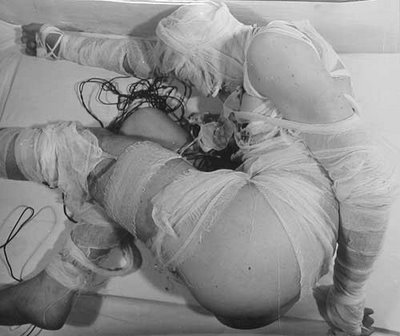
Rudolf Schwarzkogler, Aktion (1965)
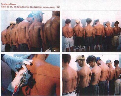
- Performance art looks for communication, but not through a mimetic de-monstration. Instead, it puts an accent on the very being, looking for the communicative aspects of reality. This can mean simply performing something, as in executing an action (see Althamer's Film), or it can mean looking at being in an objectifying way, like Vanessa Beecroft or Santiago Sierra might be doing.
What may come as a surprize is that this objectification can actually get us closer to the identity of the people. We feel empathy for Sierra's performers; we somehow refuse to see pure objects in Beecroft's girls. We feel obliged (yes, a moral category!) to project on them a presumed humanity, to see them as people, to ask ourselves about them, about their position, role, about why they are doing what they are doing and why we are doing what we are. This brings another point,
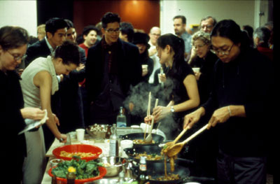
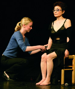
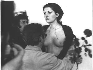
- The creation of intimacy. Look at Rirkrit Tiravanija with his exhibitions- turned- food- feasts, look at the classical Yoko Ono's Cut Piece, or even at the more drastic Rhythm O by Marina Abramovic.
They all share a space of intimacy, of sharing, of actually living together. This is a game of acknowledgement, of personal limits being overcome. It is creating a space where it is difficult for me to say something is simply a "good" or "bad" show, because I get involved (remember the Bill T. Jones case?). I don't need to actually be a "participant", i.e. I don't need to be performing an action, but I need to feel that the bond between me and what is happening on the "stage" (or in the "framework", to use an excellent term by the great Irving Goffman), that this bond goes beyond a show.
Monday, March 13, 2006
Post-Private Post
Swipe could be seen as anything but art. It seems simple: the bar has a special ID card reader, just like in a grocery store, or rather - a police car (in the U.S., that is). It allows the bar owners to see a lot of things about the customer. If it sounds to you like a sci-fi film, it's probably because you don't live in the U.S. So far, it is nothing more than an ID-checking system turned marketing device. We've heard about it, we might have had the chance to see some of them, but that's about it.
But this time, there is more.
You can also invite SWIPE to your private reception. Here is the "performance" that will take place:Many people are unaware that personal data is even encoded on their license, and, if they do realize this, they probably do not know exactly what information is there. SWIPE brings attention to these practices and enables people to see exactly what is stored on their mysterious strip.
SWIPE also illustrates how this information is used and why businesses and government crave it. Our hope is to encourage thinking beyond the individual self ("I do not care if a bar database has my name and address and time of visit...") toward understanding databases as a discursive, organizational practice and an essential technique of power in today's social field.
People who approach the bar in search of a refreshing drink will be asked by a bartender (SWIPE member) to show their driver's license for age verification. The bartender will look at the license and place it in an automated, scanning device. While the customer waits for his/her drink order, the SWIPE cash register performs a technique called computer matching based on the driver's license information. Several minutes later, the person's name is called and he/she receives their drink with "receipt." The receipt is a SWIPE compiled data image consisting of the data encoded on a driver's license augmented by online searches of data-warehouses and/or demographic analysis generated by SWIPE custom-designed software.
Basically, you get a fairly detailed picture of yourself. And if you think it matters that it has a few mistakes - it really doesn't. The data will soon be tested on you anyway. You can also access the internet toolkit, hosted by Turbulence. I found out through it that the data I regularly give away for various reasons (studies etc.) are worth $54.18.
This is a very strong initiative, and one of its creators, Beatriz da Costa, seems to be gaining momentum (she will appear in the San Jose Interactive City festival). The worst part is, this is no conspiracy theory. It is describing a simple fact, something that has been taking place for some time now. Privacy is actually at stake. And if you don't care, you might just not be getting it. Quite yet.
Saturday, March 11, 2006
WOWEE, LOOK AT THOSE HANDS!
Nobody draws hands like the great Mort Drucker.
close up, with pencil lines
If you study Drucker's stories for MAD magazine, you will see a wonderful ballet of hands from one panel to the next. Note in the following drawing how, in a tiny space crammed with Marlon Brando, Robert Duvall, Al Pacino and other superstars, a hand still dominates center stage.
There are at least two important lessons to draw from Drucker's treatment of hands.
First, Drucker constructs hands like a master architect-- he understands the structural foundation of his subject, and that gives his drawings solidity. But that's only the start. For some artists, extensive knowledge of anatomy can have a deadening effect. It locks them into a certain mechanical way of thinking. It becomes an anchor that weighs down creativity.
But if you're really good-- like Drucker-- your knowledge of anatomy sets you free. Drucker could never achieve his springing, bouncing joyful line if he had to slow down to consult reference every time he drew a hand. He has internalized his knowledge, and it has given him a solid foundation from which he can launch his trademark "slapdash" line with confidence. There's no other way to achieve that effect.
The second lesson is that Drucker did not need to draw all those hands in order to get paid for the job. The picture below would have been quite complete without one hand knocking on the door, a second hand grasping the door knob and a third gesturing in mid air.
Look in the following close up at the work that went into drawing three hands that could just as easily have been cropped from the bottom of the panel. These were not drawn for the sake of the editor.
That, my friends, is the real definition of art for art's sake.
Tuesday, March 7, 2006
Ernesto Neto's latest fluff
Ernesto Neto's Humanoids are my favorite piece of his. Most of his pieces are somewhat creepy. Yes, there is light in them, and a playful spirit, but there is also something sleazy, the smell is often intensive, and they seem distant, almost inhuman. It is not the case with these funny, soft creatures. They have a wonderful, light spirit, while remaining somewhat enigmatic and out-of-this-world. I wish they were available in stores. Wouldn't that be an amazing armchair? Design and fine arts couldn't be closer...
The work is part of a whole "labyrinth" of forms called the Malmo Experience (you guessed it, it's exhibited in Malmo).
Monday, March 6, 2006
Friday, March 3, 2006
Pretty plagiarism?
As much as I like this picture by Nicoletta Ceccoli, which adorns the cover of the last Born Magazine, it seems like...well, I'll say it - plagiarism. The Lithuanian-Polish artist Stasys Eidrigevicius painted incredibly similar pictures some 30 years ago or more, in a children's book I have somewhere in Poland. Here is an example of a similar book, though slightly different.
The pictures I'm refering to show a boy with his head covered in birds that fly away out of it. The book is a poem by Joanna Papuzinska about a boy that instead of having toys or adventures has ideas.
Even the birds look similar.
Then again, Bach's copy of Vivaldi's violin concerto was apparently a great tribute. How are we to judge?
Monika Hoinkis: humanizing the object
And this compass? Why should it always point to the North, ignoring me completely?
What if it actually lived with me? Monika Hoinkis decided to live with the objects and see if they will also accept to live with her. And they did.
The compass points at the person holding it. The metronome reacts to physical presence. Even water vibrates to... you guessed it, to your own heartbeat.
And this umbrella? Come on, you know you want it. Give it a hug. It's the only way to be well protected anyway.
See the whole Living with Things series.