Wednesday, August 31, 2005

Good news

Good news for performance art. When RoseLee Goldberg gets to business, it will hopefully mean a new level - of performance, of course:

RoseLee Goldberg, Founding Director of PERFORMA, has announced programming plans for PERFORMA05, the first biennial of new visual art performance in New York City.

It's interesting to note the term they use is "new visual art performance" - at last starting to clean up the conceptual mess the word "performance" has been creating.

Tuesday, August 30, 2005

Building room

Among the various projects by Oda Projesi, the art group created by three young Turkish women, the Annex presented at the 2003 Venice Bienale is one I find particularly powerful. One of Oda Projesi's main interests is the notion of room, as a part of the house and as space. The difference between space and room seems crucial: room is inhabited. It is the space closest to skin. Annex is the portrait of a typical dwelling, one that was meant to be temporary (as a shelter after the earthquake in Adapazari), but ended up as permanent. What we get is the transformation of an asbtract space into a human one - but this change seems to be doomed to fail. The house grows annexes, built in wood, that differ from one family to another. Oda Projesi focus on these differences, which illustrate ways of life, needs, habits: people. Those are poor people who can't afford anything more, but the pictures and descriptions force the viewer to go beyond the all-too-simple statement of poverty. They are maps that allow us to approach someone who seemed distant just a moment ago.

Monday, August 29, 2005

Better than art?

Keith Gladysz over at January Blog quotes Nietzsche about the trouble with geniuses. Basically, they're bastards. Nietzsche suggests that geniuses were not great men, because great men do not act as awefuly as most geniuses did. And he goes on to say:
We have perhaps more need of great men without works than great works for which such a heavy price has to be paid in terms of human souls. But at present we barely understand what a great man without works might be.
This raises several interesting questions. For one, how good is a good work of art? Is it enough for an artist to make good/pretty art (does it even help?)? Or is art more of a personal fancy, an entertainment? And does aspiring to more make sense? Are the people educated on Mozart and Shakespeare, on Bacon and John Cage, better people? Or is the talk about educating through art, or even evolving thanks to it, pure bluff of those who simply enjoy being the elite? Nietzsche seems to be saying that one can do better than art. So here is my question: can an artist do better than art?
Technorati: , ,

Friday, August 26, 2005

Another couple

For your art spectator's pleasure: interviews with Bjork and Matthew Barney. I found reading them "as a couple" told me a lot about the contemporary art scene, the way artists think, work, create...
(Has anyone seen the latest Matthew Barney film, Drawing Restraint 9?)

Morning exercice

Thursday, August 25, 2005

Sudden Stops

Ginny Bishton, Walking, Sudden Stops (2003)

Me

I feel tempted to turn this blog into an egocentric trip - to write just what I need to research and develop my own works. And I don't think many people would mind (or notice).
The thing is - that was not my objective. The objective was to dwelve into the flesh of new art and discover it anew. Or simply, to learn. To study the things that catch my attention, to write them down like one pins down a problem or takes a picture. The idea was - and is - to grow a possessive blog.

But I'm tired. And need motivation to go on, in the blog and in the remains of the real world. So this time, I want to think about the direction I'm heading artistically.

First, there is the dilemma: theater, performance, fine (new) arts or cinema. All of these interest me to a great extent; none fascinates me enough to choose it and leave the others behind. Is it possible to carry on so many roads? Only if one has the power of a bull, the endurance of a camel and the mind of a monkey. It overwhelms me. Of course, there are artists who do it (almost) all (Greenaway, Matthew Barney, Forced Entertainment, and several others). But I'm not quite there yet. This is a lonely road for now, and the choices are significant - that means, there are few real-life obstacles and what one wishes to do actually changes what one does (as oppose to other periods in life when reality bites and sticks and doesn't let go that easily). So, going back to school would definitely be a good idea. Getting a Masters somewhere, in something. (is it worth it?) And guess what - they don't have a MA in theater/performance/new media/cinema.
Enough of sad life stories. What about art?
Two artists I have managed not to write about are Vanessa Beecroft and Maurizio Cattelan. Yes, I wrote about their recently discovered intertwining, but frankly that was just avoiding any serious writing. Actually, I find them both very interesting, I think they do have some things in common, but would like to write about it some more. And I can't. I'm not ready for it. I think the game(s) they play is so subtle that one can easily go into quick judgements that mean nothing - either praising their "strength", or criticizing the many things they are commonly criticized for. For starters, I would say Cattelan is a modern-day Warhol (I know very little about Warhol, as he knew little about Marilyn/Campbell's/the electric chair). And leave it at that for the moment - for my argument's sake. As for Beecroft... well, it's more complicated, since she says less. Whoever says less wins, says one monk to the other - you lost, answers the latter.
Extrapolating, what I want to use from Beecroft is the idea of a perfect order - or rather, of a completely aestheticized reality. It pleases my theater-moulded mind's eye. People as objects, and, might I add, objects that could be people. In that case, we should rather say: personas. This reminds me of another great performance - Zhang Huan's To Raise the Water Level in a Fishpond. The performance is translated into pictures - and what we have is actually archive footage. This is a very interesting phenomenon in live art - the "live" part becomes ambiguous. But not put into question, only blurred. We need the conscience of it being, or having been something real. Once we have it, it can very well be represented by a picture, a film, a text or a fingernail. Because through this footage we get to travel in another way. Maybe it's a little like the fascination for biographies?
Going back to Zhang Huan's work. Contrary to Beecroft's girls (and sometimes boys), Zhang Huan's men have stories. They are all about the stories. They are migrants, the cheap labor force that moved from the countryside to Beijing looking for work. And, according to the artist, in China fish is the symbol of sex, while water - the symbol of life. Now that we have the cosmogony, the pictures speak. The beautiful pictures speak. Beecroft's pictures don't speak. They ostensibly shut up, as abstract painting or some contemporary theater work (Goat Island, some Forced Entertainment). Tim Etchells from Forced Entertainment has a method of writing for performance which is basically writing lists. The spectator fills the blanks. Minimalist? Hmm... no, not quite. Simply a very small narrative. Notice that Zhang Huan also doesn't say much: he doesn't judge the people, he doesn't interpret them. He shows them.
Then, there's another idea I really like - the intimacy of reading something for someone. As in, reading out loud, but not for the world, just for someone. I'm not sure where I got that from, there are probably some artists working on it, but I only remember my Dad and my Grandfather reading me books when I was a kid. And then - oh, I know! - I think it was Daniel Pennac who wrote a book describing his experience as a school teacher. He read books out loud for the teenage students. Impressive.
Technorati: , ,

Wednesday, August 24, 2005

Tuesday, August 23, 2005

Video of my performance

At last, here it is: the video document from the performance/installation I directed a couple months ago (together with Verónica Fernandes). The performance was made by the theater group of the Superior Institute of Social and Political Sciences in Lisbon (ISCSP). The video was shot by Sérgio d'Almeida.
Since the performance was site-specific (or site-related, to be safe...), it is simply impossible to recreate it. It was a piece that was based on intimacy and sharing, and that is just about impossible to convey on film, unless the film is not related to the event. It came out quite different to the actual event, somewhat darker and, as I mentioned, more distant.
I had a dilemma concerning the spoken words. I didn't think it was crucial to give translation, but if you don't know what someone is saying, it can be so frustrating you think you're missing out on something. So I did translate the fragments, omitting just the parts that are closer (how close?) to music/soundtrack than to an actual spoken text. For your information, here is the translation of the words that are spoken out in those parts:

tu: you
tudo [tuh-duh]: everything/all
tenho [teh-nyo]: I have
tédio [teh-d-you]: tedium, ennui, boredom

I could write about it for a long time, but let me just explain that "Entre" (the title of the piece) in Portuguese means "enter" (as in: "to enter" or "please enter"), as well as "between".


(The film file's URL: Link)

update 24.08: I have uploaded a lighter (9Mb) version of the film.

Not too deep


(via)

Sunday, August 21, 2005

What's in a concept?


Damn it, labeling is a horrible thing.
The above is part of any artist's standard lithurgy. Why name things? Why give them categories, stickers, definitions? Doesn't it kill the art?
Of course, one answer is because we want to talk about things, and we can't talk about them if we can't say anything about them. This time, though, let's leave this classic apology.
What I'm more interested in is how artists can profit from the tags their art gets.
Take an example: site-specific work. We all know what that is: a work that is meant for one specific place. Or rather: a work created thanks to the place, with the help of the physical context of a particular, none-black-or-white-box environment. (Unless, of course, you're Michael Elmgreen and Ingar Dragset, then the white box is perfect for site-specifics)
But there are some who find the term "site-specific" to be to vague. Take dance critic Camille LeFevre. In a recent article she distinguishes between site-specific, site-adaptive, site-influenced and al fresco (dance) work. Why would somebody go into such a trouble as to cut everything into small pieces? Why not just let the artists live and do things? Or is it just pure academic sharpnel thinking?
Most of the time it probably is. But the question of site-specific work has been recenly on my mind, and I discovered the name could make a difference.
You see, if we believe names refer to descriptions and/or specific objects (see philosophical accounts of names), a name can tell us something about reality. What does it matter to an artist?
Maybe it should. Site-specific work is incredibly en vogue these days. Here in Portugal, as in other places around the world, more and more artists take up the challenge of working things out in the wild, wild world.
And then, they don't. They often simply present material outside, or at a specific site (an abandoned building, a park...). A work at a specific site is not necessarily site-specific work. The latter, according to LeFevre, is the unique fruit of an artist's relation with a place:
site-specific dance is of one place and no other. Without the site, the dance ceases to exist. “To move the site-specific work is to re-place it, to make it something else,” writes Nick Kaye in Site-Specific Art: Performance, Place and Documentation, echoing visual artist Richard Serra’s definition of site-specific: “To move the work is to destroy the work.”
This definition is a challenge to an artist. I would dare say that even Richard Serra himself wasn't always up to it: some of his works seem simply placed somewhere and not made out of somewhere. Then again, nobody says site-specific is better. Still, it can be a new way of looking at things, from the ground up. And here is the thing: if you know it, and you're honest with it, it might just work. But it's very easy to misunderstand the names, to misuse them, to create a light version. To choose a shortcut. And then the works seem like decoration, like ornaments. And then I so often wish the work had been kept in a room, black, white, or of any other color.

Both pictures are of the exhibition How Are You Today?, by Michael Elmgreen and Ingar Dragset (2002, Galleria Massimo de Carlo, Milano)

Saturday, August 20, 2005

Nude Art


Duchamp, Nude Descending a Staircase (1912)

The noblest in art is the nude. This truth is recognized by all, and followed by painters, sculptors and poets; only the dancer has forgotten it, who should most remember it, as the instrument of her art is the human body itself.
- Isadora Duncan (1878-1927), The Dancer of the Future (1928, written ca.1902)

Friday, August 19, 2005

Your other shadow


Meet the Shadow. Get to know it. Don't be aggressive, or it will flee. Stay still, and wait for it to get closer and... "be the art, be the art!" (spoken out with a slightly, ever so slightly ironic tone). Simple and effective? Or cheap special effect?

(via)

Thursday, August 18, 2005

The Polish Joana Vasconcelos

Julita Wójcik, Peeling Potatoes (Zachęta Polish National Gallery, 2001)

I think now is a good time in art for women, and for folklore. What is being underlined are small, intimate human gatherings. A niche culture appeared, created for a very small group of viewers, almost for oneself. I mean internet galleries and the possibility for anyone to create his own page.

(...) But you leave this niche.

I am a simple girl and feel no need to pretend, to pose as someone else. Making art I'm not doing anything different than any person on any given day. I don't want the spectators to reflect on anything for even a second: it is all already given [literally: "served" - Vvoi]. The more realism, the better. A full naturalism, that's the way I am, simply Julita Wójcik.
Oh, if you follow the link in her name, I think you will agree with me that it is very far from a "full naturalism" or, even more, "realism" (and she doesn't want us to reflect on it? pl-lease!). It is a type of visual poetics we can find in the Portuguese artist Joana Vasconcelos, playing with the traditional, the simple, the everyday, and giving it new meanings, "elevating it" to the statute of high art - or rather, as I imagine Wójcik would prefer, elevating the so-called "high-art" to the level of true human, intimate creation.
But it's tricky, being simple. Because, whether you like it or not, whether you admit it or not, as an (public) artist you're on a stage. And that changes a lot:


And that, my dear friends, is why I like Peeling Potatoes.

Mona Lisa revisited (yet again)

I know, I know this is too easy. But somebody had to do it. And I shouldn't be always so damn serious.

Visual Noise


There is something immensely attractive about chaos. Participating in it, even witnessing it, enchants, makes it difficult to resist, as if it - made sense? All the Pollocks of the art world know it - their chaos makes sense, it is no chaos, it has a structure, a fine combination of hazards and traps that guide you into something, and thus out of chaos?

If you have ever complained about all the visual graphomaniacs gone wild in the digital era, if you've felt uncomfortable about the idea of millions of bad pictures meetings millions of innocent (and not-so-innocent) eyes, Photo Noise is water for your mill.
If, on the other hand, you firmly believe all this can be good, and mabe even used as material for other pieces, Photo Noise is the place to be.
Then again, if you don't really care, bare with me, see the archives, dance in your room to the music of Scarlatti and drink white Martini with lots of ice.

Tuesday, August 16, 2005

Breaking the (city) rules

There once was a street artist who decided to take things to another level. And his name was not Banksy. His name was Roadsworth, or Peter Gibson, as he was later presented by the police. His art consisted in painting. It was based on the premise that a painter needs not create from scratch. The city's canvas is full of beginnings, sketches, potential paintings. As Dali, when lying in the hospital bed during his last months, kept seeing new things appear out of the stones that made up the wall he saw through the window, so did Roadsworth see the streets as an undiscovered land. And discover he did.
Until in 2004 the Montreal Police (the plot of our story takes place in Montreal, Canada) decided he had crossed the line.


They stepped in.


As the folks at Wooster Collective put it,
Roadsworth was arrested for over 80 counts of mischief and is now facing up to $250,000 in fines for his street liberations.
The CitizenShift site has the whole story with pictures, films, and some text. For the street-art curious, there is a decent links page. The site seems to defend Roadsworth, as do Wooster Collective. I would defend some of his work, but there seem to be several works which as a driver (or pedestrian) I would simply find dangerous. They go beyond a subtle intervention (as is the case on the first picture you see) and change the street signs quite drastically. And that, my friends, seems like a naughty thing to do. Especially, since Roadsworth really doesn't seem to have anything against the fact that Montreal has street signs to direct the traffic. And if he doesn't, why subvert it? Unwilling sabotage?

(via)

Saturday, August 13, 2005

VJ... Peter Greenaway

Peter Greenaway, the Welsh author of such films as Pillow Book and The Draughtman's Contract, who is also a multimedia artist, working in media from projections to complex installations/performances to sculptures to painting, has recently participated as Video Jockey in Amsterdam's VJ Temple 11.

Friday, August 12, 2005

How difficult is beauty?

This wheelchair is made of cardboard. It was made by Chris Gilmore. When I first saw it, I thought it was brilliant, extremely powerful. The object of fragility, but which at the same time to many people signifies strength, and ability, here is useless, and (therefore?) meaningful. It is a simulacrum, an image of itself, a fake that is the thing itself - as a disabled person may seem (often to himself) the other version of himself. The perfection of the work makes it all the deeper, all the more painful.
The work is part of the exhibition Beauty So Difficult at the Fondazione Stelline in Milan. A review of the show is called Beauty Not So Difficult. In it, critic Rebecca Robecchi explains the "easy" enchantment of art. She also explains that Chris Gilmore makes things out of cardboard. Many things. Cars, type-writers, scooters (, cows).
And that's when I start to have a problem. I feel cheated, betrayed. The cardboard works for the wheelchair, but why the hell a scooter? If the idea is that the entire world can be made of cardboard, I get it, and it doesn't appeal to me any more than any other model maniac. Yes, it's pretty, and I appreciate the skill, but, well, I think, is this all you've got? Is beauty that easy? You need the skill to make a cow out of cardboard, and then it all works fine? It's pretty? And it's art, as in, valuable art, as in, I am to value it? This seems strangely close to juggling. You can juggle any object you want, but isn't it still juggling?
And damn it, I still like the wheelchair.

Thursday, August 11, 2005

Gorrilla, though not Girls

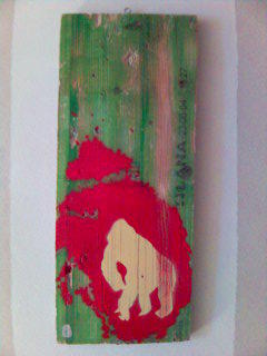
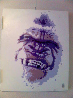
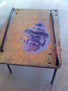
Juan de la Mora is a Chicago-born Mexican-American artist living in Madrid. His background is in architecture, but his true passion seems to be stencil art. His works are precise games of colors and forms, often introduced in "low-profile" street contexts. While it is clear de la Mora spent a substantial amount of time experimenting with graffiti on the streets, it is no less clear that in his recent works he takes it to another level, creating multi-layered works with autoCAD (architectural software) and specialized cutting-plotting machines. The exhibition I saw in Montemor-o-Velho (here in Portugal) had two distinct parts. One was the manipulation of the word manipulation, starting with a line and then turning it into a wor(l)d that could be inhabited, though remaining ambiguous, something between a room, a house, an abstract form, very much in the modernist spirit. The other (partially shown here) was a grungy, funky yet surprizingly clean way of playing with stencil forms, using the theme of a gorrilla to create dense, powerful imagery. The two parts might seem completely different, until you meet the man - and discover his passion for art, architecture, street creation, freedom, traveling, and... cooking. His dream - to have a restaurant were everything would be de la Mora design. From the space, through colors, smells and tastes. Now that's a new way of understanding Gesamtkunstwerk!


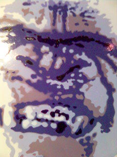
What is it I like so much about the gorrillas? This particular one is called "You and I". Without it's black color (the original model was a famous albino gorilla) it seems humanlike, but also, abstract, unreal, as if it were some sort of a hidden symbol or code, or maybe a map of something. It appears out of the white as, well, sorry, but as a shroud (as in the Turin one). A shroud is the proof of existence, and that's how this feels. Also, it gives me the idea of a medical image, some sort of analysis, so the stains become even more ambiguous and challenging. How do you read a face?


The works are part of the group exhibition Reflexiones at the Galeria Torre de Relógio, in Montemor-o-Velho, which is on until October.

Art world gossip


Yes, I have gotten that low. Maurizio Cattelan and Vanessa Beecroft used to be lovers. And, according to the title of the article, she accuses him of stealing her ideas. The content of the text, however, does not seem to confirm that.
On the other hand, it raises the (so often raised) question of originality and plagiarism in art. Cattelan is quoted as saying: "Was Warhol robbing Marilyn [Monroe's] identity when he painted her? And what was Cézanne doing? Robbing apples? In art, all you can do in the end is appropriate that which surrounds you. So it is never a robbery. At the most it is a loan. Unlike thieves, artists always give back the stolen goods."
Is it always that simple? Nothing is stolen, everything is transformed? Come on, be a little original, Maurizio, don't just repeat old phrases.
Technorati: , ,

Wednesday, August 10, 2005

Storker

Avant-garde children?

My workshop in Montemor took place during the Citemor theater festival. One of the plays I've seen there was Tot És Perfecte, created by Roger Bernat, called the "new enfant terrible of the Spanish stage".
The production could be described in many ways. It is a medieval tale with a "making-of" included, a story about love and the meaning of life, a mix between contemporary and ancient/fantasy worlds. But above all, it is a play acted by teenagers. The 14-to-16-year-olds act out their private conversations as if the stage - and the public - were simply inexistent. They talk about things they care about, worry about, love (?). And then, they represent a medieval tale. In a fairly unconvincing and uninteresting way. So what is it that makes the show shocking to some, appealing to most? When not acting the story, the teens are "themselves". With all the consequences. They swear more than a drunk butcher, they talk dirty to each other, occasionally becoming incredibly cruel, some of them even actually spanking others, smoking, or, in one boy's case, undressing and playing with the genitals in front of the public. Oh, and sucking on it. For the acrobatic trick. And the public's guilty feeling of joy.
I tried talking to the actors, the director, several other spectators. I wanted to know what they felt. They thought it was real. And funny. The actors felt just fine about all this, stating that this is who they are and they were not forced to do anything, on the contrary, they were the ones suggesting, and several things they suggested were rejected. The boys who smoked had been smoking since they were 12, the boy who made the exhibitionist trick insisted on doing that and had a long conversation with everyone about what he was going to do.
And of course, my favorite argument: this is who they are. We can't be so politically correct as to censor it. It would be hypocrisy. And come on, this is no big deal really. There have been much worse things happening on stage in contemporary theater, also to teenagers.
Then why is it bothering me? Maybe because I have a few friends who started smoking on stage, and never quit. Or because I remember myself at 14, 15, 16, and the enthusiasm with which I undertook the most silly and unwise things. I suppose I was in the luxurious situation of not being tempted to try them out on stage. Why? Maybe, because there is a difference between what's happening with or without a witness. And because I'm not sure of how far it goes, but I'm pretty sure the young people I spoke to are so even less. Or maybe because I'm just a boring moralist, who can't deal with true avant-garde when he sees it.

Wednesday, August 3, 2005

I'm going away until Sunday, and am not sure if I'll have access to the internet.

Monday, August 1, 2005

Fear

Marja-Leena's comment to my last post made me discover James W. Bailey's blog about art, mainly his own, with some fascinating insights of a fairly renowned modern artist (I've only just started investigating though). The most recent post is about a French stranger met in the metro, and is "illustrated" by two pictures (or is the text an illustration of the pics?). As I was reading through the blog, I was listening to the uneven, but occasionally excellent wps1 art radio (by the NY-based PS1 Contemporary Art Center) , to a conversation about fear. And I recalled a picture I took a few days ago in the metro. Went back to it, worked on it a little, and here it is:

Look


I guess you could say it's my drying of the puppies.

Popularity

It's incredible: it was enough to put some naked women on the blog, and the clicks keep coming in.

Of puppies and evil

What's in a teddy?
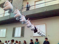
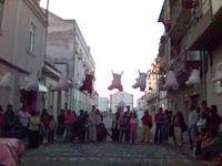
Nothing, if they remain quietly suspended on a string.
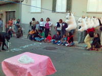
Then, Rose begins writing. And the text explains that a short time ago a soldier (with an English name... US Army? British?) was abused by his colleagues for not being of the same color. He was washed, and then scalped. Cleansed.
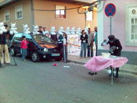
And then Rose, the old, severe- but- kind- looking lady, goes back to the puppies. She grabs the black one, and washes it. Puts white detergent on it, splatters transparent water. Then spills the filthy, gray water on the floor and puts the puppy back on its place. And leaves. Stopping to look back a couple of times, just to make sure.
Rose and the Teddy Bears is a 20-minute street performance, part of a series presented by the French theater/performance group Princesses Peluches during the FIAR International Street Arts Festival in Palmela, Portugal ("street arts" in this case basically means theater). The quote on the group's site says "Rose makes people laugh and think at the same time". Well, this time it really didn't make me laugh (though some might find the beginning amuzing thanks to the subtly stylized persona of Rose). Once you get it, it's really quite creepy. What I found interesting was that the whole thing would be rather weak - if it weren't presented by this character, which seems from a completely different story. And that's what gives the show its credibility. It's as if the old lady made it easier to swallow something so bitter we are usually tempted to refuse it as a "performance", or even as a direct social commentary.